How to Set Up Okta Single Sign-On for Apache Superset

Password logins are the first thing an auditor asks about and the last thing anyone wants to manage by hand. If your team already uses Okta for everything else, Superset should not be the exception: one identity, one place to offboard, and roles that follow the person rather than the login.

Apache Superset supports this out of the box through Flask-AppBuilder (FAB), the framework Superset is built on. The pieces are all there. What is missing is a single, current walkthrough that covers the Okta side, the Superset side, the role mapping, and the handful of reverse-proxy and cookie settings that turn a working configuration into a redirect loop. This is that walkthrough.

By the end, you will have:

  • Okta as the only login path for Superset, with the local password form gone.
  • Users created automatically on first login, with their Okta groups mapped to Superset roles.
  • Role changes in Okta reflected in Superset at next login.
  • A troubleshooting table for the errors this setup produces in practice.

The configuration shown here applies to Superset 2.1 through 4.x. The examples were written against Superset 4.x with the Flask-AppBuilder 4 series it ships with.

How Superset authentication actually works

Superset does not implement authentication itself. FAB does, through its SecurityManager, and Superset extends that with SupersetSecurityManager. FAB supports five authentication types, selected with AUTH_TYPE in superset_config.py:

AUTH_TYPE What it does Typical use
AUTH_DB Username and password stored in Superset’s metadata database Default, small teams, demos
AUTH_LDAP Bind against an LDAP or Active Directory server On-premises corporate directories
AUTH_OAUTH OAuth 2.0 / OpenID Connect against one or more providers Okta, Azure AD, Google, Keycloak, Auth0
AUTH_OID Legacy OpenID 2.0 Rarely used today
AUTH_REMOTE_USER Trust a header set by an upstream proxy Behind an SSO-terminating gateway

Okta is an AUTH_OAUTH provider. Under the hood, FAB uses the Authlib client library to run the authorization-code flow, fetch the user’s profile from the provider’s userinfo endpoint, and hand the result to a method called oauth_user_info. FAB ships a handler for Okta, so a standard setup works without a custom security manager — though as Step 2 explains, there is one good reason to write one anyway.

Prerequisites

  • Admin access to your Okta org, or someone who has it and twenty minutes.
  • A running Superset instance reachable over HTTPS on a stable hostname. OAuth callbacks to localhost work for testing; callbacks to plain HTTP in production do not.
  • The ability to edit superset_config.py and restart Superset.
  • Authlib installed in the Superset environment. The official Docker image includes it. For a pip install, run pip install authlib if python -c "import authlib" fails.
  • A short list of Okta groups you want to map to Superset roles. Three is a good start: administrators, analysts who can write SQL, and viewers.

Step 1: Create the Okta application integration

In the Okta Admin Console:

  1. Go to Applications, then Applications, and click Create App Integration.
  2. Choose OIDC – OpenID Connect as the sign-in method and Web Application as the application type.
  3. Name it something your users will recognise, for example “Superset BI”.
  4. Under Grant type, leave Authorization Code ticked. Superset does not need implicit or hybrid flows.
  5. Set the Sign-in redirect URI to https://superset.example.com/oauth-authorized/okta. The last path segment must match the provider name you will use in superset_config.py, which in this guide is okta.
  6. Set the Sign-out redirect URI to https://superset.example.com/login/.
  7. Under Assignments, assign the groups that should be allowed to log in. Anyone not assigned will be refused by Okta before Superset ever sees them, which is the behaviour you want.
  8. Save, then copy the Client ID and Client secret from the General tab.

Choose the authorization server and expose groups

Okta has two kinds of authorization servers. The org authorization server at https://<your-org>.okta.com issues tokens for Okta’s own APIs and does not let you add custom claims. The default custom authorization server at https://<your-org>.okta.com/oauth2/default does, and it is what you need if you want group-based role mapping. Every URL in this guide uses the custom server.

To make Okta include the user’s groups in the response Superset reads:

  1. Go to Security, then API, open the default authorization server, and select the Claims tab.
  2. Click Add Claim. Name it groups, set the value type to Groups, filter Matches regex with the value .*, and include it in Any scope.
  3. Add the claim for both the ID Token and the Access Token, with type Always. FAB does not read the ID token; it calls Okta’s userinfo endpoint with the access token and maps roles from that payload. Configuring only the ID token is the most common reason group mapping silently does nothing.
  4. On the Scopes tab, confirm a groups scope exists, or add one. Superset will request it.

The regex .* returns every group the user belongs to. In large orgs, that can be a long list. Filter by a prefix such as ^superset_ if you want to keep the token small; everything else in this guide still works.

Step 2: Configure Superset

Add the following to superset_config.py. Keep the client secret out of the file and read it from the environment or your secrets manager.

python
import os
from flask_appbuilder.security.manager import AUTH_OAUTH

OKTA_BASE_URL = os.environ["OKTA_BASE_URL"]  # e.g. https://acme.okta.com
OKTA_ISSUER = f"{OKTA_BASE_URL}/oauth2/default"

AUTH_TYPE = AUTH_OAUTH

OAUTH_PROVIDERS = [
    {
        "name": "okta",
        "icon": "fa-circle-o",
        "token_key": "access_token",
        "remote_app": {
            "client_id": os.environ["OKTA_CLIENT_ID"],
            "client_secret": os.environ["OKTA_CLIENT_SECRET"],
            "api_base_url": f"{OKTA_ISSUER}/v1/",
            "client_kwargs": {"scope": "openid profile email groups"},
            "server_metadata_url": f"{OKTA_ISSUER}/.well-known/openid-configuration",
            "access_token_url": f"{OKTA_ISSUER}/v1/token",
            "authorize_url": f"{OKTA_ISSUER}/v1/authorize",
            "jwks_uri": f"{OKTA_ISSUER}/v1/keys",
        },
    }
]

# Create a Superset user the first time someone signs in through Okta.
AUTH_USER_REGISTRATION = True

# Role for users whose groups match nothing in AUTH_ROLES_MAPPING.
AUTH_USER_REGISTRATION_ROLE = "Gamma"

# Okta group name -> list of Superset roles.
AUTH_ROLES_MAPPING = {
    "superset_admins": ["Admin"],
    "superset_analysts": ["Alpha", "sql_lab"],
    "superset_viewers": ["Gamma"],
}

# Re-evaluate roles from the groups claim on every login, so a change in
# Okta takes effect the next time the user signs in.
AUTH_ROLES_SYNC_AT_LOGIN = True

What each block does:

  • name is the provider key. It appears in the login button and, more importantly, in the callback path /oauth-authorized/okta. It must match the redirect URI you registered in Okta.
  • server_metadata_url lets Authlib discover the token endpoint, signing keys and supported scopes from Okta’s OpenID configuration document. The explicit access_token_url, authorize_url and jwks_uri entries are belt and braces; they let the flow keep working if discovery is ever blocked by an egress firewall.
  • api_base_url is where FAB fetches the user profile from. FAB’s built-in Okta handler calls userinfo relative to this URL, which resolves to https://acme.okta.com/oauth2/default/v1/userinfo.
  • client_kwargs.scope must include groups, or the claim you created in Step 1 will never arrive.
  • AUTH_USER_REGISTRATION is what turns a successful Okta login into a Superset user record. Without it, only users you created by hand can log in.
  • AUTH_ROLES_MAPPING keys are Okta group names, exactly as they appear in the token. Values are lists of Superset role names. Admin, Alpha, Gamma, sql_lab and Public are the roles Superset creates by default; any custom role you have created works too.
  • AUTH_ROLES_SYNC_AT_LOGIN is the setting most people miss. Without it, roles are assigned once, at registration, and removing someone from an Okta group has no effect on what they can see in Superset. Note the flip side: with sync on, Okta is the only source of truth, so a role you grant by hand in Superset’s UI is wiped at that user’s next login.

When you need a custom security manager

FAB’s built-in Okta handler works, but it derives the username from the token’s sub claim and prefixes it, so your user list fills up with entries like okta_00u1a2b3c4d5e6f7g8h9. That is unpleasant to administer and impossible to eyeball against an audit request. Overriding oauth_user_info is also the fix if your Okta org names the groups claim differently, nests it, or you want usernames to be email addresses regardless of what preferred_username says:

python
import logging

from superset.security import SupersetSecurityManager

log = logging.getLogger(__name__)


class OktaSecurityManager(SupersetSecurityManager):
    def oauth_user_info(self, provider, response=None):
        if provider != "okta":
            return super().oauth_user_info(provider, response)

        me = self.appbuilder.sm.oauth_remotes[provider].get("userinfo").json()

        # Logs which claims arrived without dumping personal data.
        log.debug("Okta userinfo claims: %s", sorted(me.keys()))

        return {
            "username": me["email"].lower(),
            "first_name": me.get("given_name", ""),
            "last_name": me.get("family_name", ""),
            "email": me["email"].lower(),
            "role_keys": me.get("superset_roles", me.get("groups", [])),
        }


# Also in superset_config.py, after the class is importable:
CUSTOM_SECURITY_MANAGER = OktaSecurityManager

The role_keys list is what FAB matches against AUTH_ROLES_MAPPING. Using the email address as the username is a deliberate choice: it is stable, unique, and survives a rename in Okta better than preferred_username does. Pick one convention before the first login, because changing it later creates duplicate user records.

That debug line is also your diagnostic for Step 1: if groups is missing from the logged claim list, the problem is the Okta claim configuration, not Superset.

Step 3: Settings that matter behind a reverse proxy

Almost every production Superset sits behind a load balancer, an ingress controller, or an Nginx proxy that terminates TLS. That changes what Superset thinks its own URL is, and OAuth is unforgiving about URLs.

python
from datetime import timedelta

# Trust X-Forwarded-* headers from the proxy so Superset builds https:// URLs.
ENABLE_PROXY_FIX = True
PROXY_FIX_CONFIG = {"x_for": 1, "x_proto": 1, "x_host": 1, "x_port": 1, "x_prefix": 1}

# Cookies must be sent on the callback from Okta.
SESSION_COOKIE_SECURE = True
SESSION_COOKIE_HTTPONLY = True
SESSION_COOKIE_SAMESITE = "Lax"  # "Strict" breaks the OAuth callback

# Log people out after a working day; Okta deactivation does not end live sessions.
PERMANENT_SESSION_LIFETIME = timedelta(hours=10)

Three points worth underlining:

  • Without ENABLE_PROXY_FIX, Superset sees the request as plain HTTP and constructs a redirect_uri starting with http://. Okta compares it to the https:// value you registered and rejects the login with a redirect URI mismatch.
  • SESSION_COOKIE_SAMESITE = "Strict" looks like the secure choice, and it is the one that breaks OAuth. The callback from Okta is a cross-site navigation. With Strict, the browser withholds the session cookie, Superset cannot find the state it stored before redirecting, and you get a mismatching_state error. Use Lax.
  • Deactivating someone in Okta stops new logins immediately but does not touch sessions Superset has already issued. PERMANENT_SESSION_LIFETIME bounds how long that window can be. For sensitive data, make it shorter.

Step 4: Restart and test

Restart Superset. The login page now shows a single “Sign in with Okta” button and no username or password fields.

  1. Sign in with a user who is in superset_admins. You should land on the welcome page with the Admin menu visible.
  2. Go to Settings, then List Users, and confirm the user was created with the expected username, email, and roles.
  3. Sign in as a user in superset_viewers from a private window. Confirm they see dashboards they are permitted to see and nothing else. Row-level security rules, if you have them, still apply exactly as before; SSO changes how people authenticate, not what the roles allow.
  4. Move that user into superset_analysts in Okta, sign them out and back in, and confirm SQL Lab appears. This proves AUTH_ROLES_SYNC_AT_LOGIN is working.
  5. Remove the user from every Superset group in Okta and sign in again. They should now hold only the AUTH_USER_REGISTRATION_ROLE. If you would rather they be refused entirely, remove them from the Okta application assignment instead.

Keep a break-glass path. Switching to AUTH_OAUTH removes the password form, so if Okta is unavailable, nobody can log in. Document the rollback: a copy of the previous superset_config.py with AUTH_DB, a known-good admin account in the metadata database, and the restart command. Test it once before you need it.

Troubleshooting

Symptom Likely cause Fix
Okta shows “The redirect_uri parameter must be a Login redirect URI” The callback URL Superset sent does not match Okta exactly Check the provider name, the scheme (http vs https), and trailing slashes. Enable ENABLE_PROXY_FIX behind a proxy.
mismatching_state: CSRF Warning! State not equal in request and response Session cookie not sent on the callback Set SESSION_COOKIE_SAMESITE = "Lax" and make sure SESSION_COOKIE_SECURE matches the scheme in use.
Login succeeds, but every user gets the Gamma role only Groups claim missing from the userinfo response Confirm the groups claim is configured for the Access Token as well as the ID Token, the groups scope is requested, and you are not using the org authorization server URLs.
“Access is Denied” after signing in User created without roles, or registration disabled Set AUTH_USER_REGISTRATION = True and a valid AUTH_USER_REGISTRATION_ROLE.
invalid_client in Superset logs Wrong client ID or secret, or the app is not a Web Application type Re-copy the credentials; recreate the integration as an OIDC Web Application if needed.
Usernames look like okta_00u1a2b3... FAB’s built-in handler derives the username from the sub claim Add the custom security manager from Step 2 before the first production login.
Two accounts for the same person Username convention changed between logins Pick one of preferred_username or email in oauth_user_info and keep it. Merge or delete the duplicate in List Users.
Roles do not update when Okta groups change Sync disabled Set AUTH_ROLES_SYNC_AT_LOGIN = True and have the user sign out and in.
Login button missing; password form still shown Config not loaded Confirm SUPERSET_CONFIG_PATH points to the file, or the file is on PYTHONPATH, and that Superset was actually restarted.

To see exactly what Okta returned, run Superset with debug logging for a single login using the log.debug line in the custom security manager above. If you need the claim values and not just their names, log the full payload once and remove it immediately afterwards; the response contains personal data.

Operational notes

  • Onboarding is now an Okta task. Add the person to the right group and assign them the application. There is nothing to do in Superset.
  • Offboarding is two steps. Deactivate in Okta, then either wait for PERMANENT_SESSION_LIFETIME to expire or, for immediate effect, set the user to inactive in Superset’s List Users.
  • Role grants must happen in Okta. With AUTH_ROLES_SYNC_AT_LOGIN enabled, editing a user’s roles in the Superset UI lasts only until their next login. Change the Okta group instead.
  • Service accounts and API clients that authenticate with a username and password against Superset’s REST API will stop working under AUTH_OAUTH. Move them to a token-based approach or keep a separate, restricted provider for them.
  • Multiple providers are allowed. OAUTH_PROVIDERS is a list. Some teams keep Okta for staff and a second provider for contractors or an embedded-analytics tenant.
  • Audit trail. Superset’s own logs record the username on each request. With SSO, those usernames are guaranteed to be real identities, which is what your auditor was after in the first place.

Where this fits in a hardened deployment

SSO is one control in a production Superset setup. It sits alongside role design, row-level security, network exposure, metadata database backups, and a patching cadence. If you are putting Superset in front of a wider audience, or an audit is on the calendar, it is worth reviewing all of those together rather than one at a time.

Our Superset Architecture Review is a fixed-scope, five-day review of exactly that: authentication and SSO, RBAC and RLS, caching and async queries, upgrade readiness and dashboard performance, delivered as a written report with prioritised fixes. If you would rather someone else kept the platform patched and monitored, that is what Managed Support is for.

For the wider set of controls, see our earlier post on data governance and security best practices for Superset deployments.

How to Build a Custom Chart Plugin for Apache Superset 4.x

Apache Superset ships with more than fifty chart types, and for most dashboards that is plenty. Then someone asks for a bullet chart against a target band, a Sankey with a custom node order, a map layer the built-in deck.gl charts do not offer, or a KPI tile that colours itself against three thresholds instead of one. At that point you have two options: bend an existing chart until it almost fits, or write a plugin.Plugins are how Superset itself is built. Every chart in the Explore view, from the humble table to the ECharts time series, is a plugin registered through the same ChartPlugin API you are about to use. Nothing about a custom plugin is second-class. It gets the same query layer, the same control panel framework, the same dashboard filters and cross-filters, and the same theming.

This guide builds a small but complete plugin for Superset 4.x. The chart is deliberately simple, a bar per category with a configurable highlight threshold, so that the plugin mechanics stay in focus. Swap the rendering for ECharts, D3, or deck.gl once the plumbing is in place.

What a plugin is made of

A Superset chart plugin is an npm package that exports a class extending ChartPlugin from @superset-ui/core. The class wires together five things:

Piece File Job
Metadata index.ts Name, description, thumbnail, category, tags, and behaviours shown in the chart picker
Query builder buildQuery.ts Turns the form data from the control panel into one or more query objects for Superset’s backend
Control panel controlPanel.ts Declares which controls appear in Explore and how they are grouped
Props transformer transformProps.ts Converts raw query results and form data into the props your component needs
Component HelloChart.tsx The React component that draws the chart

The flow at runtime is: the user changes a control, Superset runs buildQuery, sends the query to the backend, receives rows, calls transformProps with those rows plus the form data, and renders your component with the result. Controls flagged as renderTrigger skip the query and go straight to transformProps, which is how colour and label changes stay instant.

Prerequisites

  • Node.js at the version your Superset release pins. Read the engines field in superset-frontend/package.json at the tag you deploy rather than trusting a blog post: the 4.x line started on Node 18 and later releases accept Node 20 as well. Use nvm or fnm; a mismatched Node version is the most common cause of a build that fails for no obvious reason.
  • A checkout of the Superset repository at the exact tag you run in production, for example git clone --branch 4.1.1 https://github.com/apache/superset.git. You will run the frontend dev server from it and, later, build the production image from it.
  • A running Superset backend to develop against. The repo’s docker-compose setup works, or a local superset run -p 8088 --with-threads --reload --debugger.
  • Working knowledge of React and TypeScript. Plugins are TypeScript by default and there is no reason to fight that.

Step 1: Scaffold the plugin

Superset maintains a Yeoman generator that produces a working plugin skeleton. Install it and run it in a new directory next to, not inside, your Superset checkout:

bash
npm install -g yo @superset-ui/generator-superset

mkdir superset-plugin-chart-hello
cd superset-plugin-chart-hello
yo @superset-ui/superset

Answer the prompts: choose Chart plugin, accept the package name, add a one-line description, and pick Regular as the chart type (choose Time-series if your chart has a time axis; it changes the default controls). The generator writes a package.json, TypeScript config, Jest setup, a src/ folder with the five files above, and a src/images/thumbnail.png placeholder.

If the published generator lags behind the Superset version you are targeting, run it from your checkout instead:

bash
cd superset/superset-frontend/packages/generator-superset
npm install
npm link
cd ../../../../superset-plugin-chart-hello
yo @superset-ui/superset

Open package.json and check the peerDependencies. The generator pins @superset-ui/core and @superset-ui/chart-controls to the versions in the checkout you ran it from. These must match the Superset you deploy, or the plugin will compile against one API and run against another.

Step 2: The five files

The generated code works as-is. The point of walking through each file is to know what to change when your chart needs something different.

index.ts: metadata and wiring

typescript
import { t, ChartMetadata, ChartPlugin } from '@superset-ui/core';
import buildQuery from './buildQuery';
import controlPanel from './controlPanel';
import transformProps from './transformProps';
import thumbnail from './images/thumbnail.png';

export default class HelloChartPlugin extends ChartPlugin {
  constructor() {
    const metadata = new ChartMetadata({
      name: t('Hello Chart'),
      description: t('One bar per category, with bars above a threshold highlighted.'),
      thumbnail,
      category: t('Custom'),
      tags: [t('Comparison'), t('Custom')],
    });

    super({
      buildQuery,
      controlPanel,
      loadChart: () => import('./HelloChart'),
      metadata,
      transformProps,
    });
  }
}

loadChart is a dynamic import so the component is code-split and only downloaded when someone opens a dashboard that uses it. Wrap every user-visible string in t() so it goes through Superset’s translation layer.

Note what is not here: a behaviors array. Adding Behavior.InteractiveChart tells Superset the chart emits cross-filters, and it does put cross-filter controls in the UI, but the affordance does nothing until your component actually calls setDataMask, which Superset passes in through chartProps.hooks. Declaring the behaviour before you wire the hook produces a menu item that silently fails. Add the behaviour and the hook together, or neither. Dashboard native filters apply to your chart either way; they arrive as part of the query, not through this flag.

buildQuery.ts: from form data to a query

typescript
import { buildQueryContext, QueryFormData } from '@superset-ui/core';

export default function buildQuery(formData: QueryFormData) {
  const { cols: groupby } = formData;
  return buildQueryContext(formData, baseQueryObject => [
    {
      ...baseQueryObject,
      groupby,
    },
  ]);
}

buildQueryContext assembles a query object from the standard controls (metrics, filters, row limit, time range) and hands it to your callback. You return an array of query objects; one is normal, two or more is how charts like the big number with trendline fetch both a total and a series. The generator names the group-by control cols and maps it onto the query’s groupby. Recent Superset versions also accept columns; either works on 4.x.

controlPanel.ts: what the user can change

typescript
import { t, validateNonEmpty } from '@superset-ui/core';
import {
  ControlPanelConfig,
  sharedControls,
} from '@superset-ui/chart-controls';

const config: ControlPanelConfig = {
  controlPanelSections: [
    {
      label: t('Query'),
      expanded: true,
      controlSetRows: [
        [
          {
            name: 'cols',
            config: {
              ...sharedControls.groupby,
              label: t('Category column'),
              description: t('One bar per distinct value'),
            },
          },
        ],
        [
          {
            name: 'metrics',
            config: {
              ...sharedControls.metrics,
              validators: [validateNonEmpty],
            },
          },
        ],
        ['adhoc_filters'],
        ['row_limit'],
      ],
    },
    {
      label: t('Hello Chart options'),
      expanded: true,
      controlSetRows: [
        [
          {
            name: 'threshold',
            config: {
              type: 'TextControl',
              isInt: true,
              default: 0,
              renderTrigger: true,
              label: t('Highlight threshold'),
              description: t('Bars at or above this value are highlighted'),
            },
          },
        ],
        [
          {
            name: 'highlight_color',
            config: {
              type: 'ColorPickerControl',
              default: { r: 26, g: 169, b: 202, a: 1 },
              renderTrigger: true,
              label: t('Highlight colour'),
            },
          },
        ],
      ],
    },
  ],
};

export default config;

Two things to notice. First, sharedControls gives you the same metric, group-by and filter controls every built-in chart uses, so the Explore experience is consistent. Second, renderTrigger: true on the threshold and colour controls means changing them re-renders without re-querying the database. Anything that only affects drawing should be a render trigger; anything that changes what data comes back should not.

The generator’s template may also import a sections helper and open the panel with a time section such as sections.legacyRegularTime. Whether that export exists depends on the release you pin: the time controls were reworked across the 4.x line as the generic chart axes behaviour became the default. Check what your @superset-ui/chart-controls actually exports before importing it, because a missing export takes out the whole control panel rather than one control. The config above needs no time section at all; adhoc_filters covers time filtering.

Control names are snake_case here. They arrive in transformProps as camelCase (highlight_color becomes highlightColor), because ChartProps runs the form data through a camelCase conversion and keeps the original on rawFormData. This conversion is the single most common source of “my control value is undefined”.

transformProps.ts: shaping data for the component

typescript
import { ChartProps, DataRecord } from '@superset-ui/core';

export interface HelloChartProps {
  width: number;
  height: number;
  data: DataRecord[];
  categoryColumn: string;
  metricLabel: string;
  threshold: number;
  highlightColor: string;
}

export default function transformProps(chartProps: ChartProps): HelloChartProps {
  const { width, height, formData, queriesData } = chartProps;
  const { cols, metrics, threshold, highlightColor } = formData;

  const data = (queriesData[0]?.data ?? []) as DataRecord[];
  const metric = metrics?.[0];
  const metricLabel =
    typeof metric === 'string' ? metric : metric?.label ?? 'value';
  const rgba = highlightColor
    ? `rgba(${highlightColor.r}, ${highlightColor.g}, ${highlightColor.b}, ${highlightColor.a})`
    : '#1aa9ca';

  return {
    width,
    height,
    data,
    categoryColumn: Array.isArray(cols) ? cols[0] : cols,
    metricLabel,
    threshold: Number(threshold) || 0,
    highlightColor: rgba,
  };
}

queriesData is an array with one entry per query object you returned from buildQuery. Each entry has a data array of row objects keyed by column or metric label. Metrics can be plain strings (saved metrics) or ad-hoc metric objects with a label; handle both. Keep this function pure and cheap; it runs on every render trigger.

HelloChart.tsx: the component

tsx
import React from 'react';
import { styled } from '@superset-ui/core';
import { HelloChartProps } from './transformProps';

const Wrapper = styled.div<{ height: number; width: number }>`
  height: ${({ height }) => height}px;
  width: ${({ width }) => width}px;
  box-sizing: border-box;
  display: flex;
  align-items: stretch;
  gap: 6px;
  padding: 8px;
  font-family: ${({ theme }) => theme.typography.families.sansSerif};
`;

/* One column per row: bar area on top, label pinned underneath. */
const Column = styled.div`
  flex: 1 1 0;
  min-width: 0;
  display: flex;
  flex-direction: column;
`;

/* Gives the bar a definite height to take a percentage of. */
const BarArea = styled.div`
  flex: 1 1 auto;
  min-height: 0;
  display: flex;
  align-items: flex-end;
`;

const Bar = styled.div<{ pct: number; color: string }>`
  width: 100%;
  height: ${({ pct }) => pct}%;
  background-color: ${({ color }) => color};
  border-radius: 2px 2px 0 0;
`;

const Label = styled.div`
  flex: 0 0 auto;
  padding-top: 4px;
  font-size: 11px;
  text-align: center;
  white-space: nowrap;
  overflow: hidden;
  text-overflow: ellipsis;
`;

export default function HelloChart({
  width,
  height,
  data,
  categoryColumn,
  metricLabel,
  threshold,
  highlightColor,
}: HelloChartProps) {
  const max = Math.max(1, ...data.map(row => Number(row[metricLabel]) || 0));

  return (
    <Wrapper width={width} height={height}>
      {data.map(row => {
        const value = Number(row[metricLabel]) || 0;
        const pct = (value / max) * 100;
        const hot = value >= threshold;
        const category = String(row[categoryColumn]);
        return (
          <Column key={category} title={`${category}: ${value}`}>
            <BarArea>
              <Bar pct={pct} color={hot ? highlightColor : '#ccc'} />
            </BarArea>
            <Label>{category}</Label>
          </Column>
        );
      })}
    </Wrapper>
  );
}

The nesting is worth a moment, because it is the part people get wrong first. A percentage height only resolves against a parent with a definite height. Wrapper gets one from the pixel height Superset hands it, and BarArea gets one from being a flex child of Wrapper, so height: ${pct}% on the bar works. Put that percentage directly inside an auto-height div and every bar collapses to nothing.

Otherwise this is plain HTML and CSS on purpose. It has no chart library dependency, it is trivially testable, and it demonstrates the two things every component must do: fill the width and height Superset gives it, and read its theme from @superset-ui/core rather than hard-coding fonts. For anything more demanding, look at how @superset-ui/plugin-chart-echarts wraps ECharts, or how the deck.gl plugins handle WebGL. The pattern is the same; only the drawing changes.

Step 3: Run it inside Superset

The plugin has to be part of the Superset frontend bundle. Superset does carry an experimental DYNAMIC_PLUGINS feature flag that fetches a plugin from a URL at runtime, but it has stayed experimental for years and nothing in the dashboard experience is built around it, so treat compiling into the bundle as the supported path.

The package’s entry point is its build output, not its source, so build it before linking:

bash
cd superset-plugin-chart-hello
npm i --force
npm run build

The --force is there because the generator’s peer dependency ranges rarely resolve cleanly against a single Superset checkout. Then link the package into the Superset frontend:

bash
cd ../superset/superset-frontend
npm i -S ../../superset-plugin-chart-hello

Then open src/visualizations/presets/MainPreset.js and add the plugin alongside the built-ins:

javascript
import HelloChartPlugin from 'superset-plugin-chart-hello';

// ... inside the plugins array passed to super()
new HelloChartPlugin().configure({ key: 'hello_chart' }),

The key is the chart’s viz_type. It is stored on every saved chart that uses the plugin, so choose it once and never change it.

Now run three processes: the backend, the Superset dev server, and a watch build for the plugin.

bash
# terminal 1, from the repo root with your virtualenv active
superset run -p 8088 --with-threads --reload --debugger

# terminal 2
cd superset/superset-frontend
npm run dev-server

# terminal 3, in the plugin directory
npm run dev

That third terminal is not optional. Superset resolves the linked package through its main field, which points at compiled output, so editing src/HelloChart.tsx changes nothing until the plugin is rebuilt. npm run dev is the generator’s watch build; check the scripts block in your package.json if the name differs. Without it you will edit code for twenty minutes and conclude that hot reloading is broken.

Open http://localhost:9000, create a chart, and search for “Hello Chart” in the picker. Pick a dataset, a category column and a metric, and you should see bars. Change the threshold and watch the bars recolour without a spinner, which confirms the render trigger is wired correctly.

If the dev server does not pick up a rebuilt plugin, restart it; watching across a symlink is occasionally flaky on Windows and in Docker volumes.

Step 4: Getting it into production

Because the plugin is compiled into the bundle, production means building Superset’s frontend with your plugin included. The official apache/superset image does not contain the frontend source, so you build from the repository at the tag you deploy:

  • In your Superset checkout, add the plugin dependency to superset-frontend/package.json and the registration line in MainPreset.js. Use a git URL or a private registry entry, not the relative path you developed against: the plugin directory sits outside the Docker build context, so a relative dependency fails at npm ci rather than merely being untidy. Commit both changes on a branch named for the Superset version, for example 4.1.1-acme.
  • Build the image from the repo root: docker build -t registry.example.com/superset:4.1.1-acme .. The Dockerfile’s frontend build stage runs npm ci and the frontend build, which now includes your plugin.
  • Deploy that image in place of the official one. Nothing else changes: same configuration, same metadata database, same Helm chart or compose file.

When you upgrade Superset, rebase the branch onto the new tag, bump the plugin’s @superset-ui/* peer dependencies to match, rebuild, and run the plugin’s tests. Budget half a day for a minor version and more for a major one; the ChartPlugin API is stable, but control-panel helpers and theme tokens do move.

Step 5: Tests worth writing

The generator sets up Jest. Three tests pay for themselves immediately:

  • transformProps with a realistic ChartProps fixture: assert the metric label resolution for both string and ad-hoc metrics, the camelCase control names, and the empty queriesData case.
  • buildQuery with sample form data: assert the query object contains the expected groupby and metrics, so a control rename does not silently produce an empty query.
  • The component with React Testing Library: render with three rows, assert three bars, and assert the highlighted count for a given threshold.

Superset’s frontend also has a Storybook (superset-frontend/storybook). Adding a story for your plugin gives designers and stakeholders a place to look at it without a running backend.

Pitfalls that cost time

  • Peer dependency drift. @superset-ui/core in your plugin must be the version the Superset frontend uses. Two copies of the library in one bundle produce baffling errors about themes or registries being undefined.
  • Forgetting the plugin’s watch build. The linked package serves compiled output, so source edits are invisible until it rebuilds.
  • camelCase vs snake_case. Controls are defined in snake_case and read in camelCase. Log formData once in transformProps if a value is missing.
  • Forgetting renderTrigger. Every cosmetic control without it forces a database round trip.
  • Declaring behaviours you have not implemented. Behavior.InteractiveChart without a setDataMask call gives users a cross-filter option that does nothing.
  • Percentage sizing inside auto-height containers. Give the parent a definite height or the chart renders empty at full data.
  • Hard-coded colours and fonts. Read them from the theme so the chart looks right in a themed or white-labelled Superset.
  • Changing the viz_type key. Saved charts reference it. Renaming it orphans every chart built on the plugin.
  • Ignoring width and height. Superset tells your component its size. A chart that sizes itself overflows dashboard grid cells.
  • Forking Superset core. Put chart logic in the plugin package, not in the Superset repo. The only lines you should be maintaining in the fork are the dependency and the registration.

What we have built this way

The mechanics above are the same ones behind the plugins we have written up on this blog: a dual-axis line chart for Superset 4 that plots two measures on independent axes and takes part in cross-filtering, and a multi-threshold heatmap for Superset 4.1 that colours cells against several hard limits instead of one gradient. Both started as exactly the skeleton in this post.

If you have a chart in mind and want to know what it would take, our Plugin Scoping Call is a free 45-minute session with a plugin engineer. You describe the visualisation, we walk through the data shape and interactions, and within 48 hours you get a written scope, effort estimate, and timeline you can act on with or without us. The wider service is described on our Superset plugin development page.

How to Add Collaboration Features to Apache Superset

Apache Superset has become one of the most widely deployed open-source analytics platforms in the world. It connects to virtually any SQL database, renders rich interactive dashboards, and costs nothing per seat. But teams that adopt it quickly discover a gap: Superset ships without built-in Apache Superset collaboration features. Analytics is a team sport, yet Superset, out of the box, is built for viewing, not for discussing. There are no dashboard comments and no way to annotate a chart. There is also no folder tree to organise a growing library of dashboards.

The result is familiar to anyone who has run a review meeting from a BI tool. Someone screenshots a chart, pastes it into an email or chat thread, and circles the anomaly in a paint tool. The discussion about the data happens everywhere except next to the data. Context is lost, and decisions go undocumented. Three weeks later, nobody remembers why anyone queried the number or what the team agreed.

This article explains what Superset offers natively, plus three practical ways to add Apache Superset collaboration features on top of it. It also shows how Andolasoft builds them as clean, upgrade-safe extensions for enterprise clients.

What Superset Supports Natively, and Where the Gaps Are

Superset’s native collaboration surface is real but thin. Dashboards can be shared by link and published or kept as drafts. Ownership controls who can edit them. Tags let you label dashboards and filter the list page. Role-based access control and row-level security govern who sees what. Alerts and reports can be emailed or rendered in a dashboard on a schedule.

What is missing is the conversational layer: no inline comments, no visual markup, no review workflow, and no hierarchical folders. Tags can stand in for folders on the list page. But business users outside BI tools find a flat, filterable list a poor substitute for a browsable library. These gaps are consistently the top adoption complaints from non-technical stakeholders.

Three Ways to Add Apache Superset Collaboration Features

1. Pinned Comments and Visual Annotations on Dashboards

The highest-value addition is an in-dashboard markup layer. A reviewer opens a dashboard and clicks the exact chart in question. They pin a comment there, with a priority and a status, so the team can track it to resolution. Alongside pins, a drawing toolkit adds boxes, arrows, freehand marks, highlights, and text. Reviewers can mark up the live dashboard the way they would mark up a PDF. They can then save the annotation set for others to see.

Mechanically, a lightweight companion app delivers this feature inside Superset itself. It renders the target dashboard in an overlay and stores pins and drawings in your own database. Because it runs behind Superset’s session, the system attributes every comment to an authenticated user. And because it reuses Superset’s authentication, enabling Single Sign-On for Superset also enables it for the markup layer. Reviewers who never build charts just need a URL, their corporate login, and a pencil.

collaboration_markup

2. Folder-Style Navigation with Previews, Tags, and Search

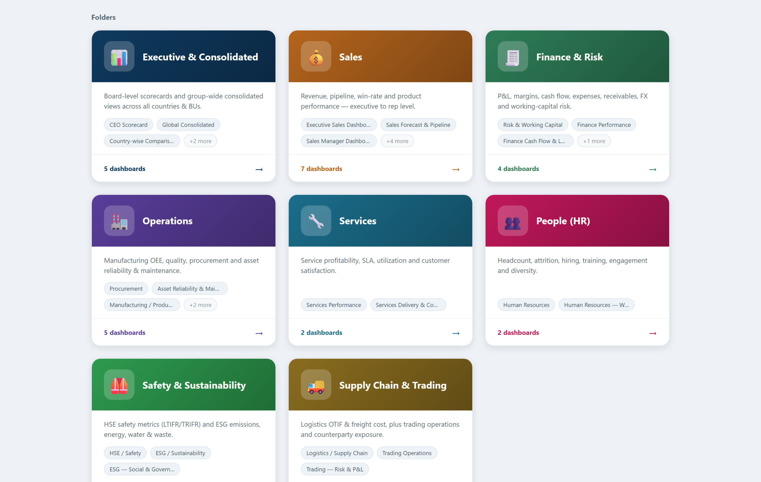
The second addition solves discovery. A folder app presents the dashboard estate as a set of coloured folder cards, one per function. Examples include Executive, Sales, Finance, and Operations. Opening a folder shows each dashboard as a card with a live preview thumbnail, its tags, and a chart count. Clicking a card opens a full preview with a jump-through to the real dashboard. A search box filters across every folder by title or tag.

collaboration_folders

The important design decision: folders generate live from the dashboard titles and tags already in Superset. The library maintains itself. Publish a new dashboard, and it appears in the right folder immediately, complete with its preview and tags. It’s instantly searchable too. No curator required.

3. Tags, RBAC, and Row-Level Security as the Governance Layer

Collaboration without governance becomes noise. The third layer is configuration, not code. A tag taxonomy, organised by department and by audience, powers both the native list filters and the folder app. Roles separate admins, editors, and viewers. Row-level security lets a country manager see their country and a business-unit head see their unit. Single Sign-On ties all of it to the corporate identity provider. Together, these controls make the collaborative layer trustworthy: every comment is attributable, and nobody annotates data they should not see.

How Andolasoft Builds Apache Superset Collaboration Features, Upgrade-Safely

The naive way to add features to Superset is to fork it and edit the source. That works until the next Superset release, at which point every upgrade becomes a merge conflict. Our implementations follow a stricter rule: never patch core.

  • Extensions, not forks: Flask blueprints deliver the comment, annotation, and folder apps alongside Superset. They use its session, authentication, and metadata, but touch none of its source files.
  • Your data, your database: pins, drawings, and folder definitions live in your PostgreSQL database. The team versions and backs them up with everything else.
  • Upgrade-safe by construction: we modify nothing in the core. A Superset version upgrade becomes a container-image bump plus a regression pass, not a re-implementation.
  • Security inherited, not duplicated: the apps inherit Superset’s login, so SSO, roles, and row-level security apply automatically.

What Changes for the Team

  • Reviews happen in context: feedback lands on the exact chart, with an author and a timestamp. It replaces the old screenshot thread.
  • Meetings get shorter: pre-meeting comments mean the meeting starts at the decision, not at the description of the problem.
  • Nothing falls through the cracks: comments carry a status. The team either resolves each query or leaves it visibly open.
  • The library invites browsing: non-technical users navigate a folder library with previews and search instead of a flat list. Adoption follows.

Frequently Asked Questions

Can You Add Apache Superset Collaboration Features Like Comments?

Not natively. In practice, though, a lightweight companion app can add Apache Superset collaboration features to any dashboard. These include pinned comments and visual annotations. It runs on Superset’s own login and SSO, and stores everything in your own database.

Does Superset have folders for dashboards?

No. Tags provide folder-like filtering on the dashboard list. A custom folder app can add full card-based navigation, with live previews, tags, and search. It generates automatically from the dashboards you already have.

Will Apache Superset Collaboration Features Break on Upgrade?

Not if you build them as extensions rather than source patches. Flask-blueprint apps that sit alongside an unmodified Superset core survive version upgrades with a simple regression pass.

Do reviewers need a Superset licence or training?

Superset is open source, so there are no licences at all. Reviewers need only a corporate login and a URL. Commenting and annotating require no chart-building knowledge.

Build It With Andolasoft

Andolasoft designs and deploys governed, board-ready analytics platforms on Apache Superset for manufacturing and industrial companies. See our detailed Superset dashboard templates for manufacturing KPIs for an example. Our BI practice covers the full lifecycle: KPI modelling to global standards (ISO 22400, SCOR, GRI) and data modelling with conformed dimensions. It also includes department dashboards with direction-aware RAG scorecards, row-level security, and Single Sign-On. Folder navigation and the Apache Superset collaboration features covered above round out the platform. Because Superset is open source, the entire platform runs without per-seat licence fees. The investment goes into your KPIs, not licences.

If your leadership team is still waiting for month-end spreadsheets, talk to us. We will stand up a working demo on a representative dataset and walk your stakeholders through it. Then we’ll give you a clear, fixed-scope plan to production.

Apache Superset Dashboard Templates for Manufacturing KPIs

Every manufacturing BI programme faces the same opening question: where do we start? Starting from a blank canvas means months of workshops before anyone sees a chart, and the first drafts inevitably reflect whoever shouted loudest rather than what the industry has already standardised. Starting from proven templates inverts the problem. The right KPIs, layouts, RAG thresholds and filters arrive on day one, and the workshops become a review exercise: confirm, adjust, connect to your data.

This article walks through a complete template library for Apache Superset that we use as the starting point for manufacturing clients: eight functional folders, roughly thirty dashboards, every KPI aligned to a recognised standard such as ISO 22400 for plant performance, SCOR for supply chain, ISO 9001 for quality, and GRI for sustainability reporting.

Why Start From a Template Library

  • Faster time to value: a working dashboard in days, a full suite in weeks. The slow part of BI is agreeing on definitions, and templates arrive with defensible, standards-based definitions already written.
  • Best practice baked in: each template encodes what world-class reporting looks like for its function, so you inherit the collective practice of an industry rather than reinventing it.
  • Consistent design language: every template opens with a KPI band, then gauges, then trend and breakdown analysis, then a scorecard table. Users learn the grammar once and can read any dashboard in the suite.
  • Standard filters: the same Date, Country, Business Unit, and Department filters appear everywhere, so any two views reconcile and cross-functional questions get answered without new extracts.
  • Targets included: RAG thresholds ship with sensible industry defaults (OEE green at 75 percent and above, scrap red above 3.5 percent, and so on) and are adjusted to your targets during onboarding.

Apache Superset Dashboard Templates

The Template Library at a Glance

Folder / Template Set Included Dashboards Headline KPIs
Executive & Consolidated CEO scorecard, global consolidated, country comparison, business-unit comparison Revenue, EBITDA, cash, OEE, LTIFR, carbon intensity
Sales Executive, manager, rep, product, forecast & pipeline, win/loss & velocity, customer & account Win rate, weighted pipeline, coverage, NRR, book-to-bill
Finance & Risk Finance performance, expense analysis, cash flow & leverage, risk & working capital Margins, DSO, free cash flow, quick ratio, AR aging
Operations Production (OEE), cost & flow, quality, procurement, asset reliability & maintenance OEE, unit cost, six losses, CAPA, PM compliance
Services Services performance, delivery & contracts SLA, CSAT, utilization, realization, renewal
People (HR) Human resources, workforce cost & talent Attrition, eNPS, revenue per employee, diversity
Safety & Sustainability HSE/safety, ESG environmental, ESG social & governance LTIFR, TRIFR, Scope 1-3, ISO 45001 / 14001
Supply Chain & Trading Logistics, trading operations, trading risk & P&L OTIF, freight per tonne, mark-to-market, VaR

Inside the Operations Templates

Production / OEE Template (ISO 22400)

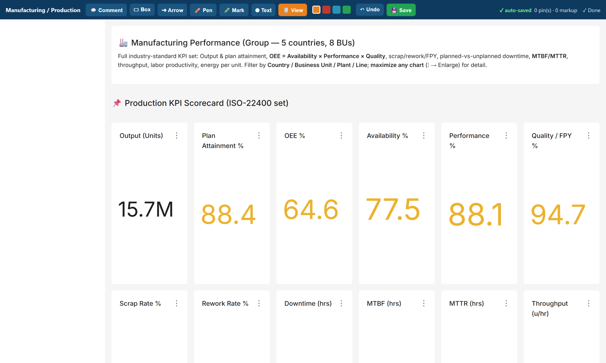
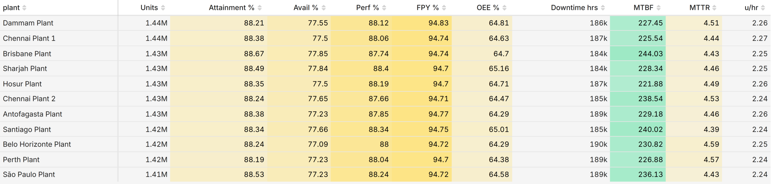
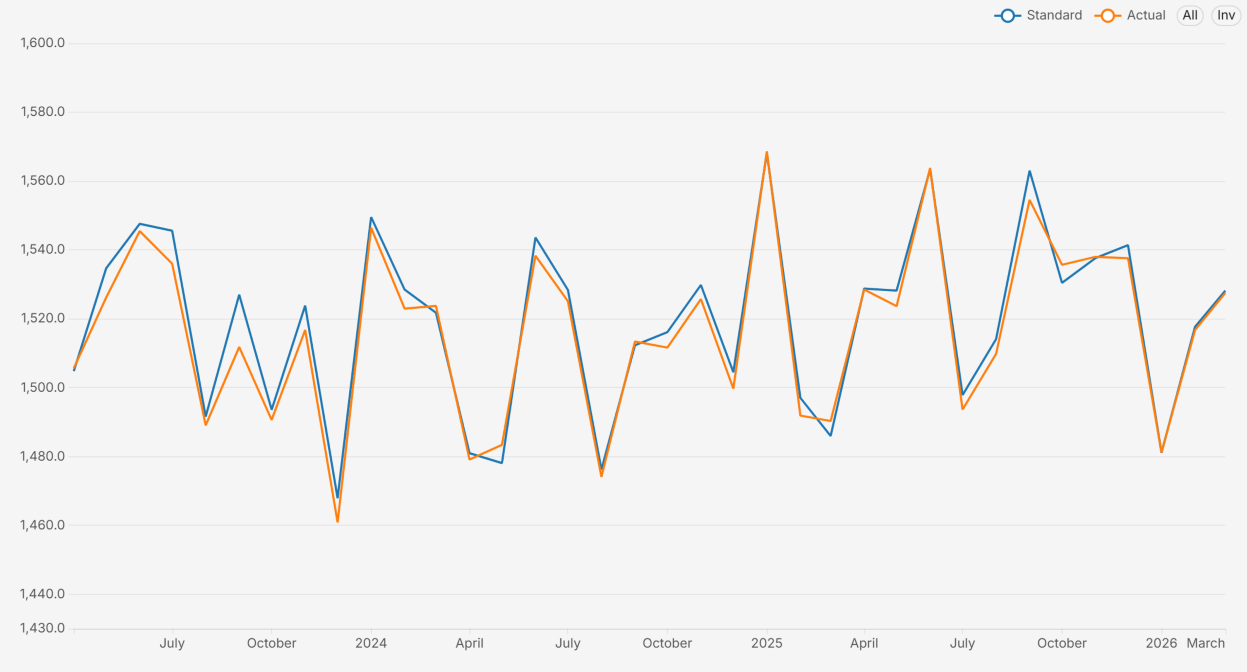
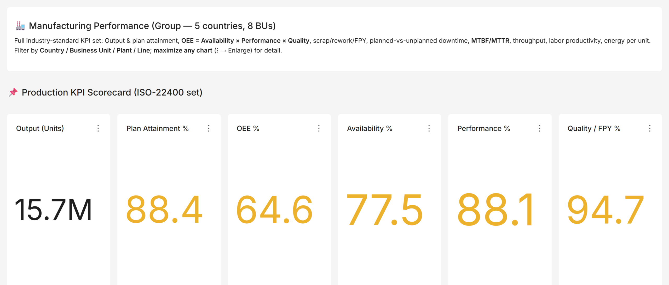
The anchor template. A twelve-tile KPI band covers output, plan attainment, OEE with its availability, performance and quality components, scrap and rework rates, downtime hours, MTBF, MTTR, and throughput. Below it: output versus plan trend, OEE decomposition by plant, planned-versus-unplanned downtime with a Pareto by reason, and plant and line scorecard tables with direction-aware RAG. This is the dashboard a plant head opens every morning. Apache Superset Dashboard Templates

Cost & Flow Template (Lean / TPM)

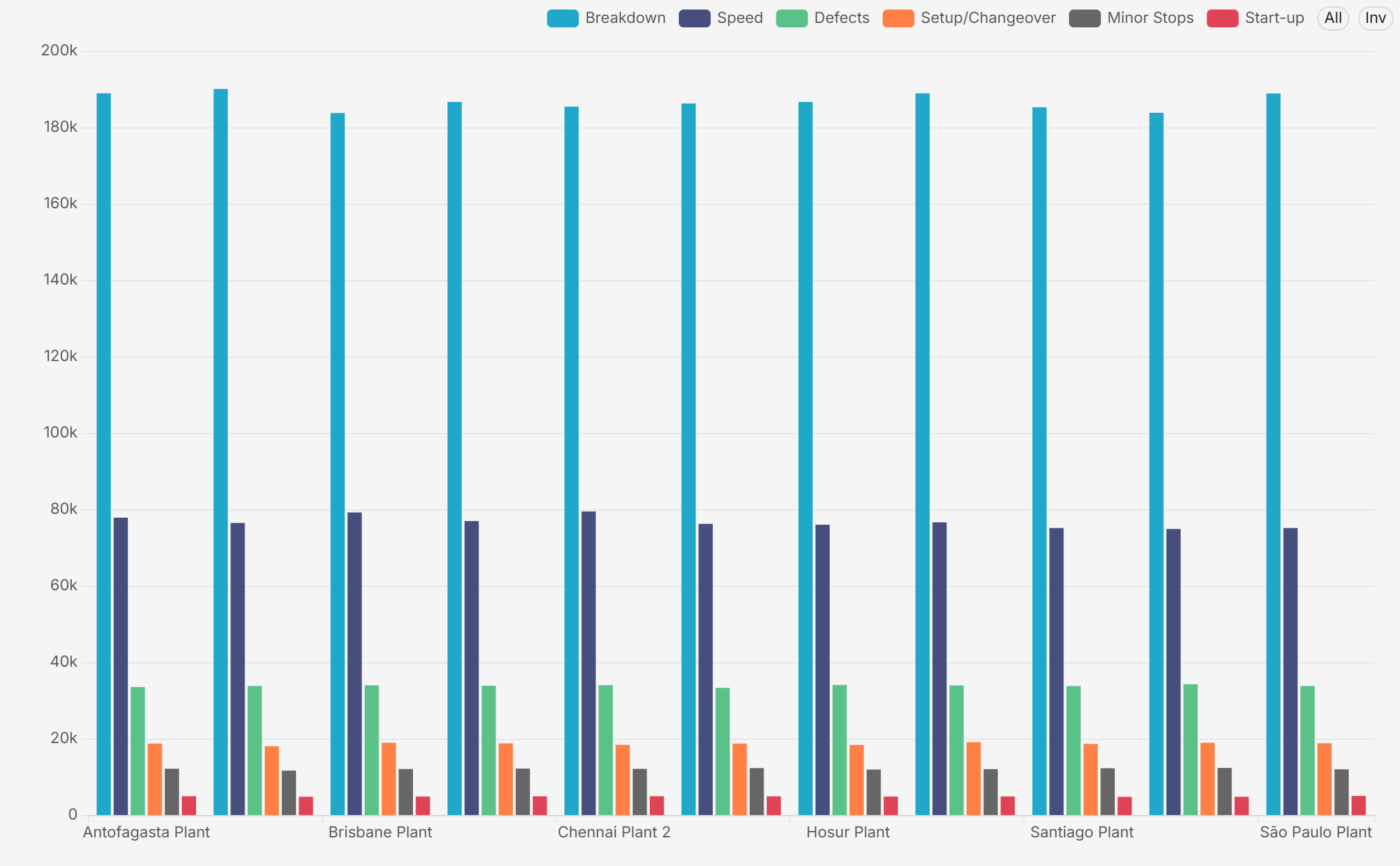
OEE tells you how much you lost; cost and flow tell you what it cost and where the flow breaks. This template adds unit cost of production against standard cost with variance percentage, a stacked cost breakdown (material, labour, energy, overhead, cost of poor quality), the classic Six Big Losses by plant, cycle time against takt time, capacity utilization, work-in-progress, and on-time delivery. Together, the two templates turn a plant-efficiency board into a genuine operations board. Apache Superset Dashboard Templates

Quality, Procurement and Maintenance Templates

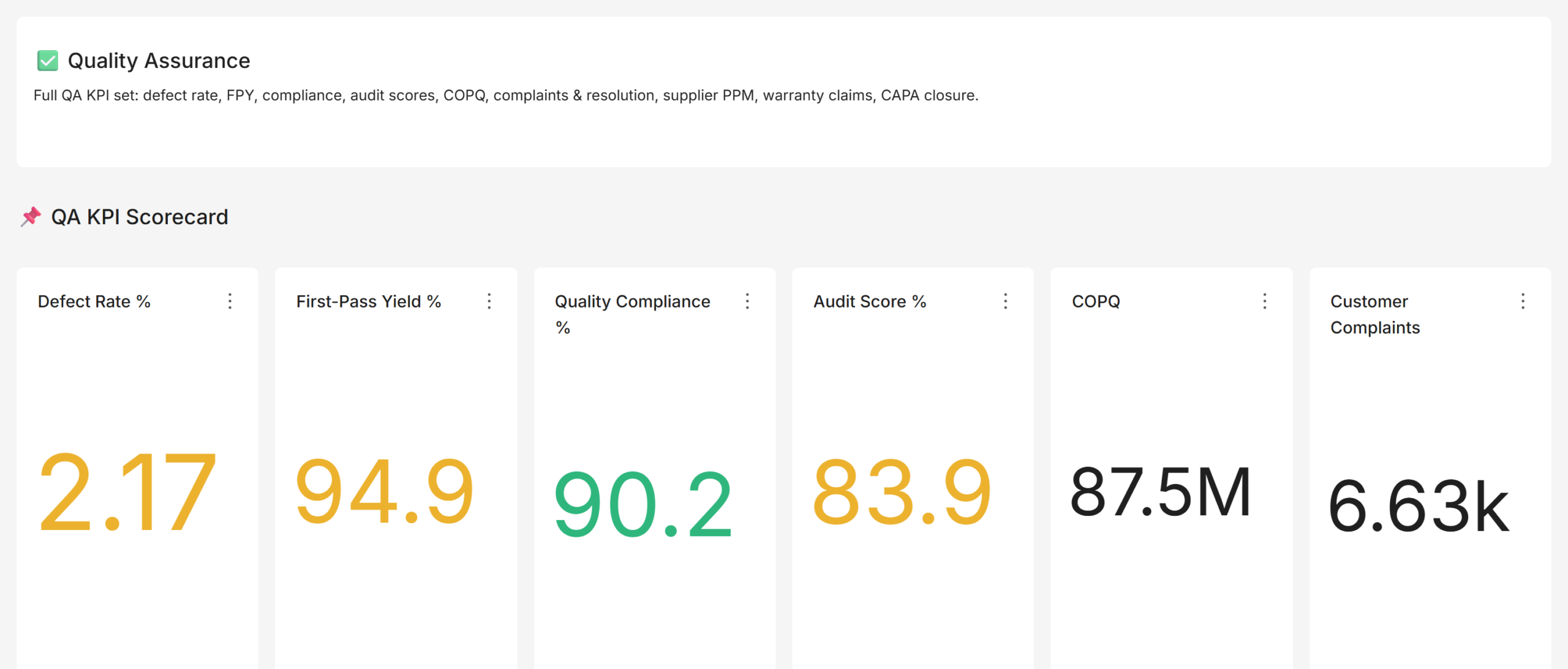
The quality template tracks defect rate, first-pass and rolled throughput yield, CAPA closure, audit scores, supplier defect PPM, and the cost of poor quality. The procurement template covers savings, vendor on-time and quality performance, emergency purchase share, spend under contract, and material availability. The maintenance template extends MTBF and MTTR with preventive-maintenance compliance, backlog, breakdown events, and the planned-versus-reactive ratio, the leading indicators that predict next quarter’s downtime.

Beyond Operations: Sales, Finance, and the Board-Level Domains

Manufacturing BI programmes often stop at the plant gate, which is a mistake: the same disciplines apply to the commercial and corporate functions, and the board reads them all on one page.

The sales templates layer the commercial view the way mature sales organisations do: an executive revenue view, a manager view with leaderboards and pipeline funnels, a rep view for personal performance, and dedicated dashboards for forecast and pipeline (weighted pipeline, coverage against quota, commit and best-case categories), win/loss and velocity (stage conversion, loss reasons, sales cycle), and customer and account health (net revenue retention, churn, backlog and book-to-bill, the KPI pair every industrial board asks about).

The finance templates go beyond the profit-and-loss basics into the balance-sheet strength a multinational needs: a cash flow and leverage view (operating, investing and financing cash flow, free cash flow, quick ratio, debt-to-equity, interest coverage) and a risk and working capital view (receivables aging, currency exposure and hedging, inventory days of supply, supplier concentration). The safety and sustainability templates complete the board pack with LTIFR and TRIFR, the incident pyramid, Scope 1 to 3 emissions, energy and water intensity, and certification coverage, the domains that regulators and lenders now expect as first-class reporting.

The Executive Layer

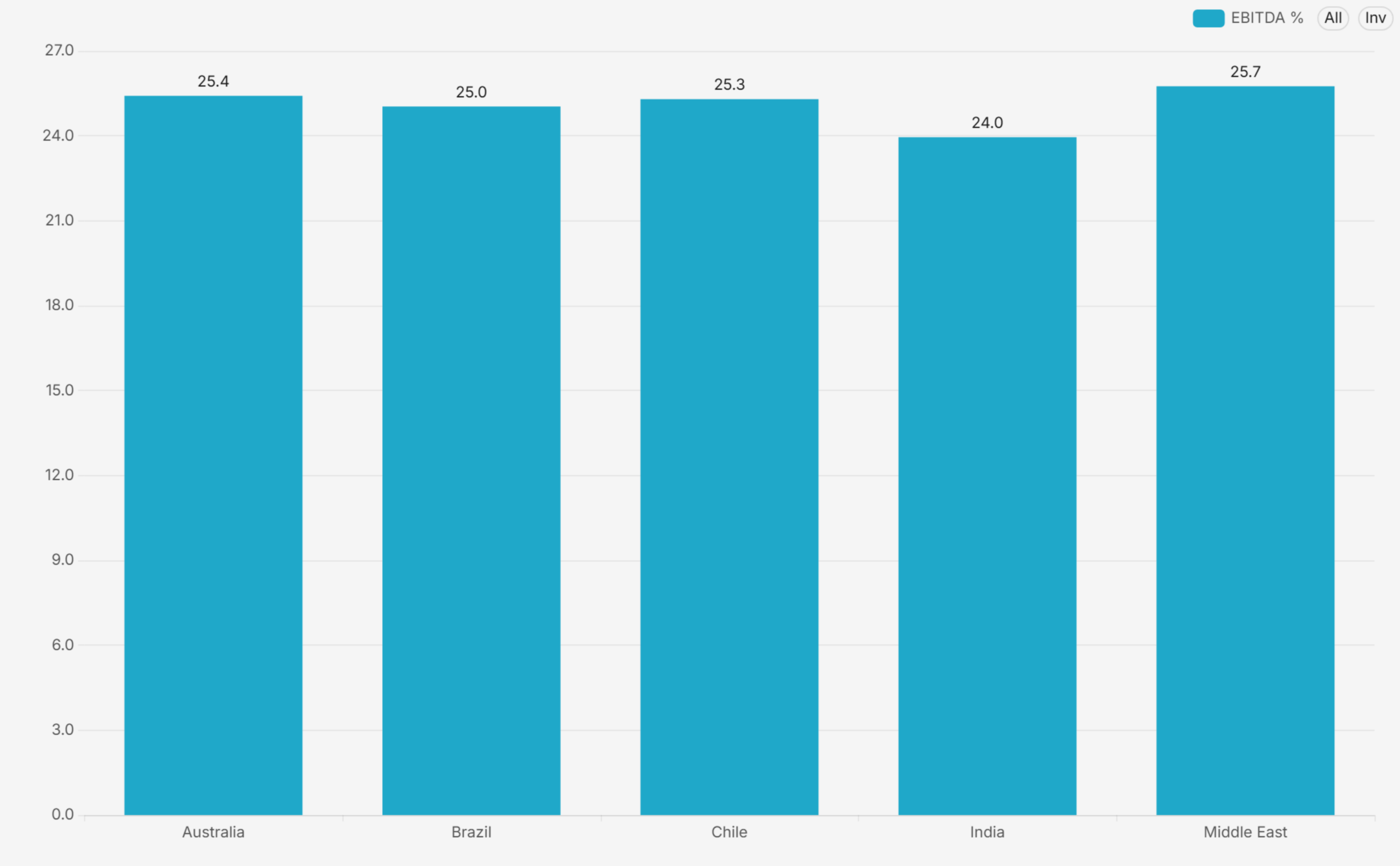
The executive templates roll one headline KPI per function onto a single page with RAG status, then provide consolidated, country-comparison, and business-unit-comparison views built on the same definitions. Because every template shares conformed dimensions, the group view and the plant view cannot disagree, and a board question about any tile drills straight into the owning department’s template without changing tools or definitions. Apache Superset Dashboard Templates

Common Mistakes When Adopting Templates

  • Skipping the definition review: copying a template without confirming the KPI formula with the owning function. The template is a starting position, not a decree; a fifteen-minute review per KPI buys lasting trust in the numbers.
  • Ignoring data grain: loading data at the wrong grain. If the template expects monthly plant-line data and the source provides only monthly plant totals, drill-downs silently mislead. Match the grain before go-live.
  • Not pruning: keeping every template even where a function does not exist. An empty dashboard erodes confidence in the full suite; prune what does not apply.
  • Frozen thresholds: treating RAG defaults as final. Industry defaults make the suite readable on day one, but each business sets its own ambition; recalibrate thresholds at the first quarterly review.

How to Customise the Templates to Your Business

  • Point at your data: connect the certified datasets to your ERP, MES, QMS, CMMS, and HR sources. The templates are source-agnostic; only the dataset layer changes.
  • Confirm definitions: review each KPI formula with the owning function and set your targets and RAG thresholds. This usually takes one workshop per department.
  • Secure: apply row-level security so each country and business unit sees its own slice, and connect Single Sign-On to your identity provider.
  • Brand and prune: apply your logo and colour theme, organise the folders to match your operating model, and retire any template that does not apply.

A template-based rollout typically reaches a governed, adopted suite in six to eight weeks, roughly half the timeline of a from-scratch build, with materially lower definition risk.

Frequently Asked Questions

Are dashboard templates really faster than building from scratch?

Yes, primarily because the slow part of BI is not chart-building but definition-settling. Templates arrive with standards-based KPI definitions that functions can review and adjust, which converts months of debate into days of confirmation.

Can the templates work with our ERP and MES?

Yes. The templates sit on a dataset layer that is mapped to your sources during onboarding. Any system that can land data in a SQL database, which includes every mainstream ERP, MES, QMS, and CMMS, can feed them.

Do the templates include targets and RAG thresholds?

They ship with industry-default thresholds for every KPI, which are then tuned to your targets during the definition workshops. The RAG logic is direction-aware, so lower-is-better metrics colour correctly.

Build It With Andolasoft

Andolasoft designs and deploys governed, board-ready analytics platforms on Apache Superset for manufacturing and industrial companies. Our BI practice covers the full lifecycle: KPI modelling to global standards (ISO 22400, SCOR, GRI), data modelling with conformed dimensions, department and business-unit dashboards with direction-aware RAG scorecards, row-level security, Single Sign-On, folder navigation and in-dashboard collaboration. Because Superset is open source, the entire platform runs without per-seat licence fees, so the investment goes into your KPIs, not licences.

If your leadership team is still waiting for month-end spreadsheets, talk to us. We will stand up a working demo on a representative dataset, walk your stakeholders through it, and give you a clear, fixed-scope plan to production.

Apache Superset for Manufacturing Dashboards & KPIs: Complete Guide

Walk into the Monday review meeting of a typical mid-size manufacturer. You will see the same scene every time. A finance analyst presents a deck assembled on Friday. A plant head disputes the OEE number because his own spreadsheet tells a different story. Meanwhile, a CEO asks a question that nobody can answer until someone re-runs an export from the ERP. In short, the company is not short of data. Instead, it is short of manufacturing dashboards that give everyone a single, trusted, always-current view of that data.

That view is what an executive dashboard provides. In this guide, we explain what executive reports and KPIs actually mean in a manufacturing context. We also show how department and business-unit manufacturing dashboards fit underneath the executive layer. In addition, we explain why this layered approach matters for a multi-plant or multinational operation. Finally, we describe how Andolasoft addresses the most common reporting pain points using Apache Superset, an enterprise-grade open-source analytics platform. Everything shown here comes from a real analytics suite we built for industrial clients. It includes around 30 dashboards across eight functional areas, with every KPI aligned to a recognised global standard.

What Are Executive Reports and KPIs in Manufacturing Dashboards?

An executive report is a deliberately compressed summary of business performance. An operational report might list every work order in a plant. However, an executive report answers one question per function: are we on track? This is exactly why manufacturing dashboards trade detail for speed of comprehension. After all, a leadership team reviewing eight functions in a thirty-minute meeting cannot read eight hundred rows.

A KPI, or Key Performance Indicator, is the unit of that compression. It is a single number, defined once, measured consistently, and compared against an explicit target. Overall Equipment Effectiveness (OEE), gross margin percentage, on-time delivery and lost-time injury frequency rate are all KPIs. Three properties separate a genuine KPI from a vanity metric: it has an owner who is accountable for it, it has a target that defines success, and it drives a decision when it moves. For a deeper look at the metrics that matter most, see our guide to must-have metrics for CEOs and COOs.

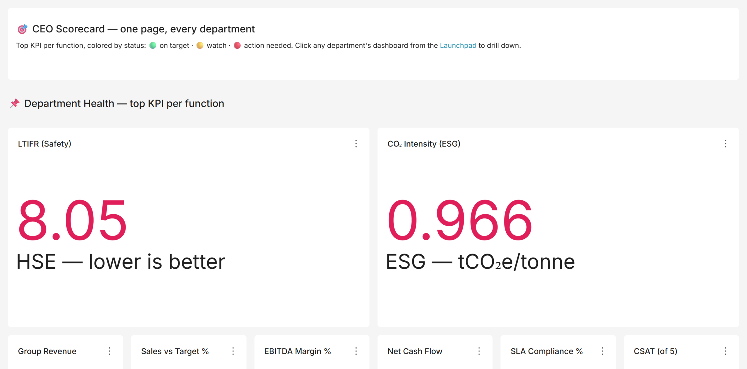
An executive dashboard combines the two ideas. It places one headline KPI per function on a single page, each coloured with a red, amber or green (RAG) status against its target. Green means on target, amber means watch, red means act. A well-built executive dashboard lets a CEO scan the health of the entire enterprise in under a minute and know exactly where to drill in. This kind of layered visibility is exactly what powers real-time decision-making for enterprises.

kpi_executive

For a manufacturing group, the executive scorecard typically carries: revenue and EBITDA margin, free cash flow, sales versus target, OEE and plan attainment, quality (defect rate or first-pass yield), on-time delivery, procurement savings, safety (LTIFR, lost-time injuries per million hours worked), carbon intensity and workforce attrition. That specific mix matters. Boards of industrial companies are now expected to open with safety, close with cash, and evidence ESG in between; a scorecard that shows only financials is a decade out of date. Building this view typically starts with our data and analytics services.

Department and Business-Unit Manufacturing Dashboards and KPIs

The executive number is a headline. The department dashboard is the story behind it. When the OEE tile turns amber on the CEO scorecard, someone has to find out why, and that means a production dashboard that decomposes OEE by plant, line, and shift, shows the downtime Pareto, and separates planned from unplanned stoppages. A mature BI suite is therefore layered: an executive layer for direction, a department layer for diagnosis, and consistent filters connecting the two.

KPIs by Department: What Good Looks Like

Each function has a settled, internationally recognised KPI set. The table below summarises the department dashboards we implement for manufacturing clients and the standards they align to.

Department  Representative KPIs  Standard / Framework 
Production / Manufacturing  OEE, availability, performance, quality, plan attainment, throughput, MTBF, MTTR  ISO 22400 
Cost & Efficiency  Unit cost of production, cost variance vs standard, six big losses, COPQ, cycle vs takt time, capacity utilization  Lean / TPM 
Quality  Defect rate, first-pass yield, rolled throughput yield, CAPA closure, audit score, supplier PPM, cost of poor quality  ISO 9001 
Procurement  Savings realised, vendor on time and quality, emergency PO share, spend under contract, material availability  Category management 
Maintenance  PM compliance, maintenance backlog, MTBF, MTTR, planned vs reactive ratio, maintenance cost  Reliability / TPM 
Finance  Revenue vs budget, gross / EBITDA / net margin, DSO, cash conversion cycle, free cash flow, ROCE, leverage  Standard finance 
Sales  Bookings and order intake, win rate, weighted pipeline, pipeline coverage, net revenue retention, book-to-bill  Enterprise sales 
Human Resources  Attrition, absenteeism, time to hire, eNPS, revenue per employee, labour cost %, diversity  Human capital 
Safety & ESG  LTIFR, TRIFR, near misses, incident close-out, Scope 1-3 emissions, energy and water intensity, ISO 45001 / 14001 coverage  GRI / board pack 

kpi_manufacturing

OEE: The Anchor KPI of Any Plant Dashboard

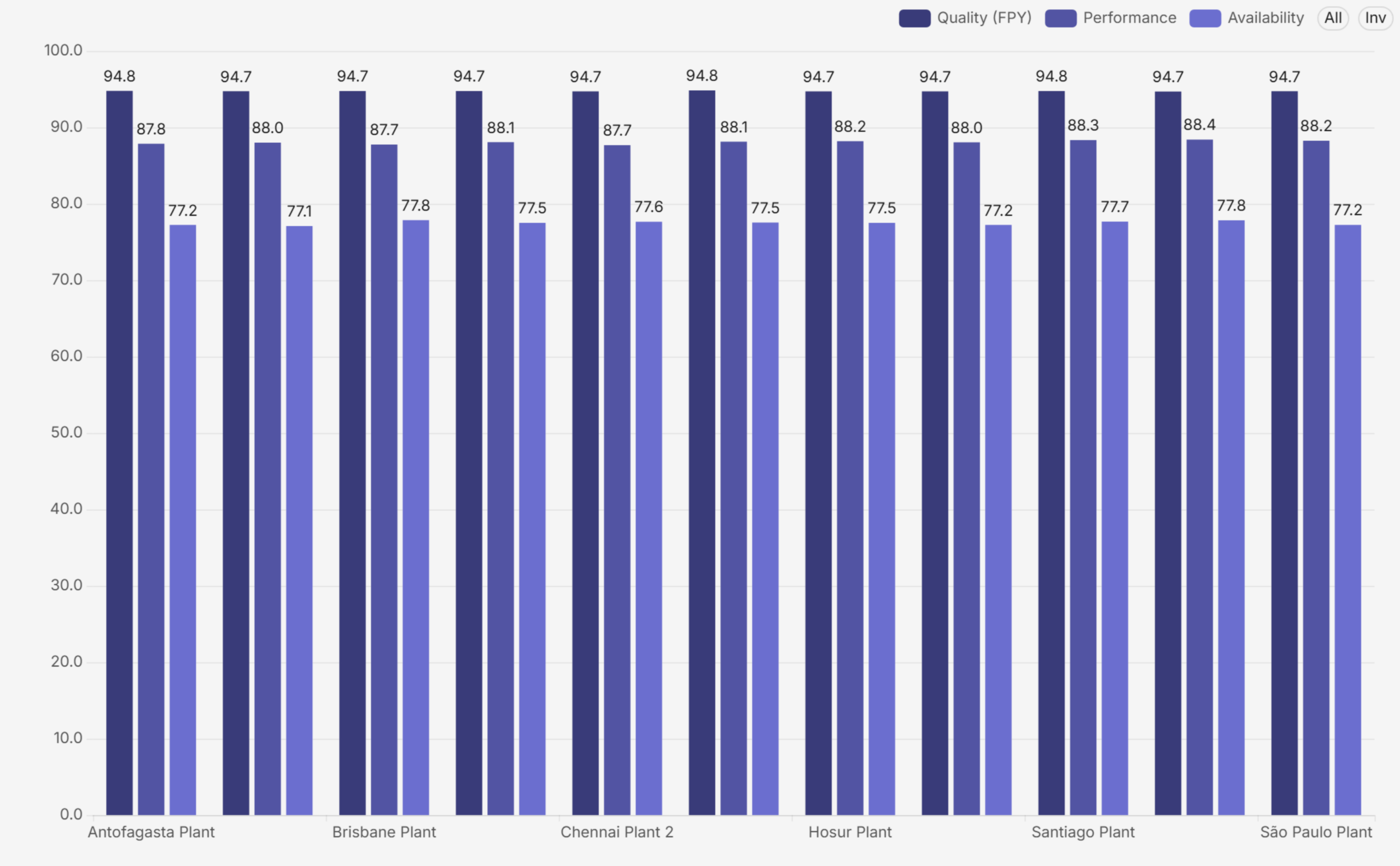
OEE deserves special attention because it is the one number that summarises how well a plant converts available time into good product. The formula is simple: OEE = Availability x Performance x Quality. Availability captures downtime losses, Performance captures speed losses, and Quality captures defect losses. World-class discrete manufacturing runs around 85 percent; most plants that have never measured systematically discover they are between 45 and 60 percent, which is precisely why measuring it is so valuable.

A good production dashboard never shows OEE as a single tile alone. It decomposes the number by plant and by component, so a low score is immediately attributable to availability, performance or quality, and then drills into the loss behind that component.

oee_components

Business-Unit, Country, and Consolidated Views

Multi-plant and multinational manufacturers add a third dimension. The same KPIs must roll up into a consolidated group view and slice cleanly by country and business unit. This is harder than it sounds. For example, each region might calculate attainment differently, or one plant might report scrap in units while another reports it in value. In that case, the consolidated number becomes fiction. The fix, therefore, is architectural: a single data model with conformed Country, Business Unit, Department, and Time dimensions. As a result, every one of these manufacturing dashboards filters and aggregates on exactly the same definitions. This holds from the CEO scorecard down to a line-level view. Done properly, a group CFO can compare one country’s plant with another’s on a like-for-like basis. The numbers then reconcile all the way down. Getting this right depends on solid data governance practices for reliable BI insights.

Why You Need Manufacturing Dashboards: The Business Case

The case for manufacturing dashboards is not aesthetic. It is operational and financial:

  • Single source of truth: one governed set of numbers replaces conflicting spreadsheets. When finance, operations and sales pull from the same semantic layer, the Monday meeting stops being an argument about whose figure is right.
  • Faster decisions: a RAG scorecard directs attention in seconds. Leaders act on exceptions instead of reading every chart, which shortens the review cycle and pushes decisions closer to the event.
  • Accountability: every KPI has an owner, a target, and a visible status. Performance conversations become specific: this number, this gap, this action.
  • Root-cause speed: a group KPI drills down to the plant, line, shift, vendor, or salesperson behind it, so diagnosis takes minutes rather than a week of data requests.
  • Consistency: the same Date, Country, Business Unit, and Department filters exist on every dashboard, so any two views can be compared without translation.
  • Governed access: row-level security means a country manager sees their country, a BU head sees their unit, and the board sees everything, all from the same dashboards.

rag_scorecard

One design detail is worth calling out: RAG must be direction-aware. For margin, higher is better; for attrition or unit-cost variance, lower is better. Dashboards that colour every high number green quietly train leaders to misread the page. In our implementations, every threshold is set per KPI, with the direction of good explicitly defined, so green always means on target and red always means action needed, whatever the metric. These are exactly the kind of benefits of a self-service BI platform that make adoption stick.

Common Pain Points in Manufacturing Reporting

Across industrial clients, we see the same six failure modes again and again:

  • Fragmented systems: Production data lives in the MES, finance in the ERP, quality in a QMS, maintenance in a CMMS, safety in spreadsheets. Nobody sees the whole picture, and cross-functional questions (what did that downtime cost?) go unanswered.
  • Stale, manual reporting: Reports are assembled by hand every month. By the time leadership sees a problem, it is four to six weeks old, and the window to act has closed.
  • Inconsistent definitions: The same KPI is calculated three different ways in three departments. Meetings dissolve into reconciliation instead of decisions.
  • Missing board-level domains: Safety, ESG and sustainability reporting is absent or manual, even though boards, lenders and regulators now expect it as a first-class domain.
  • No multi-entity view: There is no way to slice performance by country or business unit without a fresh extract, and no security model controlling who sees what.
  • No collaboration: Reports are read-only artefacts. Reviewers annotate PDFs or trade screenshots over email, and the discussion is separated from the data.

How Andolasoft Builds Manufacturing Dashboards with Apache Superset

Apache Superset is a mature, open-source BI platform used by thousands of engineering-led organisations. It connects to virtually any SQL database and renders more than forty chart types. In addition, it supports native cross-dashboard filters, conditional formatting, role-based access, and row-level security. Because it is open source, it carries no per-seat licence cost. These are among the must-have enterprise BI features we evaluate for every client. Andolasoft’s Superset BI services build on that foundation and turn it into governed manufacturing dashboards, with a delivery method refined across manufacturing engagements:

  • Define KPIs once, to a standard: we run KPI workshops per function and write down the formula, grain, target and RAG threshold for every measure before building anything. This is the step that ends definition wars.
  • Model a governed data layer: staging, conformed, and semantic layers on PostgreSQL, with shared Country, Business Unit, Department, and Time dimensions so every view reconciles. We often pair this with the right ETL tools to streamline the BI pipeline.
  • Build layered, role-based dashboards: an executive scorecard, consolidated and per-country and per-BU comparison views, and detailed dashboards for every department, each opening with a KPI band, then gauges, then analysis, then a scorecard table. This is how we deliver scalable and customizable data analytics across every plant.
  • Direction-aware RAG everywhere: thresholds with the direction of good defined per KPI, so the colour language is trustworthy across the entire suite.
  • Secure by design: row-level security per country and business unit, Single Sign-On against the corporate identity provider, and role-based access for admins, editors, and viewers. See our security best practices for Superset deployments for more detail.
  • Adoption features Superset lacks natively: a folder-style navigation app so business users browse dashboards like a library, and an in-dashboard comment and annotation app so reviews happen in context. Both are delivered as clean extensions that survive Superset upgrades.

six_losses

The outcome, in the suites we deliver, is roughly thirty dashboards across eight functional folders. These cover executive, sales, finance and risk, operations, services, people, safety and sustainability, and supply chain. As a result, every number traces to a governed dataset. Likewise, every one of these manufacturing dashboards responds to the same filters, and every KPI carries a defensible definition and a visible status. This mirrors the outcomes in our case study on tailored Superset dashboards for SaaS teams.

Implementation Roadmap: From Spreadsheets to a Governed Suite

A realistic enterprise rollout runs about sixteen weeks:

  • Weeks 1-2, Discovery: KPI workshops, source-system assessment, dashboard inventory, and wireframes.
  • Weeks 2-6, Data foundation: data model, ETL pipelines, certified datasets, and row-level security.
  • Weeks 5-10, Core dashboards: executive, finance and sales dashboards, first UAT cycle.
  • Weeks 8-13, Operational dashboards: operations, quality, HR, safety, ESG, and supply-chain dashboards.
  • Weeks 10-14, Platform features: SSO, branding, folder navigation, collaboration app.
  • Weeks 14-16, Launch: user acceptance, training, go-live, and hypercare.

The most common mistake is inverting the order. Teams build manufacturing dashboards before the KPI definitions and the data model are settled. That path produces beautiful charts on disputed numbers, and adoption dies within a quarter. Definitions first, model second, dashboards third. We break down other common BI implementation mistakes in a dedicated guide.

Frequently Asked Questions

What is OEE and why does it matter?

OEE (Overall Equipment Effectiveness) is Availability x Performance x Quality. It is the standard single measure of how effectively equipment converts available time into a good product, and the anchor KPI on any manufacturing dashboard. World-class is around 85 percent; unmeasured plants typically discover they run between 45 and 60 percent.

Which KPIs should a manufacturing CEO track?

One headline KPI per function: revenue and EBITDA margin, free cash flow, sales versus target, OEE and plan attainment, defect rate, on-time delivery, procurement savings, LTIFR for safety, carbon intensity for ESG, and attrition for people, each with a RAG status against an explicit target.

What is the difference between an executive dashboard and a department-level manufacturing dashboard?

An executive dashboard compresses each function into one number for direction-setting. A department dashboard expands one function into its full KPI set for diagnosis. They share definitions and filters so a leader can drill from the headline to the root cause without changing tools.

Is Apache Superset good for manufacturing analytics?

Yes. Superset connects to any SQL database, supports the chart types manufacturing needs (KPI tiles, gauges, Pareto, treemaps, scorecard tables), offers conditional formatting for RAG, native filters, role-based access and row-level security, and is open source, which removes per-seat BI licence cost at enterprise scale. Many of our manufacturing clients reach us while running Power BI migration services or Tableau migration services in parallel, before consolidating everything onto Superset.

How long does a manufacturing BI implementation take?

A focused departmental rollout takes four to six weeks. A full enterprise suite, with a governed data layer, thirty-odd dashboards, SSO, row-level security, and collaboration features, typically takes around sixteen weeks with a phased, milestone-based plan.

Build It With Andolasoft

Andolasoft designs and deploys governed, board-ready analytics platforms on Apache Superset for manufacturing and industrial companies. Our BI practice covers the full lifecycle. First, we handle KPI modelling to global standards such as ISO 22400, SCOR, and GRI. Next, we build data models with conformed dimensions, plus department and business-unit manufacturing dashboards with direction-aware RAG scorecards. We then add row-level security, Single Sign-On, folder navigation, and in-dashboard collaboration. Because Superset is open source, the entire platform runs without per-seat licence fees. As a result, the investment goes into your KPIs, not licences. If you want the fundamentals first, start with why Apache Superset is the future of open-source BI.

If your leadership team is still waiting for month-end spreadsheets instead of real-time manufacturing dashboards, talk to us. We will stand up a working demo on a representative dataset and walk your stakeholders through it. Then, we will give you a clear, fixed-scope plan to production.

How To Slash Your BI Costs By 80% With Proven Open Source AI

The BI software market is dominated by a handful of legacy vendors — Tableau, Microsoft Power BI, Qlik, and SAP BusinessObjects — whose licensing models were designed for an era before cloud-native, AI-first alternatives existed. Today, these tools impose a heavy financial burden on growing businesses.

Consider the numbers. Tableau charges $70–$115 per user per month, which means a team of 50 analysts costs $42,000–$69,000 annually — just for the license. Add cloud hosting, professional services, and annual upgrades, and your total cost of ownership easily exceeds $200,000 per year. Qlik Sense follows a similar pattern, with enterprise contracts often exceeding $150,000 annually.

Beyond licensing, hidden costs compound the damage:

  • Vendor lock-in: Your data pipelines, dashboards, and reports are trapped inside proprietary formats. Switching costs are enormous.
  • Per-seat pricing traps: Every new analyst, manager, or stakeholder who needs access adds cost. Collaboration becomes expensive.
  • Slow upgrade cycles: New AI and ML features arrive on the vendor’s timeline, not yours. Competitive advantage erodes.
  • Professional services fees: Implementation, customization, and support add 30–50% to your annual spend.

The result? Many SMEs and project teams simply can’t afford the BI capabilities they need to compete. That’s where open source BI powered by AI changes everything.

What Are Open Source BI Tools and Why They Are Winning in 2026

Open source BI tools are analytics platforms where the source code is publicly available, community-maintained, and free to use. You pay only for hosting, support, and implementation — not for a per-seat license. This fundamentally flips the economics of business intelligence.

In 2026, open source BI is no longer a compromise. It is the preferred choice for forward-thinking organizations. According to Gartner’s 2025 Data & Analytics Survey, over 60% of mid-sized enterprises plan to adopt open source analytics platforms by 2027, driven by cost savings and AI integration capabilities.

The most powerful open source BI platforms today include:

  • Apache Superset — A modern, enterprise-grade BI platform with 50,000+ GitHub stars and native AI integrations.
  • Metabase — A beginner-friendly self-service analytics tool ideal for SME teams.
  • Grafana — Best-in-class for real-time monitoring dashboards and operational analytics.
  • Redash — A lightweight SQL-based reporting tool for data teams.
  • Apache Kylin — OLAP-on-Hadoop engine designed for petabyte-scale analytical queries.

Our expert team at Andolasoft helps businesses implement and scale these platforms as part of our Superset BI Services, combining open source power with enterprise-grade reliability and our AI Framework Services.

The 80% Cost Reduction: How the Math Works

Let’s be specific about the 80% savings figure, because vague claims help no one. Here is a real-world cost comparison for a 50-person analytics team:

Cost Component Tableau (Enterprise) Apache Superset (Open Source)
Annual License $69,000 $0
Cloud Hosting $24,000 $8,400 (managed cloud)
Implementation $35,000 $12,000 (one-time)
Annual Support $18,000 $6,000
Total Year 1 $146,000 $26,400
Savings $119,600 (82% reduction)

Beyond Year 1, savings accelerate further because you eliminate annual license renewals entirely. Over five years, this team saves over $500,000 — capital that can fund product development, sales, or hiring.

This is the power of open source data analytics. It doesn’t just save money — it fundamentally changes what’s financially possible for your business intelligence strategy.

Top 5 Open Source AI BI Tools That Deliver 80% Cost Savings

1. Apache Superset — The Enterprise-Grade Champion

Apache Superset is the most powerful open source BI tool available today. Originally built by Airbnb’s data engineering team and now an Apache Software Foundation top-level project, Superset supports over 40 database connectors, rich visualization libraries, and a no-code chart builder.

Key capabilities include SQL Lab for advanced querying, role-based access control for enterprise security, and seamless integration with Python-based AI/ML pipelines. Andolasoft’s Superset BI implementation services help you deploy, customize, and scale Superset for your specific industry needs. We also offer specialized loan analytics systems and loan monitoring solutions built on Superset for NBFC and BFSI clients.

2. Metabase — Self-Service Analytics for SMEs

Metabase democratizes data access. Its point-and-click interface allows non-technical business users to build reports and dashboards without writing SQL. For SMEs with limited data engineering resources, Metabase delivers extraordinary value at near-zero license cost.

3. Grafana — Real-Time Operational Dashboards

Grafana excels at time-series analytics and real-time monitoring. If your team needs live operational dashboards — tracking server performance, IoT sensor data, or financial transaction flows — Grafana is unmatched. Its plugin ecosystem and alerting capabilities make it a staple for DevOps and IT teams integrating with cloud infrastructure services.

4. Redash — SQL-Powered Reporting for Data Teams

Redash is purpose-built for data analysts who live in SQL. It supports 35+ data sources, collaborative query editing, and schedule-based report delivery. It’s lightweight, fast to deploy, and integrates cleanly with modern data stacks.

5. Apache Kylin — OLAP at Petabyte Scale

For organizations dealing with massive datasets — think large-scale BFSI data platforms or geo-spatial engineering datasets — Apache Kylin provides sub-second query responses on petabyte-scale data through pre-computed OLAP cubes. This is the tool for when speed and scale both matter.

How AI Is Supercharging Open Source BI in 2026

The most exciting development in open source BI is the rapid integration of artificial intelligence. Modern open source platforms now support AI capabilities that were exclusive to enterprise vendors just two years ago. This convergence of AI and open source BI is the defining trend of 2026.

Here’s how AI is transforming open source BI tools:

  • Natural Language Querying (NLQ): Ask your dashboard questions in plain English. AI translates your query into SQL and returns visualized results instantly. No SQL knowledge required.
  • Automated Anomaly Detection: AI monitors your data streams continuously and alerts you to unusual patterns before they become critical business problems.
  • Predictive Analytics: Integrate Python-based ML models directly into your BI dashboards for forward-looking insights, not just historical reporting.
  • AI-Powered Data Prep: Automated data cleaning, deduplication, and transformation reduce the manual effort of data engineering by up to 70%.
  • Smart Dashboard Recommendations: AI analyzes your data schema and usage patterns to suggest the most relevant visualizations for your business goals.

Andolasoft’s Autonomous AI Assistants and Intelligent Automation Services integrate seamlessly with open source BI platforms. We build AI layers on top of Apache Superset that give your team conversational analytics, predictive modeling, and automated reporting — all within the open source cost model.

Our AI Framework Services ensure that the AI models powering your BI platform are production-grade, explainable, and compliant with your industry’s regulatory requirements.

Real-World Use Cases: Open Source BI Delivering Results

NBFC & BFSI: Transforming Loan Portfolio Analytics

A mid-sized Non-Banking Financial Company (NBFC) was spending $180,000 annually on a legacy BI platform to monitor loan performance, NPA ratios, and collection efficiency. By migrating to Apache Superset with Andolasoft’s NBFC data analytics solutions, they reduced their annual BI spend to $28,000 — an 84% cost reduction — while gaining real-time loan monitoring dashboards and AI-powered early warning systems for default risk.

Similarly, our BFSI data analytics clients in the banking sector have used open source BI to build regulatory reporting dashboards, fraud detection visualizations, and customer segment analysis tools at a fraction of the cost of Bloomberg or Cognos platforms.

SME Manufacturing: Operational Intelligence on a Budget

A 200-employee manufacturing SME needed production floor analytics, inventory optimization dashboards, and sales performance reporting. Previously, this required an expensive ERP-bundled BI module. By deploying Metabase and Grafana on their existing cloud infrastructure through Andolasoft’s application modernization services, they built a fully integrated analytics stack for under $15,000 — saving $95,000 compared to their previous vendor quote.

SaaS Startup: Scaling Analytics Without Scaling Costs

A B2B SaaS startup needed product analytics, customer success dashboards, and ARR reporting for their investor board. Using Apache Superset integrated with their existing Python backend — built by Andolasoft’s Python development team — they deployed a full analytics platform in six weeks. Their total analytics infrastructure cost: $8,400 per year. The equivalent Tableau setup would have cost $65,000+.

Step-by-Step: How to Implement Open Source BI and Cut Costs by 80%

Transitioning to open source BI requires a structured approach to ensure you capture the full cost savings without disrupting business operations. Here is the proven implementation framework Andolasoft uses with clients:

Step 1: Audit Your Current BI Spend and Requirements

Document all existing BI tools, licenses, user counts, data sources, and use cases. Identify which reports are business-critical and which are never used. Most organizations discover that 40–60% of their BI license costs cover features nobody uses.

Step 2: Define Your Open Source BI Architecture

Choose your tool stack based on use case. Apache Superset works well as the primary analytics layer. Grafana handles real-time monitoring. Redash serves the SQL-heavy data engineering team. Our digital strategy and transformation team maps your requirements to the right open source stack.

Step 3: Select Your Cloud Infrastructure

Open source BI tools run on any cloud platform — AWS, GCP, Azure, or on-premise. Our cloud infrastructure services help you choose the most cost-effective deployment model and configure auto-scaling to match your usage patterns.

Step 4: Implement with Enterprise Security Standards

Open source doesn’t mean unsecured. Deploy role-based access control (RBAC), single sign-on (SSO), data encryption at rest and in transit, and audit logging from day one. Our enterprise IT security team ensures your open source BI platform meets SOC 2, ISO 27001, and industry-specific compliance requirements.

Step 5: Migrate Data Pipelines and Dashboards

Systematically migrate your most-used dashboards first. Our enterprise integration services team handles connector development, ETL pipeline migration, and data model translation from proprietary formats to open standards.

Step 6: Train Your Team and Drive Adoption

User adoption is the most common failure point in BI migrations. We provide structured training programs, self-service documentation, and hypercare support during the first 90 days. Our enterprise project management framework keeps migrations on schedule and within budget.

Step 7: Add AI Capabilities to Maximize ROI

Once the core platform is stable, layer in AI capabilities — natural language querying, predictive dashboards, and automated anomaly detection. Our Innovation & Product R&D team helps design AI features tailored to your industry’s analytical needs.

Governance, Compliance, and Data Quality in Open Source BI

One concern we hear frequently is: “Will open source BI meet our governance and compliance requirements?” The answer is yes — when implemented correctly. In fact, open source platforms often offer better governance transparency than proprietary tools because you can audit the underlying code.

Our digital governance solutions team implements data cataloging, lineage tracking, quality scorecards, and policy enforcement frameworks within Apache Superset. This gives compliance officers the visibility they need to meet GDPR, CCPA, RBI, and SEBI requirements.

For geo-spatial data analytics needs, our geo-spatial engineering services team integrates location intelligence layers into open source BI dashboards, delivering capabilities that cost $80,000+ in proprietary GIS platforms at a fraction of the price.

Additionally, our software quality assurance practice ensures that every BI dashboard, data pipeline, and AI model is rigorously tested before reaching business users.

Why Andolasoft Is Your Trusted Open Source BI Partner

Andolasoft has been delivering data and analytics solutions for over 15 years. Our team of 200+ engineers, data scientists, and BI specialists has implemented open source BI platforms across BFSI, manufacturing, healthcare, retail, and SaaS sectors. We don’t just deploy software — we build analytics ecosystems that drive measurable business outcomes.

Our Apache Superset BI Services cover the complete lifecycle: strategy, architecture, implementation, customization, AI integration, training, and ongoing managed support. We are an Apache Superset specialized partner with certified engineers and a portfolio of 50+ successful deployments.

We also build complementary solutions using ReactJS for custom dashboard front-ends and Python for data engineering, ML model serving, and API development — giving you a truly integrated, end-to-end analytics stack built on open standards.

Open Source BI vs. Proprietary BI: Head-to-Head Comparison (2026)

Feature Apache Superset (Open Source) Tableau (Proprietary) Power BI (Proprietary)
Annual License Cost (50 users) $0 $42,000–$69,000 $12,000–$60,000
AI/ML Integration Native Python/ML support Einstein AI (extra cost) Copilot (premium tier)
Customization Full source code access Limited APIs Limited
Data Connectors 40+ native connectors 70+ connectors 100+ connectors
Vendor Lock-in None High High (Microsoft ecosystem)
5-Year TCO (50 users) ~$130,000 ~$620,000 ~$380,000

The data speaks clearly. Open source BI tools deliver comparable or superior functionality at 80% lower total cost of ownership over a five-year period. The only question is how quickly you make the transition.

Conclusion: The Time to Cut Your BI Costs Is Now

The business intelligence landscape has permanently shifted. Open source AI-powered BI tools now offer capabilities that match or exceed legacy enterprise vendors — at 80% lower cost. The technology is mature, the community is vibrant, and the business case is overwhelming.

Every month you continue paying $50,000–$200,000+ in BI licensing fees is a month you’re choosing to subsidize software vendors instead of investing in your own growth. The SMEs and startups winning in 2026 have made the switch. They’re running Apache Superset, integrating AI analytics, and reinvesting their savings into product, people, and market expansion.

Andolasoft has the expertise, the certified engineers, and the proven methodology to make your open source BI migration smooth, fast, and successful. From Superset BI implementation to intelligent automation and AI-powered analytics, we help you build the analytics stack your business needs to compete and win.

The 80% savings aren’t theoretical — they’re waiting for you. The only question is: when will you claim them?

Frequently Asked Questions (FAQs)

1. What are open source BI tools?

Open source BI tools are business intelligence platforms whose source code is publicly available and free to use. Examples include Apache Superset, Metabase, Grafana, and Redash. You pay only for hosting, support, and implementation — not per-seat licenses.

2. Can open source BI tools really reduce costs by 80%?

Yes. The 80% reduction is achievable because you eliminate per-seat licensing fees, which typically represent 60–70% of total BI costs. Combined with efficient cloud hosting and one-time implementation costs, organizations consistently achieve 75–85% cost reductions compared to enterprise vendors like Tableau or Qlik.

3. Is Apache Superset suitable for enterprise use?

Absolutely. Apache Superset is used in production by companies including Airbnb, Twitter, Lyft, and Nielsen. It supports enterprise-grade features including RBAC, SSO, audit logging, and high-availability deployments at petabyte scale.

4. How long does it take to migrate from Tableau to Apache Superset?

A typical migration takes 6–16 weeks depending on the number of dashboards, data sources, and users involved. Andolasoft’s structured migration methodology has delivered migrations of 200+ dashboards in under 12 weeks for enterprise clients.

5. Does open source BI support AI and machine learning?

Yes. Apache Superset integrates natively with Python-based ML frameworks including scikit-learn, TensorFlow, and PyTorch. Natural language querying, predictive analytics, and automated anomaly detection can all be implemented within an open source BI stack.

6. What are the security risks of open source BI tools?

Open source BI tools are as secure as proprietary alternatives when properly configured. They support RBAC, SSO, data encryption, and audit logging. The open source model also allows independent security audits of the codebase — something proprietary vendors cannot offer.

7. Which industries benefit most from open source BI?

Open source BI delivers the most value in cost-sensitive industries: BFSI, NBFC, healthcare, manufacturing, retail, and SaaS. Any organization with 20+ analytics users and significant BI licensing costs will see substantial savings.

8. What support is available for open source BI tools?

Support options include vibrant community forums, commercial support contracts from specialist vendors like Andolasoft, and managed service arrangements. Commercial support costs are typically 80–90% lower than proprietary vendor support contracts.

9. How does Andolasoft help with open source BI implementation?

Andolasoft provides end-to-end open source BI services: strategy, architecture design, Apache Superset implementation, AI integration, dashboard migration, user training, and ongoing managed support. We have delivered 50+ successful open source BI projects across 12 countries.

10. Can I try open source BI before committing to a full migration?

Yes. Andolasoft offers a proof-of-concept engagement where we deploy Apache Superset with your existing data sources and build 3–5 key dashboards in four weeks.