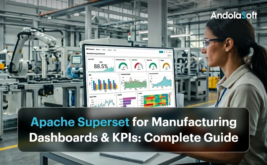
Walk into the Monday review meeting of a typical mid-size manufacturer. You will see the same scene every time. A finance analyst presents a deck assembled on Friday. A plant head disputes the OEE number because his own spreadsheet tells a different story. Meanwhile, a CEO asks a question that nobody can answer until someone re-runs an export from the ERP. In short, the company is not short of data. Instead, it is short of manufacturing dashboards that give everyone a single, trusted, always-current view of that data.
That view is what an executive dashboard provides. In this guide, we explain what executive reports and KPIs actually mean in a manufacturing context. We also show how department and business-unit manufacturing dashboards fit underneath the executive layer. In addition, we explain why this layered approach matters for a multi-plant or multinational operation. Finally, we describe how Andolasoft addresses the most common reporting pain points using Apache Superset, an enterprise-grade open-source analytics platform. Everything shown here comes from a real analytics suite we built for industrial clients. It includes around 30 dashboards across eight functional areas, with every KPI aligned to a recognised global standard.
What Are Executive Reports and KPIs in Manufacturing Dashboards?
An executive report is a deliberately compressed summary of business performance. An operational report might list every work order in a plant. However, an executive report answers one question per function: are we on track? This is exactly why manufacturing dashboards trade detail for speed of comprehension. After all, a leadership team reviewing eight functions in a thirty-minute meeting cannot read eight hundred rows.
A KPI, or Key Performance Indicator, is the unit of that compression. It is a single number, defined once, measured consistently, and compared against an explicit target. Overall Equipment Effectiveness (OEE), gross margin percentage, on-time delivery and lost-time injury frequency rate are all KPIs. Three properties separate a genuine KPI from a vanity metric: it has an owner who is accountable for it, it has a target that defines success, and it drives a decision when it moves. For a deeper look at the metrics that matter most, see our guide to must-have metrics for CEOs and COOs.
An executive dashboard combines the two ideas. It places one headline KPI per function on a single page, each coloured with a red, amber or green (RAG) status against its target. Green means on target, amber means watch, red means act. A well-built executive dashboard lets a CEO scan the health of the entire enterprise in under a minute and know exactly where to drill in. This kind of layered visibility is exactly what powers real-time decision-making for enterprises.
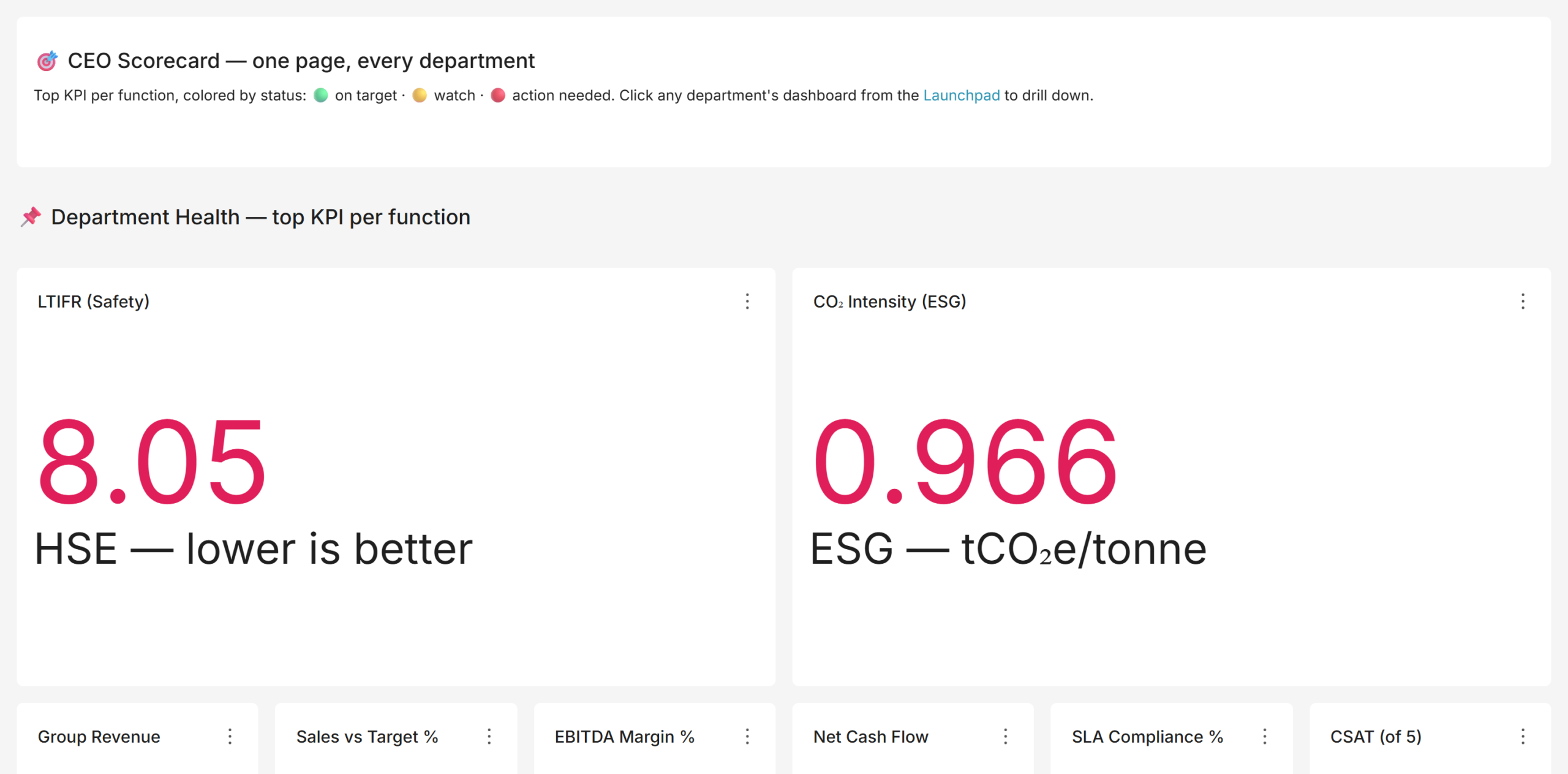
For a manufacturing group, the executive scorecard typically carries: revenue and EBITDA margin, free cash flow, sales versus target, OEE and plan attainment, quality (defect rate or first-pass yield), on-time delivery, procurement savings, safety (LTIFR, lost-time injuries per million hours worked), carbon intensity and workforce attrition. That specific mix matters. Boards of industrial companies are now expected to open with safety, close with cash, and evidence ESG in between; a scorecard that shows only financials is a decade out of date. Building this view typically starts with our data and analytics services.
Department and Business-Unit Manufacturing Dashboards and KPIs
The executive number is a headline. The department dashboard is the story behind it. When the OEE tile turns amber on the CEO scorecard, someone has to find out why, and that means a production dashboard that decomposes OEE by plant, line, and shift, shows the downtime Pareto, and separates planned from unplanned stoppages. A mature BI suite is therefore layered: an executive layer for direction, a department layer for diagnosis, and consistent filters connecting the two.
KPIs by Department: What Good Looks Like
Each function has a settled, internationally recognised KPI set. The table below summarises the department dashboards we implement for manufacturing clients and the standards they align to.
| Department | Representative KPIs | Standard / Framework |
| Production / Manufacturing | OEE, availability, performance, quality, plan attainment, throughput, MTBF, MTTR | ISO 22400 |
| Cost & Efficiency | Unit cost of production, cost variance vs standard, six big losses, COPQ, cycle vs takt time, capacity utilization | Lean / TPM |
| Quality | Defect rate, first-pass yield, rolled throughput yield, CAPA closure, audit score, supplier PPM, cost of poor quality | ISO 9001 |
| Procurement | Savings realised, vendor on time and quality, emergency PO share, spend under contract, material availability | Category management |
| Maintenance | PM compliance, maintenance backlog, MTBF, MTTR, planned vs reactive ratio, maintenance cost | Reliability / TPM |
| Finance | Revenue vs budget, gross / EBITDA / net margin, DSO, cash conversion cycle, free cash flow, ROCE, leverage | Standard finance |
| Sales | Bookings and order intake, win rate, weighted pipeline, pipeline coverage, net revenue retention, book-to-bill | Enterprise sales |
| Human Resources | Attrition, absenteeism, time to hire, eNPS, revenue per employee, labour cost %, diversity | Human capital |
| Safety & ESG | LTIFR, TRIFR, near misses, incident close-out, Scope 1-3 emissions, energy and water intensity, ISO 45001 / 14001 coverage | GRI / board pack |
OEE: The Anchor KPI of Any Plant Dashboard
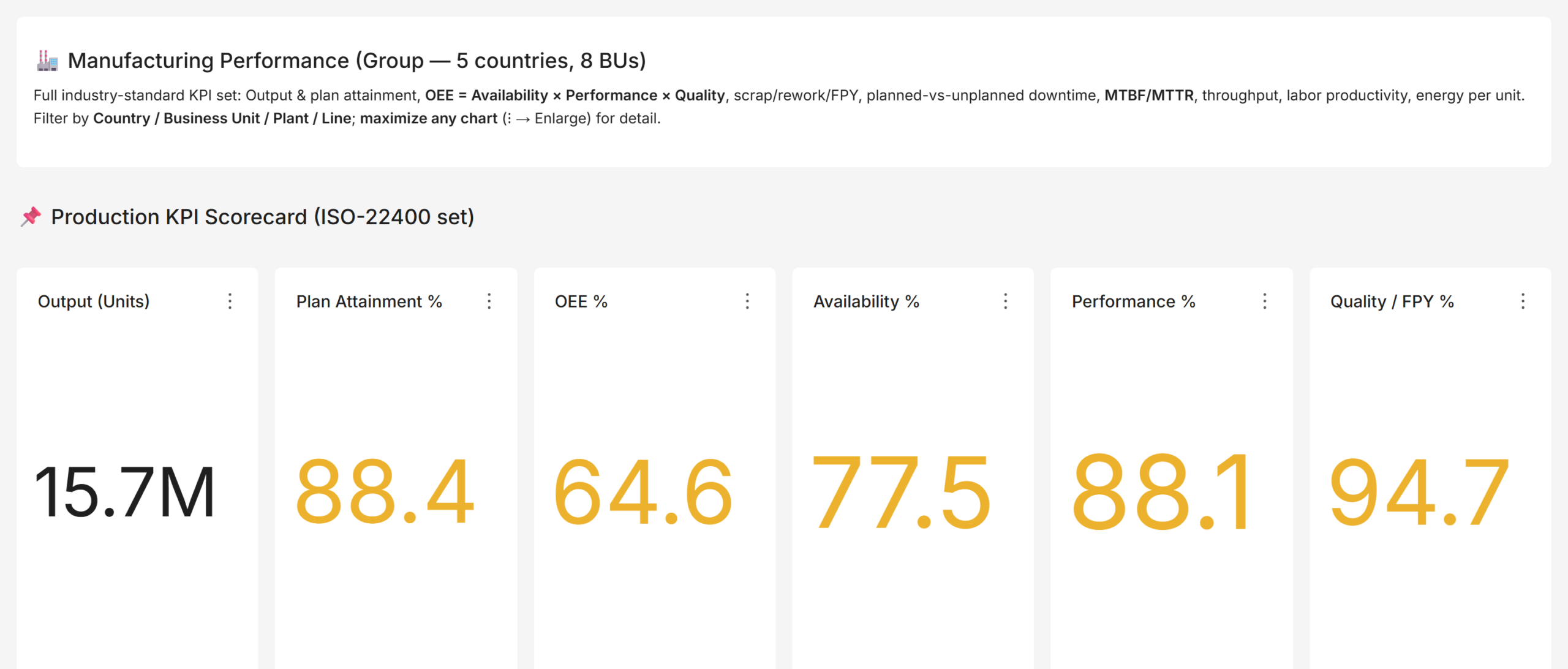
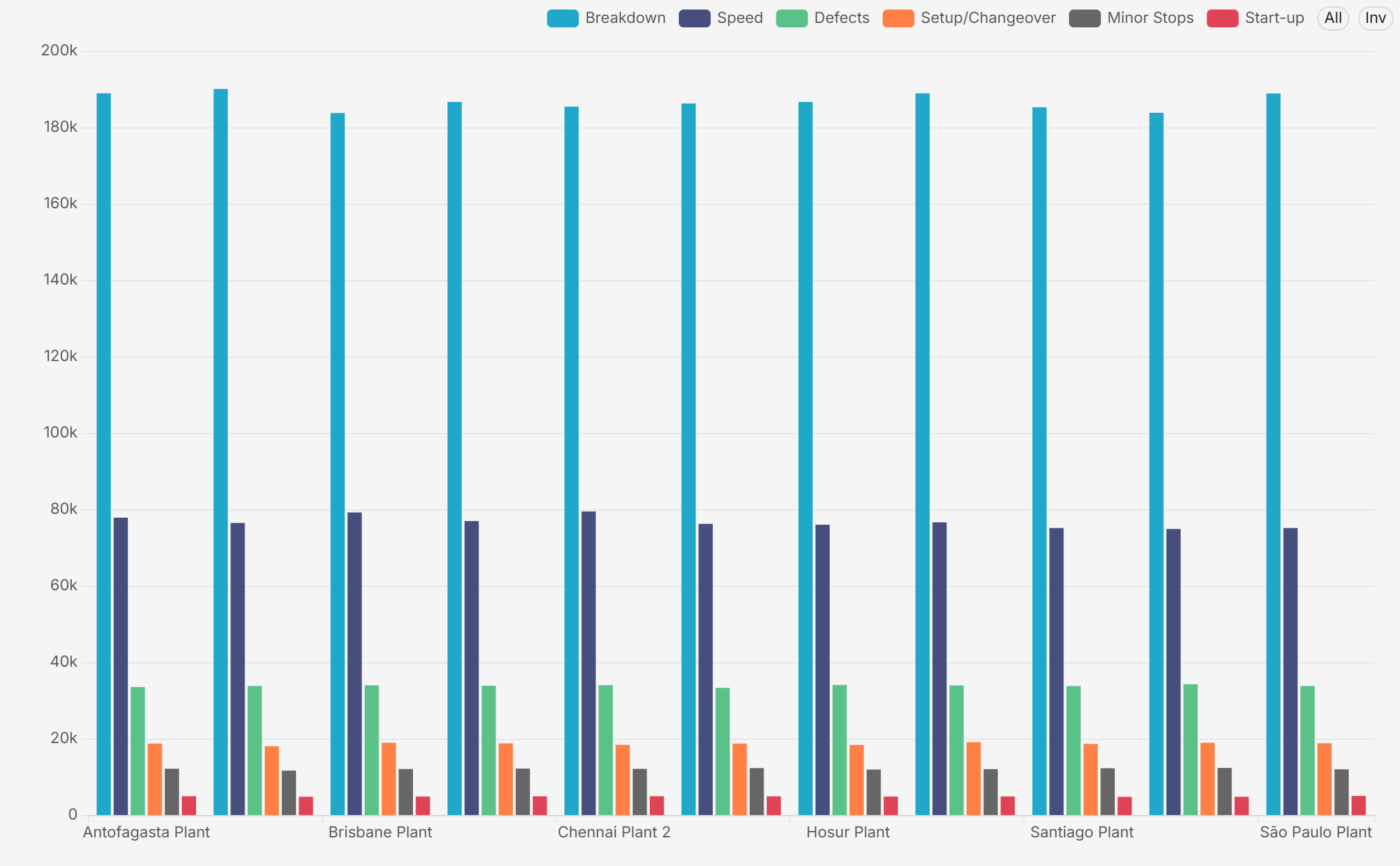
OEE deserves special attention because it is the one number that summarises how well a plant converts available time into good product. The formula is simple: OEE = Availability x Performance x Quality. Availability captures downtime losses, Performance captures speed losses, and Quality captures defect losses. World-class discrete manufacturing runs around 85 percent; most plants that have never measured systematically discover they are between 45 and 60 percent, which is precisely why measuring it is so valuable.
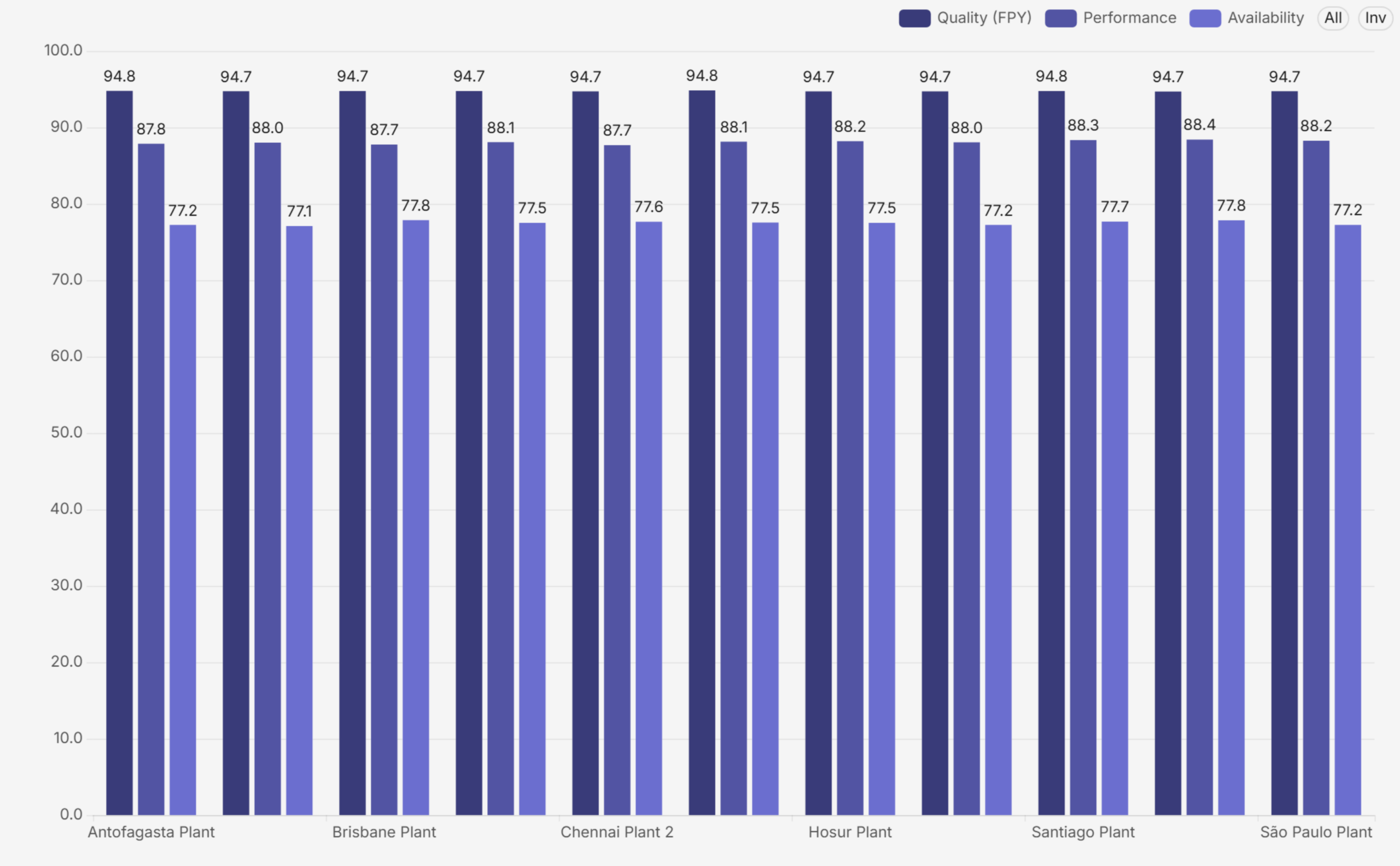
A good production dashboard never shows OEE as a single tile alone. It decomposes the number by plant and by component, so a low score is immediately attributable to availability, performance or quality, and then drills into the loss behind that component.
Business-Unit, Country, and Consolidated Views
Multi-plant and multinational manufacturers add a third dimension. The same KPIs must roll up into a consolidated group view and slice cleanly by country and business unit. This is harder than it sounds. For example, each region might calculate attainment differently, or one plant might report scrap in units while another reports it in value. In that case, the consolidated number becomes fiction. The fix, therefore, is architectural: a single data model with conformed Country, Business Unit, Department, and Time dimensions. As a result, every one of these manufacturing dashboards filters and aggregates on exactly the same definitions. This holds from the CEO scorecard down to a line-level view. Done properly, a group CFO can compare one country’s plant with another’s on a like-for-like basis. The numbers then reconcile all the way down. Getting this right depends on solid data governance practices for reliable BI insights.
Why You Need Manufacturing Dashboards: The Business Case
The case for manufacturing dashboards is not aesthetic. It is operational and financial:
- Single source of truth: one governed set of numbers replaces conflicting spreadsheets. When finance, operations and sales pull from the same semantic layer, the Monday meeting stops being an argument about whose figure is right.
- Faster decisions: a RAG scorecard directs attention in seconds. Leaders act on exceptions instead of reading every chart, which shortens the review cycle and pushes decisions closer to the event.
- Accountability: every KPI has an owner, a target, and a visible status. Performance conversations become specific: this number, this gap, this action.
- Root-cause speed: a group KPI drills down to the plant, line, shift, vendor, or salesperson behind it, so diagnosis takes minutes rather than a week of data requests.
- Consistency: the same Date, Country, Business Unit, and Department filters exist on every dashboard, so any two views can be compared without translation.
- Governed access: row-level security means a country manager sees their country, a BU head sees their unit, and the board sees everything, all from the same dashboards.

One design detail is worth calling out: RAG must be direction-aware. For margin, higher is better; for attrition or unit-cost variance, lower is better. Dashboards that colour every high number green quietly train leaders to misread the page. In our implementations, every threshold is set per KPI, with the direction of good explicitly defined, so green always means on target and red always means action needed, whatever the metric. These are exactly the kind of benefits of a self-service BI platform that make adoption stick.
Common Pain Points in Manufacturing Reporting
Across industrial clients, we see the same six failure modes again and again:
- Fragmented systems: Production data lives in the MES, finance in the ERP, quality in a QMS, maintenance in a CMMS, safety in spreadsheets. Nobody sees the whole picture, and cross-functional questions (what did that downtime cost?) go unanswered.
- Stale, manual reporting: Reports are assembled by hand every month. By the time leadership sees a problem, it is four to six weeks old, and the window to act has closed.
- Inconsistent definitions: The same KPI is calculated three different ways in three departments. Meetings dissolve into reconciliation instead of decisions.
- Missing board-level domains: Safety, ESG and sustainability reporting is absent or manual, even though boards, lenders and regulators now expect it as a first-class domain.
- No multi-entity view: There is no way to slice performance by country or business unit without a fresh extract, and no security model controlling who sees what.
- No collaboration: Reports are read-only artefacts. Reviewers annotate PDFs or trade screenshots over email, and the discussion is separated from the data.
How Andolasoft Builds Manufacturing Dashboards with Apache Superset
Apache Superset is a mature, open-source BI platform used by thousands of engineering-led organisations. It connects to virtually any SQL database and renders more than forty chart types. In addition, it supports native cross-dashboard filters, conditional formatting, role-based access, and row-level security. Because it is open source, it carries no per-seat licence cost. These are among the must-have enterprise BI features we evaluate for every client. Andolasoft’s Superset BI services build on that foundation and turn it into governed manufacturing dashboards, with a delivery method refined across manufacturing engagements:
- Define KPIs once, to a standard: we run KPI workshops per function and write down the formula, grain, target and RAG threshold for every measure before building anything. This is the step that ends definition wars.
- Model a governed data layer: staging, conformed, and semantic layers on PostgreSQL, with shared Country, Business Unit, Department, and Time dimensions so every view reconciles. We often pair this with the right ETL tools to streamline the BI pipeline.
- Build layered, role-based dashboards: an executive scorecard, consolidated and per-country and per-BU comparison views, and detailed dashboards for every department, each opening with a KPI band, then gauges, then analysis, then a scorecard table. This is how we deliver scalable and customizable data analytics across every plant.
- Direction-aware RAG everywhere: thresholds with the direction of good defined per KPI, so the colour language is trustworthy across the entire suite.
- Secure by design: row-level security per country and business unit, Single Sign-On against the corporate identity provider, and role-based access for admins, editors, and viewers. See our security best practices for Superset deployments for more detail.
- Adoption features Superset lacks natively: a folder-style navigation app so business users browse dashboards like a library, and an in-dashboard comment and annotation app so reviews happen in context. Both are delivered as clean extensions that survive Superset upgrades.
The outcome, in the suites we deliver, is roughly thirty dashboards across eight functional folders. These cover executive, sales, finance and risk, operations, services, people, safety and sustainability, and supply chain. As a result, every number traces to a governed dataset. Likewise, every one of these manufacturing dashboards responds to the same filters, and every KPI carries a defensible definition and a visible status. This mirrors the outcomes in our case study on tailored Superset dashboards for SaaS teams.
Implementation Roadmap: From Spreadsheets to a Governed Suite
A realistic enterprise rollout runs about sixteen weeks:
- Weeks 1-2, Discovery: KPI workshops, source-system assessment, dashboard inventory, and wireframes.
- Weeks 2-6, Data foundation: data model, ETL pipelines, certified datasets, and row-level security.
- Weeks 5-10, Core dashboards: executive, finance and sales dashboards, first UAT cycle.
- Weeks 8-13, Operational dashboards: operations, quality, HR, safety, ESG, and supply-chain dashboards.
- Weeks 10-14, Platform features: SSO, branding, folder navigation, collaboration app.
- Weeks 14-16, Launch: user acceptance, training, go-live, and hypercare.
The most common mistake is inverting the order. Teams build manufacturing dashboards before the KPI definitions and the data model are settled. That path produces beautiful charts on disputed numbers, and adoption dies within a quarter. Definitions first, model second, dashboards third. We break down other common BI implementation mistakes in a dedicated guide.
Frequently Asked Questions
What is OEE and why does it matter?
OEE (Overall Equipment Effectiveness) is Availability x Performance x Quality. It is the standard single measure of how effectively equipment converts available time into a good product, and the anchor KPI on any manufacturing dashboard. World-class is around 85 percent; unmeasured plants typically discover they run between 45 and 60 percent.
Which KPIs should a manufacturing CEO track?
One headline KPI per function: revenue and EBITDA margin, free cash flow, sales versus target, OEE and plan attainment, defect rate, on-time delivery, procurement savings, LTIFR for safety, carbon intensity for ESG, and attrition for people, each with a RAG status against an explicit target.
What is the difference between an executive dashboard and a department-level manufacturing dashboard?
An executive dashboard compresses each function into one number for direction-setting. A department dashboard expands one function into its full KPI set for diagnosis. They share definitions and filters so a leader can drill from the headline to the root cause without changing tools.
Is Apache Superset good for manufacturing analytics?
Yes. Superset connects to any SQL database, supports the chart types manufacturing needs (KPI tiles, gauges, Pareto, treemaps, scorecard tables), offers conditional formatting for RAG, native filters, role-based access and row-level security, and is open source, which removes per-seat BI licence cost at enterprise scale. Many of our manufacturing clients reach us while running Power BI migration services or Tableau migration services in parallel, before consolidating everything onto Superset.
How long does a manufacturing BI implementation take?
A focused departmental rollout takes four to six weeks. A full enterprise suite, with a governed data layer, thirty-odd dashboards, SSO, row-level security, and collaboration features, typically takes around sixteen weeks with a phased, milestone-based plan.
Build It With Andolasoft
Andolasoft designs and deploys governed, board-ready analytics platforms on Apache Superset for manufacturing and industrial companies. Our BI practice covers the full lifecycle. First, we handle KPI modelling to global standards such as ISO 22400, SCOR, and GRI. Next, we build data models with conformed dimensions, plus department and business-unit manufacturing dashboards with direction-aware RAG scorecards. We then add row-level security, Single Sign-On, folder navigation, and in-dashboard collaboration. Because Superset is open source, the entire platform runs without per-seat licence fees. As a result, the investment goes into your KPIs, not licences. If you want the fundamentals first, start with why Apache Superset is the future of open-source BI.
If your leadership team is still waiting for month-end spreadsheets instead of real-time manufacturing dashboards, talk to us. We will stand up a working demo on a representative dataset and walk your stakeholders through it. Then, we will give you a clear, fixed-scope plan to production.