How to Add Collaboration Features to Apache Superset

Apache Superset has become one of the most widely deployed open-source analytics platforms in the world. It connects to virtually any SQL database, renders rich interactive dashboards, and costs nothing per seat. But teams that adopt it quickly discover a gap: Superset ships without built-in Apache Superset collaboration features. Analytics is a team sport, yet Superset, out of the box, is built for viewing, not for discussing. There are no dashboard comments and no way to annotate a chart. There is also no folder tree to organise a growing library of dashboards.

The result is familiar to anyone who has run a review meeting from a BI tool. Someone screenshots a chart, pastes it into an email or chat thread, and circles the anomaly in a paint tool. The discussion about the data happens everywhere except next to the data. Context is lost, and decisions go undocumented. Three weeks later, nobody remembers why anyone queried the number or what the team agreed.

This article explains what Superset offers natively, plus three practical ways to add Apache Superset collaboration features on top of it. It also shows how Andolasoft builds them as clean, upgrade-safe extensions for enterprise clients.

What Superset Supports Natively, and Where the Gaps Are

Superset’s native collaboration surface is real but thin. Dashboards can be shared by link and published or kept as drafts. Ownership controls who can edit them. Tags let you label dashboards and filter the list page. Role-based access control and row-level security govern who sees what. Alerts and reports can be emailed or rendered in a dashboard on a schedule.

What is missing is the conversational layer: no inline comments, no visual markup, no review workflow, and no hierarchical folders. Tags can stand in for folders on the list page. But business users outside BI tools find a flat, filterable list a poor substitute for a browsable library. These gaps are consistently the top adoption complaints from non-technical stakeholders.

Three Ways to Add Apache Superset Collaboration Features

1. Pinned Comments and Visual Annotations on Dashboards

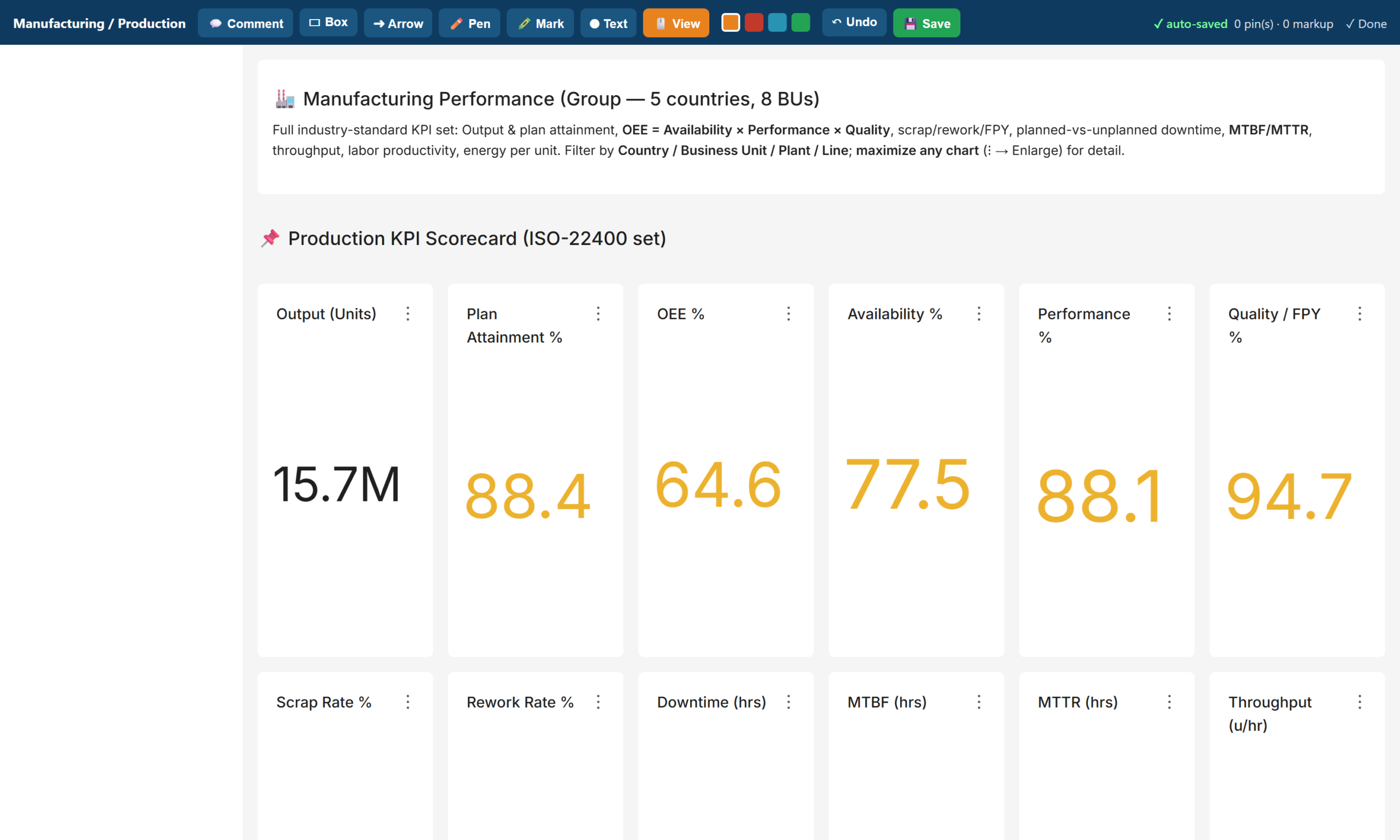
The highest-value addition is an in-dashboard markup layer. A reviewer opens a dashboard and clicks the exact chart in question. They pin a comment there, with a priority and a status, so the team can track it to resolution. Alongside pins, a drawing toolkit adds boxes, arrows, freehand marks, highlights, and text. Reviewers can mark up the live dashboard the way they would mark up a PDF. They can then save the annotation set for others to see.

Mechanically, a lightweight companion app delivers this feature inside Superset itself. It renders the target dashboard in an overlay and stores pins and drawings in your own database. Because it runs behind Superset’s session, the system attributes every comment to an authenticated user. And because it reuses Superset’s authentication, enabling Single Sign-On for Superset also enables it for the markup layer. Reviewers who never build charts just need a URL, their corporate login, and a pencil.

collaboration_markup

2. Folder-Style Navigation with Previews, Tags, and Search

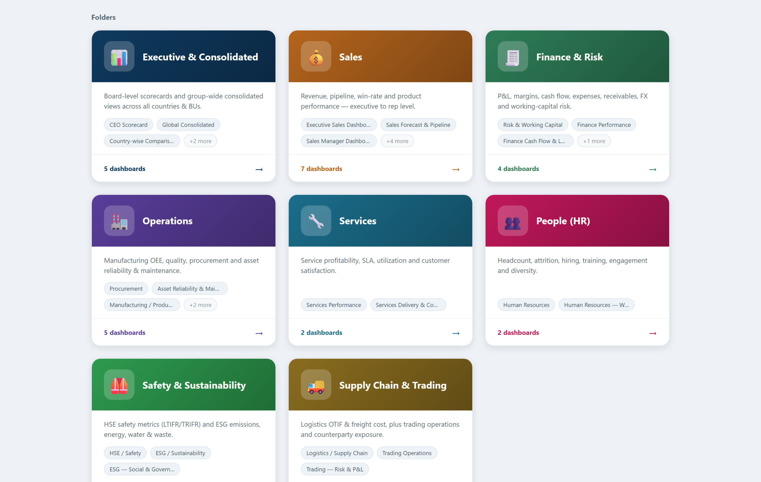
The second addition solves discovery. A folder app presents the dashboard estate as a set of coloured folder cards, one per function. Examples include Executive, Sales, Finance, and Operations. Opening a folder shows each dashboard as a card with a live preview thumbnail, its tags, and a chart count. Clicking a card opens a full preview with a jump-through to the real dashboard. A search box filters across every folder by title or tag.

collaboration_folders

The important design decision: folders generate live from the dashboard titles and tags already in Superset. The library maintains itself. Publish a new dashboard, and it appears in the right folder immediately, complete with its preview and tags. It’s instantly searchable too. No curator required.

3. Tags, RBAC, and Row-Level Security as the Governance Layer

Collaboration without governance becomes noise. The third layer is configuration, not code. A tag taxonomy, organised by department and by audience, powers both the native list filters and the folder app. Roles separate admins, editors, and viewers. Row-level security lets a country manager see their country and a business-unit head see their unit. Single Sign-On ties all of it to the corporate identity provider. Together, these controls make the collaborative layer trustworthy: every comment is attributable, and nobody annotates data they should not see.

How Andolasoft Builds Apache Superset Collaboration Features, Upgrade-Safely

The naive way to add features to Superset is to fork it and edit the source. That works until the next Superset release, at which point every upgrade becomes a merge conflict. Our implementations follow a stricter rule: never patch core.

  • Extensions, not forks: Flask blueprints deliver the comment, annotation, and folder apps alongside Superset. They use its session, authentication, and metadata, but touch none of its source files.
  • Your data, your database: pins, drawings, and folder definitions live in your PostgreSQL database. The team versions and backs them up with everything else.
  • Upgrade-safe by construction: we modify nothing in the core. A Superset version upgrade becomes a container-image bump plus a regression pass, not a re-implementation.
  • Security inherited, not duplicated: the apps inherit Superset’s login, so SSO, roles, and row-level security apply automatically.

What Changes for the Team

  • Reviews happen in context: feedback lands on the exact chart, with an author and a timestamp. It replaces the old screenshot thread.
  • Meetings get shorter: pre-meeting comments mean the meeting starts at the decision, not at the description of the problem.
  • Nothing falls through the cracks: comments carry a status. The team either resolves each query or leaves it visibly open.
  • The library invites browsing: non-technical users navigate a folder library with previews and search instead of a flat list. Adoption follows.

Frequently Asked Questions

Can You Add Apache Superset Collaboration Features Like Comments?

Not natively. In practice, though, a lightweight companion app can add Apache Superset collaboration features to any dashboard. These include pinned comments and visual annotations. It runs on Superset’s own login and SSO, and stores everything in your own database.

Does Superset have folders for dashboards?

No. Tags provide folder-like filtering on the dashboard list. A custom folder app can add full card-based navigation, with live previews, tags, and search. It generates automatically from the dashboards you already have.

Will Apache Superset Collaboration Features Break on Upgrade?

Not if you build them as extensions rather than source patches. Flask-blueprint apps that sit alongside an unmodified Superset core survive version upgrades with a simple regression pass.

Do reviewers need a Superset licence or training?

Superset is open source, so there are no licences at all. Reviewers need only a corporate login and a URL. Commenting and annotating require no chart-building knowledge.

Build It With Andolasoft

Andolasoft designs and deploys governed, board-ready analytics platforms on Apache Superset for manufacturing and industrial companies. See our detailed Superset dashboard templates for manufacturing KPIs for an example. Our BI practice covers the full lifecycle: KPI modelling to global standards (ISO 22400, SCOR, GRI) and data modelling with conformed dimensions. It also includes department dashboards with direction-aware RAG scorecards, row-level security, and Single Sign-On. Folder navigation and the Apache Superset collaboration features covered above round out the platform. Because Superset is open source, the entire platform runs without per-seat licence fees. The investment goes into your KPIs, not licences.

If your leadership team is still waiting for month-end spreadsheets, talk to us. We will stand up a working demo on a representative dataset and walk your stakeholders through it. Then we’ll give you a clear, fixed-scope plan to production.

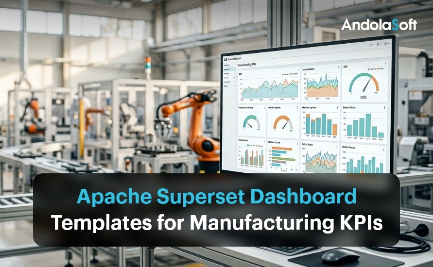
Apache Superset Dashboard Templates for Manufacturing KPIs

Every manufacturing BI programme faces the same opening question: where do we start? Starting from a blank canvas means months of workshops before anyone sees a chart, and the first drafts inevitably reflect whoever shouted loudest rather than what the industry has already standardised. Starting from proven templates inverts the problem. The right KPIs, layouts, RAG thresholds and filters arrive on day one, and the workshops become a review exercise: confirm, adjust, connect to your data.

This article walks through a complete template library for Apache Superset that we use as the starting point for manufacturing clients: eight functional folders, roughly thirty dashboards, every KPI aligned to a recognised standard such as ISO 22400 for plant performance, SCOR for supply chain, ISO 9001 for quality, and GRI for sustainability reporting.

Why Start From a Template Library

  • Faster time to value: a working dashboard in days, a full suite in weeks. The slow part of BI is agreeing on definitions, and templates arrive with defensible, standards-based definitions already written.
  • Best practice baked in: each template encodes what world-class reporting looks like for its function, so you inherit the collective practice of an industry rather than reinventing it.
  • Consistent design language: every template opens with a KPI band, then gauges, then trend and breakdown analysis, then a scorecard table. Users learn the grammar once and can read any dashboard in the suite.
  • Standard filters: the same Date, Country, Business Unit, and Department filters appear everywhere, so any two views reconcile and cross-functional questions get answered without new extracts.
  • Targets included: RAG thresholds ship with sensible industry defaults (OEE green at 75 percent and above, scrap red above 3.5 percent, and so on) and are adjusted to your targets during onboarding.

Apache Superset Dashboard Templates

The Template Library at a Glance

Folder / Template Set Included Dashboards Headline KPIs
Executive & Consolidated CEO scorecard, global consolidated, country comparison, business-unit comparison Revenue, EBITDA, cash, OEE, LTIFR, carbon intensity
Sales Executive, manager, rep, product, forecast & pipeline, win/loss & velocity, customer & account Win rate, weighted pipeline, coverage, NRR, book-to-bill
Finance & Risk Finance performance, expense analysis, cash flow & leverage, risk & working capital Margins, DSO, free cash flow, quick ratio, AR aging
Operations Production (OEE), cost & flow, quality, procurement, asset reliability & maintenance OEE, unit cost, six losses, CAPA, PM compliance
Services Services performance, delivery & contracts SLA, CSAT, utilization, realization, renewal
People (HR) Human resources, workforce cost & talent Attrition, eNPS, revenue per employee, diversity
Safety & Sustainability HSE/safety, ESG environmental, ESG social & governance LTIFR, TRIFR, Scope 1-3, ISO 45001 / 14001
Supply Chain & Trading Logistics, trading operations, trading risk & P&L OTIF, freight per tonne, mark-to-market, VaR

Inside the Operations Templates

Production / OEE Template (ISO 22400)

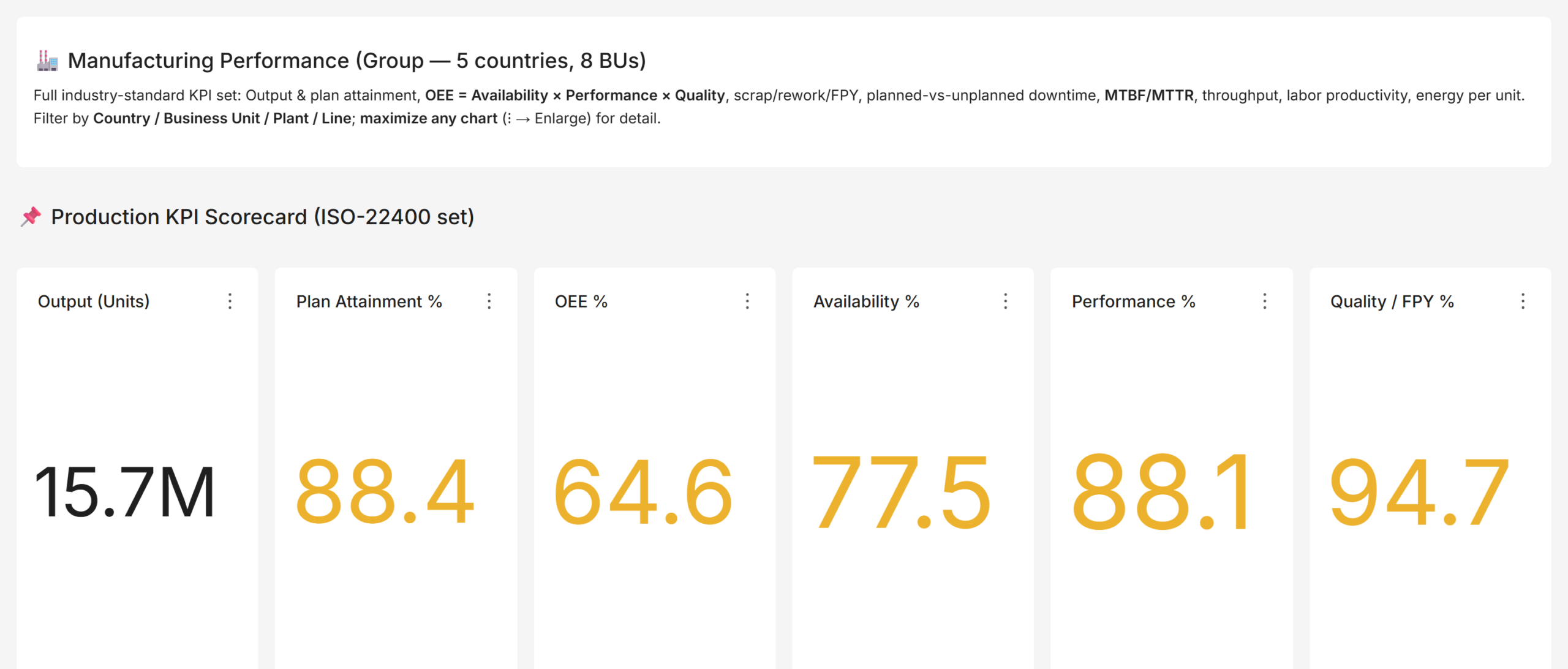
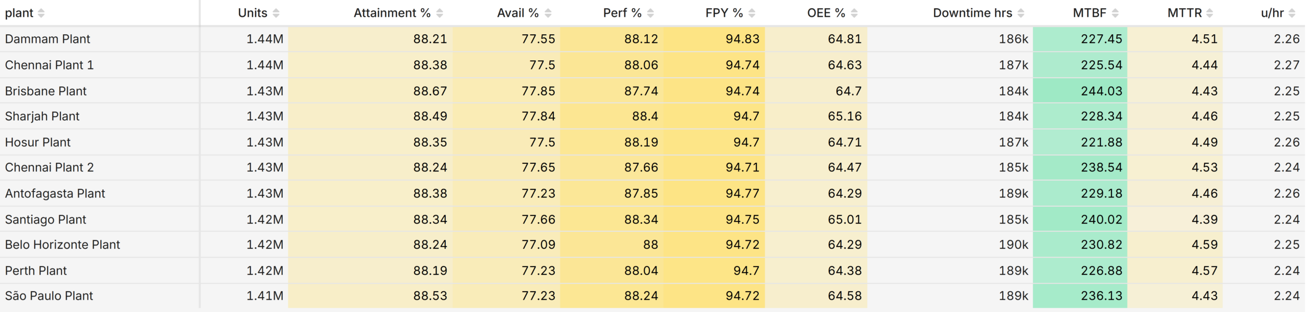
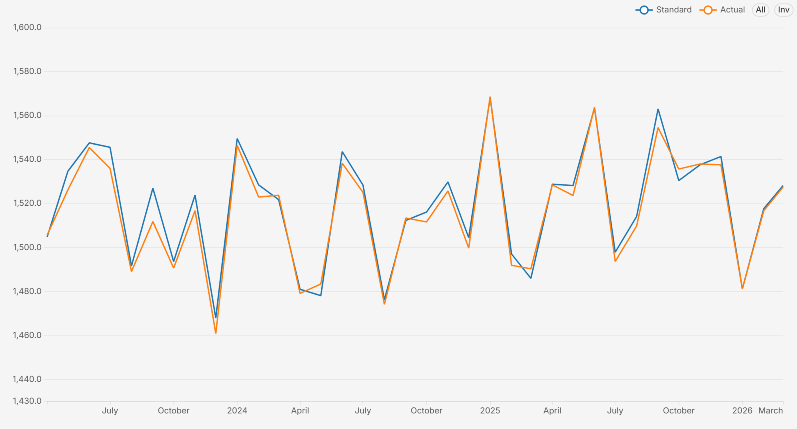
The anchor template. A twelve-tile KPI band covers output, plan attainment, OEE with its availability, performance and quality components, scrap and rework rates, downtime hours, MTBF, MTTR, and throughput. Below it: output versus plan trend, OEE decomposition by plant, planned-versus-unplanned downtime with a Pareto by reason, and plant and line scorecard tables with direction-aware RAG. This is the dashboard a plant head opens every morning. Apache Superset Dashboard Templates

Cost & Flow Template (Lean / TPM)

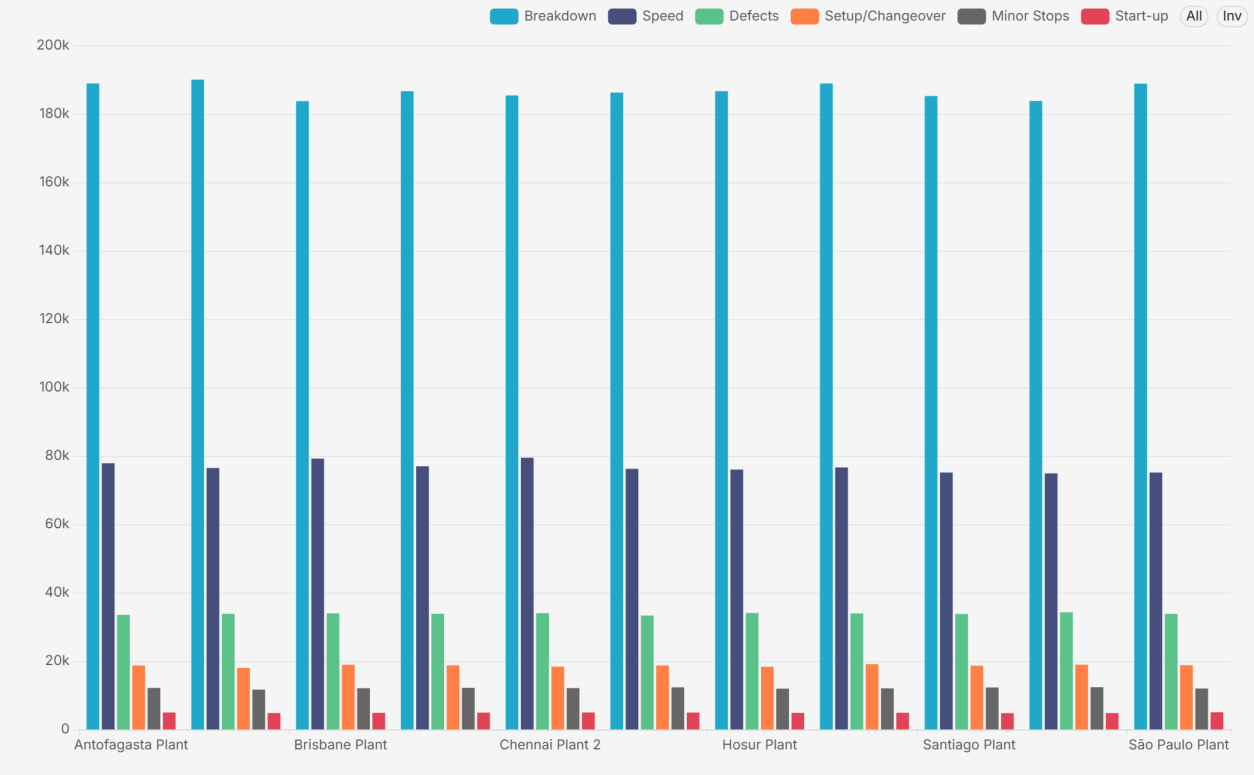
OEE tells you how much you lost; cost and flow tell you what it cost and where the flow breaks. This template adds unit cost of production against standard cost with variance percentage, a stacked cost breakdown (material, labour, energy, overhead, cost of poor quality), the classic Six Big Losses by plant, cycle time against takt time, capacity utilization, work-in-progress, and on-time delivery. Together, the two templates turn a plant-efficiency board into a genuine operations board. Apache Superset Dashboard Templates

Quality, Procurement and Maintenance Templates

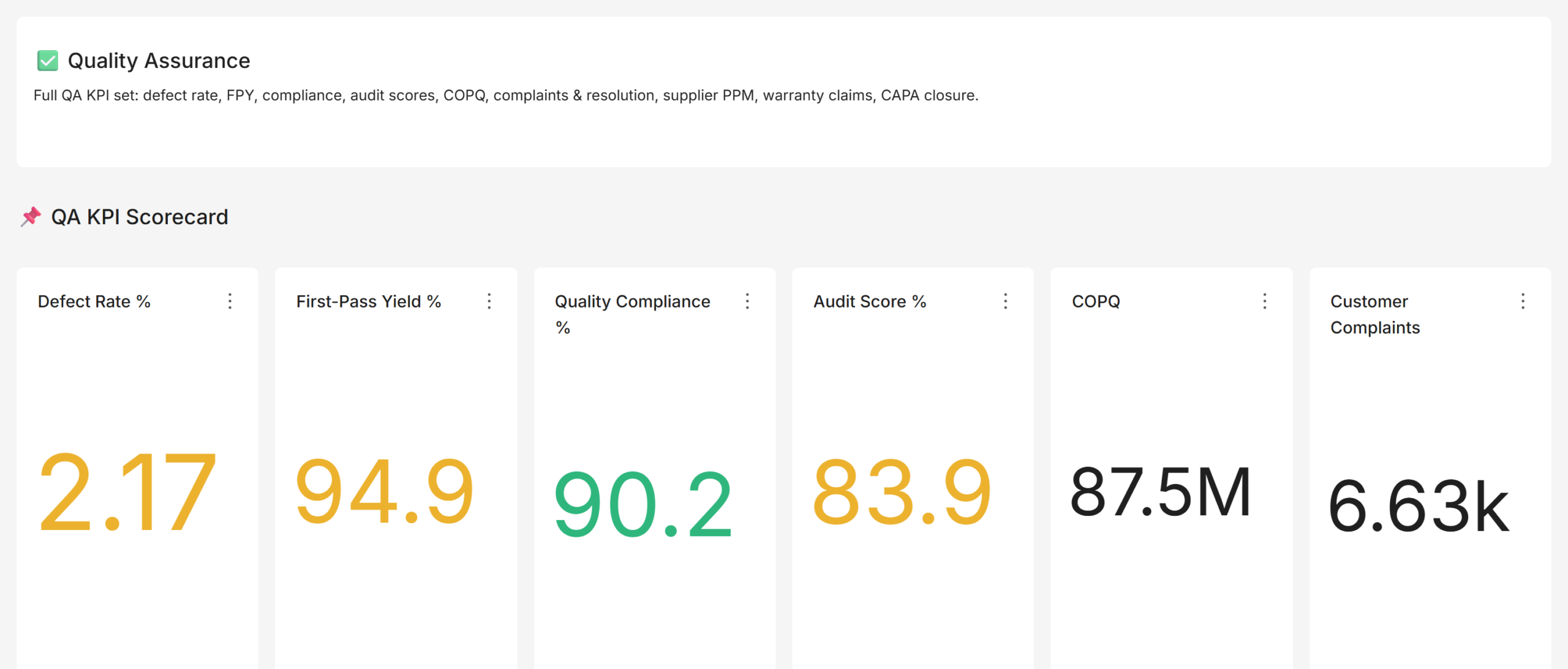
The quality template tracks defect rate, first-pass and rolled throughput yield, CAPA closure, audit scores, supplier defect PPM, and the cost of poor quality. The procurement template covers savings, vendor on-time and quality performance, emergency purchase share, spend under contract, and material availability. The maintenance template extends MTBF and MTTR with preventive-maintenance compliance, backlog, breakdown events, and the planned-versus-reactive ratio, the leading indicators that predict next quarter’s downtime.

Beyond Operations: Sales, Finance, and the Board-Level Domains

Manufacturing BI programmes often stop at the plant gate, which is a mistake: the same disciplines apply to the commercial and corporate functions, and the board reads them all on one page.

The sales templates layer the commercial view the way mature sales organisations do: an executive revenue view, a manager view with leaderboards and pipeline funnels, a rep view for personal performance, and dedicated dashboards for forecast and pipeline (weighted pipeline, coverage against quota, commit and best-case categories), win/loss and velocity (stage conversion, loss reasons, sales cycle), and customer and account health (net revenue retention, churn, backlog and book-to-bill, the KPI pair every industrial board asks about).

The finance templates go beyond the profit-and-loss basics into the balance-sheet strength a multinational needs: a cash flow and leverage view (operating, investing and financing cash flow, free cash flow, quick ratio, debt-to-equity, interest coverage) and a risk and working capital view (receivables aging, currency exposure and hedging, inventory days of supply, supplier concentration). The safety and sustainability templates complete the board pack with LTIFR and TRIFR, the incident pyramid, Scope 1 to 3 emissions, energy and water intensity, and certification coverage, the domains that regulators and lenders now expect as first-class reporting.

The Executive Layer

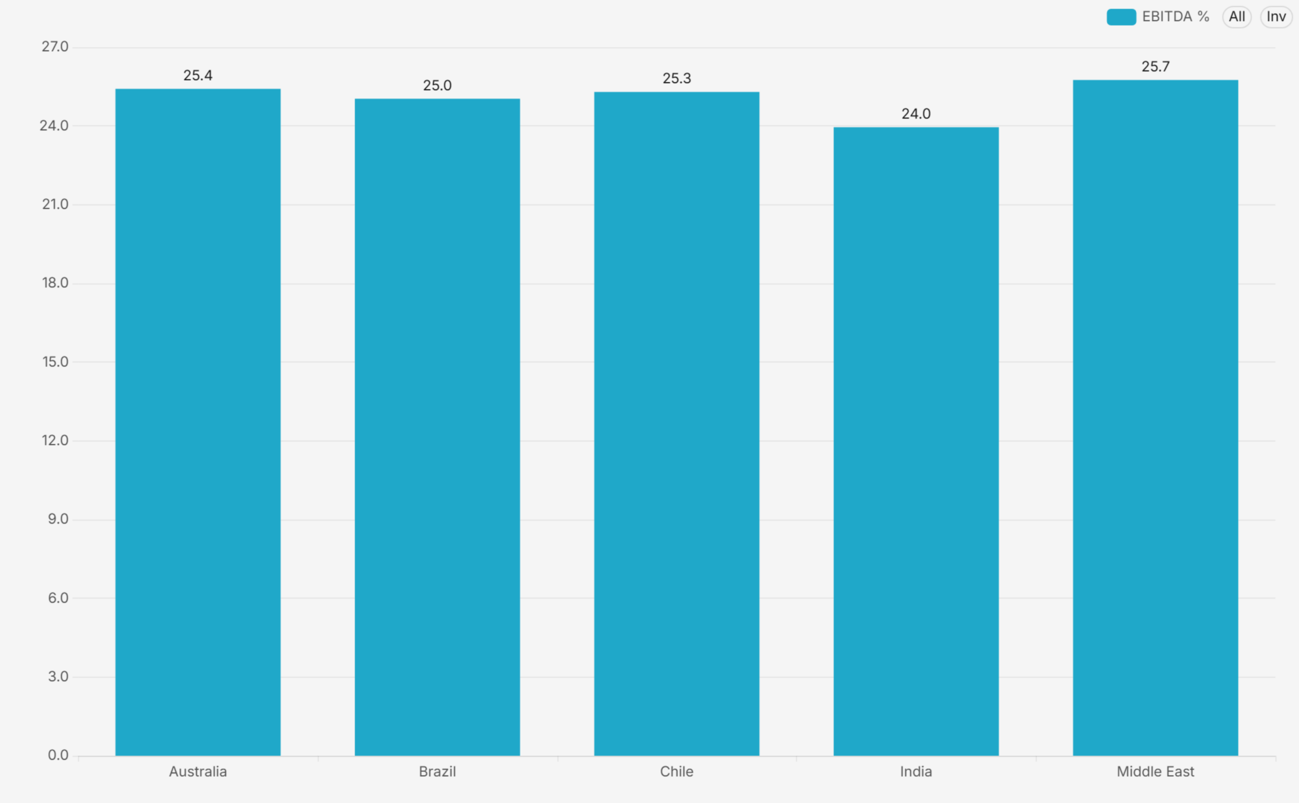
The executive templates roll one headline KPI per function onto a single page with RAG status, then provide consolidated, country-comparison, and business-unit-comparison views built on the same definitions. Because every template shares conformed dimensions, the group view and the plant view cannot disagree, and a board question about any tile drills straight into the owning department’s template without changing tools or definitions. Apache Superset Dashboard Templates

Common Mistakes When Adopting Templates

  • Skipping the definition review: copying a template without confirming the KPI formula with the owning function. The template is a starting position, not a decree; a fifteen-minute review per KPI buys lasting trust in the numbers.
  • Ignoring data grain: loading data at the wrong grain. If the template expects monthly plant-line data and the source provides only monthly plant totals, drill-downs silently mislead. Match the grain before go-live.
  • Not pruning: keeping every template even where a function does not exist. An empty dashboard erodes confidence in the full suite; prune what does not apply.
  • Frozen thresholds: treating RAG defaults as final. Industry defaults make the suite readable on day one, but each business sets its own ambition; recalibrate thresholds at the first quarterly review.

How to Customise the Templates to Your Business

  • Point at your data: connect the certified datasets to your ERP, MES, QMS, CMMS, and HR sources. The templates are source-agnostic; only the dataset layer changes.
  • Confirm definitions: review each KPI formula with the owning function and set your targets and RAG thresholds. This usually takes one workshop per department.
  • Secure: apply row-level security so each country and business unit sees its own slice, and connect Single Sign-On to your identity provider.
  • Brand and prune: apply your logo and colour theme, organise the folders to match your operating model, and retire any template that does not apply.

A template-based rollout typically reaches a governed, adopted suite in six to eight weeks, roughly half the timeline of a from-scratch build, with materially lower definition risk.

Frequently Asked Questions

Are dashboard templates really faster than building from scratch?

Yes, primarily because the slow part of BI is not chart-building but definition-settling. Templates arrive with standards-based KPI definitions that functions can review and adjust, which converts months of debate into days of confirmation.

Can the templates work with our ERP and MES?

Yes. The templates sit on a dataset layer that is mapped to your sources during onboarding. Any system that can land data in a SQL database, which includes every mainstream ERP, MES, QMS, and CMMS, can feed them.

Do the templates include targets and RAG thresholds?

They ship with industry-default thresholds for every KPI, which are then tuned to your targets during the definition workshops. The RAG logic is direction-aware, so lower-is-better metrics colour correctly.

Build It With Andolasoft

Andolasoft designs and deploys governed, board-ready analytics platforms on Apache Superset for manufacturing and industrial companies. Our BI practice covers the full lifecycle: KPI modelling to global standards (ISO 22400, SCOR, GRI), data modelling with conformed dimensions, department and business-unit dashboards with direction-aware RAG scorecards, row-level security, Single Sign-On, folder navigation and in-dashboard collaboration. Because Superset is open source, the entire platform runs without per-seat licence fees, so the investment goes into your KPIs, not licences.

If your leadership team is still waiting for month-end spreadsheets, talk to us. We will stand up a working demo on a representative dataset, walk your stakeholders through it, and give you a clear, fixed-scope plan to production.

Apache Superset for Manufacturing Dashboards & KPIs: Complete Guide

Walk into the Monday review meeting of a typical mid-size manufacturer. You will see the same scene every time. A finance analyst presents a deck assembled on Friday. A plant head disputes the OEE number because his own spreadsheet tells a different story. Meanwhile, a CEO asks a question that nobody can answer until someone re-runs an export from the ERP. In short, the company is not short of data. Instead, it is short of manufacturing dashboards that give everyone a single, trusted, always-current view of that data.

That view is what an executive dashboard provides. In this guide, we explain what executive reports and KPIs actually mean in a manufacturing context. We also show how department and business-unit manufacturing dashboards fit underneath the executive layer. In addition, we explain why this layered approach matters for a multi-plant or multinational operation. Finally, we describe how Andolasoft addresses the most common reporting pain points using Apache Superset, an enterprise-grade open-source analytics platform. Everything shown here comes from a real analytics suite we built for industrial clients. It includes around 30 dashboards across eight functional areas, with every KPI aligned to a recognised global standard.

What Are Executive Reports and KPIs in Manufacturing Dashboards?

An executive report is a deliberately compressed summary of business performance. An operational report might list every work order in a plant. However, an executive report answers one question per function: are we on track? This is exactly why manufacturing dashboards trade detail for speed of comprehension. After all, a leadership team reviewing eight functions in a thirty-minute meeting cannot read eight hundred rows.

A KPI, or Key Performance Indicator, is the unit of that compression. It is a single number, defined once, measured consistently, and compared against an explicit target. Overall Equipment Effectiveness (OEE), gross margin percentage, on-time delivery and lost-time injury frequency rate are all KPIs. Three properties separate a genuine KPI from a vanity metric: it has an owner who is accountable for it, it has a target that defines success, and it drives a decision when it moves. For a deeper look at the metrics that matter most, see our guide to must-have metrics for CEOs and COOs.

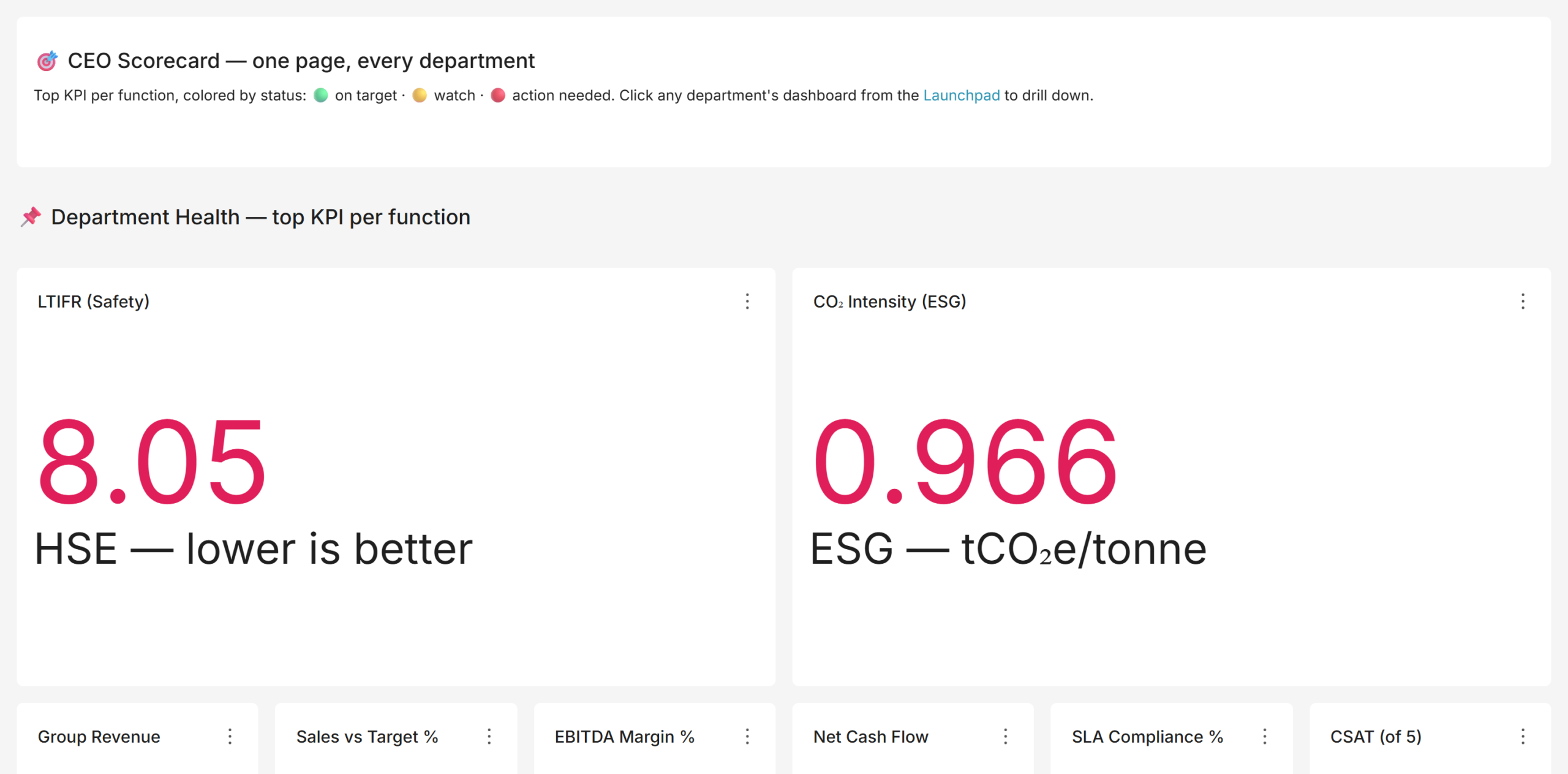
An executive dashboard combines the two ideas. It places one headline KPI per function on a single page, each coloured with a red, amber or green (RAG) status against its target. Green means on target, amber means watch, red means act. A well-built executive dashboard lets a CEO scan the health of the entire enterprise in under a minute and know exactly where to drill in. This kind of layered visibility is exactly what powers real-time decision-making for enterprises.
kpi_executive

For a manufacturing group, the executive scorecard typically carries: revenue and EBITDA margin, free cash flow, sales versus target, OEE and plan attainment, quality (defect rate or first-pass yield), on-time delivery, procurement savings, safety (LTIFR, lost-time injuries per million hours worked), carbon intensity and workforce attrition. That specific mix matters. Boards of industrial companies are now expected to open with safety, close with cash, and evidence ESG in between; a scorecard that shows only financials is a decade out of date. Building this view typically starts with our data and analytics services.

Department and Business-Unit Manufacturing Dashboards and KPIs

The executive number is a headline. The department dashboard is the story behind it. When the OEE tile turns amber on the CEO scorecard, someone has to find out why, and that means a production dashboard that decomposes OEE by plant, line, and shift, shows the downtime Pareto, and separates planned from unplanned stoppages. A mature BI suite is therefore layered: an executive layer for direction, a department layer for diagnosis, and consistent filters connecting the two.

KPIs by Department: What Good Looks Like

Each function has a settled, internationally recognised KPI set. The table below summarises the department dashboards we implement for manufacturing clients and the standards they align to.

Department  Representative KPIs  Standard / Framework 
Production / Manufacturing  OEE, availability, performance, quality, plan attainment, throughput, MTBF, MTTR  ISO 22400 
Cost & Efficiency  Unit cost of production, cost variance vs standard, six big losses, COPQ, cycle vs takt time, capacity utilization  Lean / TPM 
Quality  Defect rate, first-pass yield, rolled throughput yield, CAPA closure, audit score, supplier PPM, cost of poor quality  ISO 9001 
Procurement  Savings realised, vendor on time and quality, emergency PO share, spend under contract, material availability  Category management 
Maintenance  PM compliance, maintenance backlog, MTBF, MTTR, planned vs reactive ratio, maintenance cost  Reliability / TPM 
Finance  Revenue vs budget, gross / EBITDA / net margin, DSO, cash conversion cycle, free cash flow, ROCE, leverage  Standard finance 
Sales  Bookings and order intake, win rate, weighted pipeline, pipeline coverage, net revenue retention, book-to-bill  Enterprise sales 
Human Resources  Attrition, absenteeism, time to hire, eNPS, revenue per employee, labour cost %, diversity  Human capital 
Safety & ESG  LTIFR, TRIFR, near misses, incident close-out, Scope 1-3 emissions, energy and water intensity, ISO 45001 / 14001 coverage  GRI / board pack 

kpi_manufacturing

OEE: The Anchor KPI of Any Plant Dashboard

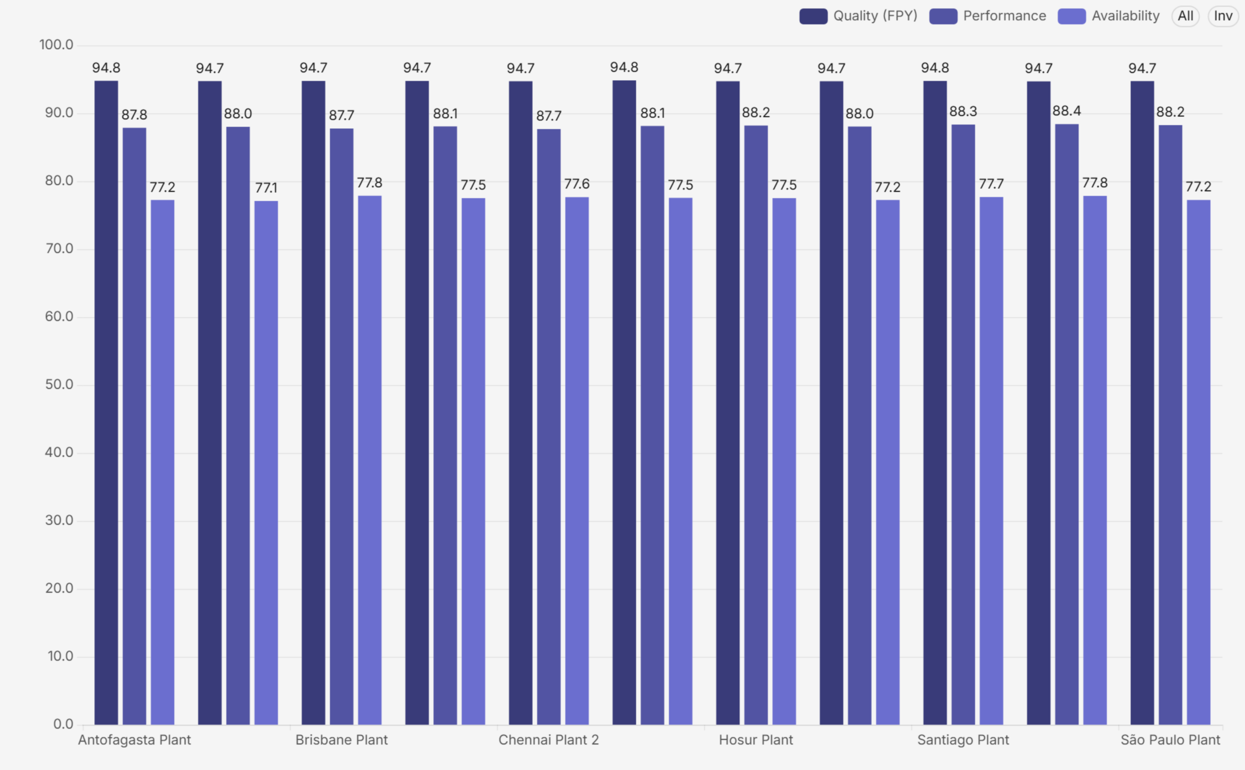
OEE deserves special attention because it is the one number that summarises how well a plant converts available time into good product. The formula is simple: OEE = Availability x Performance x Quality. Availability captures downtime losses, Performance captures speed losses, and Quality captures defect losses. World-class discrete manufacturing runs around 85 percent; most plants that have never measured systematically discover they are between 45 and 60 percent, which is precisely why measuring it is so valuable.

A good production dashboard never shows OEE as a single tile alone. It decomposes the number by plant and by component, so a low score is immediately attributable to availability, performance or quality, and then drills into the loss behind that component.
oee_components

Business-Unit, Country, and Consolidated Views

Multi-plant and multinational manufacturers add a third dimension. The same KPIs must roll up into a consolidated group view and slice cleanly by country and business unit. This is harder than it sounds. For example, each region might calculate attainment differently, or one plant might report scrap in units while another reports it in value. In that case, the consolidated number becomes fiction. The fix, therefore, is architectural: a single data model with conformed Country, Business Unit, Department, and Time dimensions. As a result, every one of these manufacturing dashboards filters and aggregates on exactly the same definitions. This holds from the CEO scorecard down to a line-level view. Done properly, a group CFO can compare one country’s plant with another’s on a like-for-like basis. The numbers then reconcile all the way down. Getting this right depends on solid data governance practices for reliable BI insights.

Why You Need Manufacturing Dashboards: The Business Case

The case for manufacturing dashboards is not aesthetic. It is operational and financial:

  • Single source of truth: one governed set of numbers replaces conflicting spreadsheets. When finance, operations and sales pull from the same semantic layer, the Monday meeting stops being an argument about whose figure is right.
  • Faster decisions: a RAG scorecard directs attention in seconds. Leaders act on exceptions instead of reading every chart, which shortens the review cycle and pushes decisions closer to the event.
  • Accountability: every KPI has an owner, a target, and a visible status. Performance conversations become specific: this number, this gap, this action.
  • Root-cause speed: a group KPI drills down to the plant, line, shift, vendor, or salesperson behind it, so diagnosis takes minutes rather than a week of data requests.
  • Consistency: the same Date, Country, Business Unit, and Department filters exist on every dashboard, so any two views can be compared without translation.
  • Governed access: row-level security means a country manager sees their country, a BU head sees their unit, and the board sees everything, all from the same dashboards.

rag_scorecard

One design detail is worth calling out: RAG must be direction-aware. For margin, higher is better; for attrition or unit-cost variance, lower is better. Dashboards that colour every high number green quietly train leaders to misread the page. In our implementations, every threshold is set per KPI, with the direction of good explicitly defined, so green always means on target and red always means action needed, whatever the metric. These are exactly the kind of benefits of a self-service BI platform that make adoption stick.

Common Pain Points in Manufacturing Reporting

Across industrial clients, we see the same six failure modes again and again:

  • Fragmented systems: Production data lives in the MES, finance in the ERP, quality in a QMS, maintenance in a CMMS, safety in spreadsheets. Nobody sees the whole picture, and cross-functional questions (what did that downtime cost?) go unanswered.
  • Stale, manual reporting: Reports are assembled by hand every month. By the time leadership sees a problem, it is four to six weeks old, and the window to act has closed.
  • Inconsistent definitions: The same KPI is calculated three different ways in three departments. Meetings dissolve into reconciliation instead of decisions.
  • Missing board-level domains: Safety, ESG and sustainability reporting is absent or manual, even though boards, lenders and regulators now expect it as a first-class domain.
  • No multi-entity view: There is no way to slice performance by country or business unit without a fresh extract, and no security model controlling who sees what.
  • No collaboration: Reports are read-only artefacts. Reviewers annotate PDFs or trade screenshots over email, and the discussion is separated from the data.

How Andolasoft Builds Manufacturing Dashboards with Apache Superset

Apache Superset is a mature, open-source BI platform used by thousands of engineering-led organisations. It connects to virtually any SQL database and renders more than forty chart types. In addition, it supports native cross-dashboard filters, conditional formatting, role-based access, and row-level security. Because it is open source, it carries no per-seat licence cost. These are among the must-have enterprise BI features we evaluate for every client. Andolasoft’s Superset BI services build on that foundation and turn it into governed manufacturing dashboards, with a delivery method refined across manufacturing engagements:

  • Define KPIs once, to a standard: we run KPI workshops per function and write down the formula, grain, target and RAG threshold for every measure before building anything. This is the step that ends definition wars.
  • Model a governed data layer: staging, conformed, and semantic layers on PostgreSQL, with shared Country, Business Unit, Department, and Time dimensions so every view reconciles. We often pair this with the right ETL tools to streamline the BI pipeline.
  • Build layered, role-based dashboards: an executive scorecard, consolidated and per-country and per-BU comparison views, and detailed dashboards for every department, each opening with a KPI band, then gauges, then analysis, then a scorecard table. This is how we deliver scalable and customizable data analytics across every plant.
  • Direction-aware RAG everywhere: thresholds with the direction of good defined per KPI, so the colour language is trustworthy across the entire suite.
  • Secure by design: row-level security per country and business unit, Single Sign-On against the corporate identity provider, and role-based access for admins, editors, and viewers. See our security best practices for Superset deployments for more detail.
  • Adoption features Superset lacks natively: a folder-style navigation app so business users browse dashboards like a library, and an in-dashboard comment and annotation app so reviews happen in context. Both are delivered as clean extensions that survive Superset upgrades.
six_losses

The outcome, in the suites we deliver, is roughly thirty dashboards across eight functional folders. These cover executive, sales, finance and risk, operations, services, people, safety and sustainability, and supply chain. As a result, every number traces to a governed dataset. Likewise, every one of these manufacturing dashboards responds to the same filters, and every KPI carries a defensible definition and a visible status. This mirrors the outcomes in our case study on tailored Superset dashboards for SaaS teams.

Implementation Roadmap: From Spreadsheets to a Governed Suite

A realistic enterprise rollout runs about sixteen weeks:

  • Weeks 1-2, Discovery: KPI workshops, source-system assessment, dashboard inventory, and wireframes.
  • Weeks 2-6, Data foundation: data model, ETL pipelines, certified datasets, and row-level security.
  • Weeks 5-10, Core dashboards: executive, finance and sales dashboards, first UAT cycle.
  • Weeks 8-13, Operational dashboards: operations, quality, HR, safety, ESG, and supply-chain dashboards.
  • Weeks 10-14, Platform features: SSO, branding, folder navigation, collaboration app.
  • Weeks 14-16, Launch: user acceptance, training, go-live, and hypercare.

The most common mistake is inverting the order. Teams build manufacturing dashboards before the KPI definitions and the data model are settled. That path produces beautiful charts on disputed numbers, and adoption dies within a quarter. Definitions first, model second, dashboards third. We break down other common BI implementation mistakes in a dedicated guide.

Frequently Asked Questions

What is OEE and why does it matter?

OEE (Overall Equipment Effectiveness) is Availability x Performance x Quality. It is the standard single measure of how effectively equipment converts available time into a good product, and the anchor KPI on any manufacturing dashboard. World-class is around 85 percent; unmeasured plants typically discover they run between 45 and 60 percent.

Which KPIs should a manufacturing CEO track?

One headline KPI per function: revenue and EBITDA margin, free cash flow, sales versus target, OEE and plan attainment, defect rate, on-time delivery, procurement savings, LTIFR for safety, carbon intensity for ESG, and attrition for people, each with a RAG status against an explicit target.

What is the difference between an executive dashboard and a department-level manufacturing dashboard?

An executive dashboard compresses each function into one number for direction-setting. A department dashboard expands one function into its full KPI set for diagnosis. They share definitions and filters so a leader can drill from the headline to the root cause without changing tools.

Is Apache Superset good for manufacturing analytics?

Yes. Superset connects to any SQL database, supports the chart types manufacturing needs (KPI tiles, gauges, Pareto, treemaps, scorecard tables), offers conditional formatting for RAG, native filters, role-based access and row-level security, and is open source, which removes per-seat BI licence cost at enterprise scale. Many of our manufacturing clients reach us while running Power BI migration services or Tableau migration services in parallel, before consolidating everything onto Superset.

How long does a manufacturing BI implementation take?

A focused departmental rollout takes four to six weeks. A full enterprise suite, with a governed data layer, thirty-odd dashboards, SSO, row-level security, and collaboration features, typically takes around sixteen weeks with a phased, milestone-based plan.

Build It With Andolasoft

Andolasoft designs and deploys governed, board-ready analytics platforms on Apache Superset for manufacturing and industrial companies. Our BI practice covers the full lifecycle. First, we handle KPI modelling to global standards such as ISO 22400, SCOR, and GRI. Next, we build data models with conformed dimensions, plus department and business-unit manufacturing dashboards with direction-aware RAG scorecards. We then add row-level security, Single Sign-On, folder navigation, and in-dashboard collaboration. Because Superset is open source, the entire platform runs without per-seat licence fees. As a result, the investment goes into your KPIs, not licences. If you want the fundamentals first, start with why Apache Superset is the future of open-source BI.

If your leadership team is still waiting for month-end spreadsheets instead of real-time manufacturing dashboards, talk to us. We will stand up a working demo on a representative dataset and walk your stakeholders through it. Then, we will give you a clear, fixed-scope plan to production.