BI Dashboards: Must-Have Metrics for CEOs and COOs

In today’s data-driven era, over 68% of CEOs agree that timely insights from BI dashboards directly improve organizational performance. Yet, many leaders still struggle with siloed spreadsheets, inconsistent reporting, and outdated visualizations.

Imagine having live, actionable metrics at your fingertips — guiding every strategic move, from revenue forecasting to operational efficiency.

This blog will help you understand:

  • Why BI dashboards are critical for modern leadership
  • The must-have KPIs for CEOs and COOs
  • Best practices to build dashboards that deliver value
  • Real-world success examples powered by Andolasoft

Let’s dive in.

BI Dashboards Metrics

Why BI Dashboards Matter for Executives

Fast-moving markets require leaders to operate on more than intuition — they need accurate, real-time insights. BI dashboards act as a strategic nerve center that consolidates data from ERP, CRM, IoT, and external APIs.

However, legacy systems commonly create:

Key Challenges Executives Face

Challenge Impact
Data Silos & Inconsistencies Conflicting numbers lead to poor decisions
Inefficient Reporting Cycles Manual reporting consumes days, delaying action
Security & Compliance Risks Data spread across tools increases exposure

Industry Impact Examples

  • Healthcare: Lack of dashboards results in poor visibility into patient flow and resource usage.
  • eCommerce: Reliance on delayed metrics causes missed sales and inventory risks.
  • Logistics: Without real-time tracking, fuel costs rise and delivery delays increase.
  • Fintech/SaaS: Inability to correlate churn with product usage slows growth.

The consequences? Revenue leakage, reduced efficiency, and slower innovation.

By partnering with Andolasoft, enterprises modernize reporting with scalable BI, AI, and ML-driven insights.

Best Practices for Building Executive BI Dashboards

To create dashboards that empower CEOs and COOs, follow these proven steps:

Define Clear Objectives

  • Align KPIs with strategic goals
  • Limit dashboards to 3–5 core objectives
  • Avoid “dashboard bloat”

Choose the Right Metrics

Example KPI Categories:

  • Revenue & Profitability → MRR/ARR, EBITDA, Gross Margin
  • Operational Efficiency → Cycle times, on-time delivery, resource utilization
  • Customer Experience → NPS, CSAT, churn rate
  • Employee Productivity → Utilization rate, project completion speed

Use Proven Frameworks

  • Balanced Scorecard → 360° organizational view
  • OKRs → Tie metrics to measurable outcomes

Ensure Data Quality & Governance

  • Standardized ETL/ELT pipelines
  • RBAC permissions, audit logs & encryption

Prioritize Usability & Design

  • Large KPI cards for priority metrics
  • Drill-downs and filters for deeper insights
  • Mobile-responsive layout for executives on the go

Optimize Scalability & Speed

  • Leverage Snowflake, BigQuery or Redshift
  • Use caching and incremental loads to improve performance

Adopt Agile & DevOps for BI

  • CI/CD pipelines for dashboard releases
  • Automated data validation and monitoring

Avoid Common Pitfalls

  • Limit to max 8 widgets per view
  • Don’t ignore mobile analytics use cases

Quick Wins for Faster Impact

  • Executive summary cards
  • Slack/email alerts
  • Industry-specific dashboard templates

Andolasoft’s Role in BI Transformation

With deep expertise in:

Andolasoft builds future-ready BI systems with modern architecture, security, DevOps automation, and scalable design.

Customer Success Story

A fintech startup partnered with Andolasoft to build a real-time credit risk dashboard. Results in 12 weeks:

Outcome Impact
40% Faster Reporting From 3 days to 30 minutes
30% Higher Conversion Optimized loan journey based on behavior insights
25% Cost Reduction Smart scaling eliminated cloud waste

Executives now make real-time, data-backed decisions, with predictive alerts and improved risk controls.

Key Takeaways

  • Define objectives before selecting metrics
  • Focus on core KPIs aligned with financial, operational, and customer outcomes
  • Ensure data governance and scalable cloud architecture
  • Use agile processes for continuous improvement
  • Partner with experts — BI dashboards aren’t plug-and-play

BI dashboards are no longer optional — they’re a strategic advantage.

FAQs

Q1. What are the most critical BI dashboard metrics for CEOs and COOs?

MRR/ARR, gross margin, cycle times, on-time delivery, NPS, CSAT, churn rate, and employee utilization.

Q2. How can I ensure data accuracy?

Standardize ETL/ELT pipelines, enforce RBAC, and automate validation.

Q3. Can Andolasoft integrate legacy systems?

Yes — we connect outdated systems to modern cloud warehouses with secure workflows.

Q4. Which BI tools are recommended?

Microsoft Power BI, Tableau, Qlik Sense, and Looker.

Q5. How fast can we deploy a dashboard?

A functional MVP can be ready in 4–6 weeks.

Predictive BI: Transforming Raw Data Into Future Insights

Predictive BI is reshaping how organizations anticipate market trends, customer behaviors, and operational bottlenecks.

According to a recent Gartner report, companies adopting predictive intelligence can improve decision-making speed by up to 50%.

In today’s hyper-competitive landscape, traditional reporting is no longer enough.

Leaders now require real-time forecasting to stay ahead — making Predictive BI: Transforming Raw Data Into Future Insights more urgent than ever.

In this post, you’ll learn:

  • Why predictive intelligence is mission-critical
  • Practical frameworks and implementation strategy
  • Real-world results from transformations

Whether you’re a CTO, founder, product manager, or engineering lead — you’ll walk away with a blueprint for implementing Predictive BI with confidence and measurable ROI.

Predictive BI The Future of Decision-Making

Why Predictive BI Matters Now

As organizations scale, data grows exponentially — from IoT sensors and SaaS interactions to ERP and CRM workflows. Without predictive intelligence, businesses risk inefficiencies and lost opportunities.

What Happens Without Predictive BI?

  • Overstocked inventory and lost sales due to poor forecasting
  • Reactive operations, leading to downtime and inefficiencies
  • Cybersecurity threats that go unnoticed until it’s too late

Where Predictive BI Is Making an Impact

  • Healthcare: Predict patient admissions to reduce staffing gaps
  • Logistics: Optimize routes to reduce fuel consumption by 15%
  • SaaS: Improve conversion rates by 20% using behavioral analytics
  • Manufacturing: Detect maintenance needs before equipment fails

The Cost of Doing Nothing

Legacy BI systems create:

  • Data silos
  • Manual reporting delays
  • High operational costs

Modern enterprises need a scalable, integrated Predictive BI ecosystem — guided by experts who understand both technology and industry context.

Predictive BI Framework & Best Practices

Implementing Predictive BI is not a one-time task — it’s a structured journey. Below is the recommended implementation roadmap.

1. Define Clear Business Objectives

Align predictive goals to measurable KPIs such as churn reduction, seasonal demand forecasting, or supply chain efficiency.

2. Conduct Data Inventory & Quality Assessment

Audit data sources (ERP, CRM, IoT sensors, finance systems) and evaluate them based on:

  • Completeness
  • Accuracy
  • Timeliness

High-quality input = reliable predictions.

3. Choose Scalable Architecture

Adopt Lambda or Kappa architecture to support:

  • Real-time analytics
  • Batch processing
  • Cost efficiency

4. Select the Right Tech Stack

Select the Right Tech Stack

5. Iterative Model Development

Use Agile sprints, A/B testing, and continuous retraining to maintain accuracy as data evolves.

6. Embed Security & Compliance

Implement:

  • Encryption
  • RBAC
  • Audit logs
  • SOC 2/HIPAA compliance

7. Monitor, Optimize & Operationalize

Deploy model drift alerts and automated dashboards.

Quick Wins:

  • Add anomaly alerts for trend deviations
  • Enable self-service access for end users

8. Build a Data-Driven Culture

Train teams, provide documentation, and make insights accessible.

Do’s & Don’ts of Predictive BI

Do: Invest in data governance early
Don’t: Overcomplicate early models

Do: Containerize deployments (Kubernetes, Docker)
Don’t: Ignore model explainability — stakeholder trust matters

How Andolasoft Accelerates Predictive BI Adoption

Andolasoft offers end-to-end expertise:

  • Custom Web & Mobile Engineering: Predictive dashboards and apps
  • SaaS Product Engineering: Scalable multi-tenant architecture
  • BI, AI & ML Solutions: End-to-end model pipelines
  • Application Modernization: Migration to cloud-native stacks
  • Cloud, DevOps & Automation: Predictive CI/CD and automated retraining

With Andolasoft as a technology partner, organizations avoid:

  • Data silos
  • Costly architectural missteps
  • Underutilized analytics investments

Customer Success Example

  • Challenge: Predict patient admission volumes to reduce ER wait times.
  • Solution: Real-time forecasting deployed with cloud-native predictive framework.

Results in 6 Months:

  • 40% reduction in ER wait times
  • 25% improvement in staffing efficiency
  • 30% infrastructure savings through modernization

MedSecure now scales confidently with predictive capabilities embedded across operations.

Key Takeaways

  • Predictive BI converts raw data into forward-looking insights that drive measurable business impact.
  • High-quality data, scalable architecture, and governance are foundational.
  • Continuous model training and DevOps practices ensure accurate forecasting.
  • Security, compliance, and explainability must be included from day one.
  • Working with Andolasoft accelerates deployment and avoids implementation pitfalls.

Transforming Insights with Intelligent Heatmaps: Multi-Threshold Coloring Comes to Superset 4.1

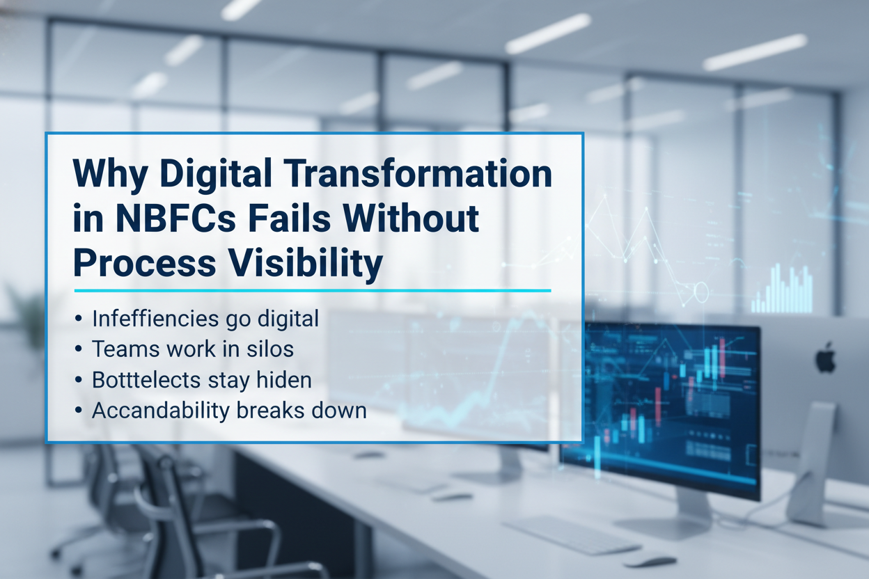
Heatmaps have long been a staple of modern analytics. They’re fast, intuitive, and visually expressive. But as organizations — especially data-intensive sectors like NBFCs — evolve in their analytical requirements, traditional heatmaps no longer provide the clarity needed for high-stakes decisions.

In NBFC operations, the difference between a healthy metric and a risky one can be razor thin. Early detection of stress indicators, repayment behavior patterns, fraud risk, delinquency zones, and operational inefficiencies can directly impact revenue, portfolio quality, and regulatory compliance.

This is where intelligent visualization becomes more than a design choice — it becomes a strategic advantage. Today, we’re excited to introduce our Advanced Multi-Threshold Heatmap Customization for Superset 4.1, purpose-built to empower NBFCs and modern enterprises with sharper insights and clearer decision boundaries.

Why Multi-Threshold Heatmaps Matter

Why Heatmaps Needed an Upgrade — Especially for NBFCs

Traditional heatmaps rely on simple gradient scales that blur critical distinctions. But NBFC data environments demand sharper, more explicit boundaries for better decision-making. These use cases require precise segmentation:

  • Portfolio delinquency segmentation
  • Risk-tier classification
  • Branch-level performance variance
  • Collections prioritization zones
  • Fee income heatmaps
  • Recovery cycle analysis
  • Borrower behavior scoring

A simple gradient doesn’t tell the full story — it hides it.

NBFCs need clarity, not ambiguity.
That’s exactly why multi-threshold color segmentation is transformative.

Introducing Multi-Threshold Heatmap Coloring for Superset 4.1

Our custom Superset plugin brings next-level intelligence to heatmaps by enabling multiple thresholds — each with its own distinct, meaningful color.

Key Enhancements

  • Custom color bands per threshold
  • Segmentation aligned with risk and performance tiers
  • Optimized for large portfolios and multi-branch NBFC datasets
  • Configurable to NBFC scoring models, risk matrices, and internal policy rules
  • Compatible across underwriting, collections, operations, audit, MIS, and CXO dashboards

With this upgrade, your heatmap no longer looks like a generic chart — it becomes a decision-ready dashboard.

A Smarter Way to Interpret Complex Data

NBFCs manage diverse and complex datasets — geographies, risk classes, customer cohorts, credit products, and operational KPIs. Multi-threshold heatmaps convert every range into a clear signal.

What This Unlocks

  • Identify early stress zones in portfolio quality
  • Highlight operational bottlenecks in branches or tele-calling teams
  • Spot early signs of delinquency shifts
  • Detect unusual patterns in product performance
  • Prioritize collections based on risk severity
  • Present high-clarity insights for leadership and CXOs

Decision-makers don’t just see color.

They see context.

Real-World Use Cases

This customization is inspired by sectors dealing with intense risk segmentation, compliance needs, and operational complexity.

1. Portfolio Delinquency Heatmap

Visualize DPD (Days Past Due) ranges with color-coded thresholds:

  • 0–10 days = Green
  • 11–30 days = Amber
  • 31–90 days = Red
  • 90+ days = Critical

This instantly highlights risk pockets across regions, loan products, or borrower cohorts.

2. Branch-Level Performance & Productivity

Evaluate multiple branches using key thresholds like:

  • Disbursement volume
  • Collection efficiency
  • NPA movement
  • Bounce rate
  • Conversion funnel health

Branches needing attention become instantly visible.

3. Risk Scoring & Underwriting Patterns

Identify hidden behavior patterns across:

  • Bureau score buckets
  • Customer segments
  • Ticket sizes
  • Loan tenures
  • Co-applicant or guarantor clusters

Threshold colors help uncover unusual underwriting clusters and risk trends.

4. Early Warning Signals (EWS) for Credit Risk

Automatically highlight risk triggers based on:

  • EMI payment delays
  • Sudden shifts in repayment behavior
  • Suspicious transaction patterns
  • Geographic risk escalation

This allows NBFC risk teams to act before issues escalate.

5. Collections & Recovery Planning

Segment borrower buckets for targeted action:

  • High-risk accounts
  • Bounce-prone groups
  • Field-visit-required clusters
  • Tele-caller performance variations

This ensures optimal allocation of collection resources.

6. Fraud Detection Matrices

Visualize risk indicators like:

  • Unusual application clusters
  • Common or repeated KYC attributes
  • High-risk geographic zones
  • Agent-level anomaly scores

heatmap thresholds help detect early signs of fraud or anomalies.

7. Audit, Compliance & Operational Monitoring

Monitor branch-level compliance factors:

  • KYC completeness
  • Document submission accuracy
  • Policy deviations
  • Reconciliation mismatches

Clear segmentation supports smarter audit planning and compliance oversight.

In short, heatmap thresholds allow NBFCs to see risks before they become losses.

Built for Superset 4.1, Designed for Enterprise BI

Our plugin is engineered for Superset’s latest architecture, ensuring:

  • Seamless, clean integration
  • High performance on large, complex datasets
  • Cloud and on-premises compatibility
  • Smooth version upgrades
  • Full support for multi-tenant NBFC deployments

Perfect for NBFCs with distributed teams, multi-branch operations, and advanced MIS needs.

High-Level Deployment: Bringing the Plugin Into Production

We ship the complete plugin package, making enterprise deployment predictable and stable.

1. Get the Custom Plugin Bundle

Includes:

  • Frontend build artifacts
  • Plugin configuration
  • Optional backend enhancements

2. Integrate with Superset’s Plugin Framework

Your DevOps team places the plugin in the Superset plugin folder.

3. Rebuild the Superset Frontend

Your CI pipeline bundles the custom chart into Superset.

4. Deploy to Staging and Then Production

Validate performance across NBFC dashboards:

  • Collections
  • Risk MIS
  • Portfolio health
  • CXO insights

Once approved, move to production with zero manual patching.

5. Give Role-Based Access (RBAC)

Grant access to:

  • Risk teams
  • Collections teams
  • Branch operations
  • MIS and analytics teams
  • CXO groups

Works seamlessly with your existing permission model.

Why NBFCs Choose Our Superset Customizations

We build analytics solutions tailored to industries that rely on accurate, timely, and actionable insights.

Our capabilities include:

  • Custom Superset charts and plugins
  • NBFC-ready dashboards & MIS systems
  • Risk, delinquency, and exposure visualization
  • Collections and productivity analytics
  • Workflow and data modeling enhancements
  • Ongoing Superset maintenance and upgrade support

We understand the operational realities of NBFCs — from disbursements and risk scoring to collections and audits — and build tools designed to solve them.

Conclusion: Giving NBFCs the Visual Intelligence They Deserve

The Multi-Threshold Heatmap Plugin for Superset 4.1 is more than a visual upgrade — it’s a strategic tool that empowers NBFCs with sharper risk visibility, enhanced operational control, and faster decision-making.

When thresholds guide your color logic, insights become instant.
Risks become visible.
Decisions become faster.

If your NBFC needs sharper, more intelligent dashboards, we’re here to help bring that transformation to life.

Apache Superset vs Power BI vs Tableau: Which BI Tool Fits Your Enterprise?

Analytics is no longer a single tool decision; it’s a platform choice that shapes your data architecture, governance model, and talent strategy. Cloud data lakes, lakehouses, and streaming sources have expanded, AI is now table stakes, and governance-by-design is the default expectation from CIOs and CISOs. With budgets under pressure, leaders must balance capability, cost, and vendor lock-in. This guide compares Apache Superset, Microsoft Power BI, and Tableau using enterprise-grade criteria so you can select a platform that fits your architecture, scale, and compliance needs—without surprises later.

Snapshot: the three platforms at a glance

Apache_Superset vs. Power BI vs. Tablue

Core evaluation criteria

  1. Data connectivity & modeling
  2. Visualization & self-service
  3. Governance, security & compliance
  4. Pricing & TCO
  5. AI & automation
  6. Deployment, scalability & performance
  7. Ecosystem & extensibility

Data connectivity & modeling

Apache Superset

Superset connects to SQL-speaking databases through Python DB-API drivers and SQLAlchemy dialects — great for lakehouses and modern warehouses. This approach offers broad coverage and makes adding new engines straightforward, provided drivers/dialects exist.

Modeling approach: SQL-first. You’ll define datasets as saved queries or table references. Complex semantic modeling (like ragged hierarchies or row-level calc logic) is possible but typically handled in the data layer (dbt, views, materializations) or via custom code.

Power BI

Power BI provides multiple modes (Import, DirectQuery, Direct Lake with Fabric) and a robust semantic model (tabular) supporting measures, relationships, and calculations via DAX. The product is increasingly intertwined with Microsoft Fabric (Lakehouse, Dataflows Gen2, Pipelines) to unify ingestion, transformation, and modeling.

Tableau

Tableau connects broadly and emphasizes flexible joins/relationships via the Tableau Data Model, plus Tableau Prep for visual data prep. Prep Builder (authoring) and Prep Conductor (orchestration) integrate into a governed pipeline with the Data Management add-on.

Bottom line:

  • Choose Superset if your team is comfortable modeling in SQL/dbt and wants to leverage your warehouse semantics directly.
  • Choose Power BI if you need a governed semantic layer with DAX and tight integration to a Fabric Lakehouse.
  • Choose Tableau if you want visual modeling and prep that business users can learn quickly.

Visualization & self-service analytics

Apache Superset

Superset’s chart gallery covers essentials (time-series, categorical, geospatial, ECharts) and supports custom visualizations. The focus is on efficient exploration and lightweight dashboard authoring. Power users can extend visuals or embed dashboards into internal apps.

Power BI

The Power BI also blends pixel-perfect visuals with enterprise reporting patterns. Shared datasets, Apps, and reusable semantic models support organizational BI at scale. Tight integration with Office 365 and Teams helps business users collaborate around insights.

Tableau

Tableau remains the benchmark for visual exploration and storytelling. Its drag-and-drop paradigm, level-of-detail expressions, and presentation-ready dashboards make it a favorite for analysts and executives. Tableau’s strengths often show in ad-hoc discovery and interactive stories.

Bottom line:

  • Exploration/storytelling first: Tableau.
  • Standardized, governed reporting at scale: Power BI.
  • Customizable OSS exploration & embedded scenarios: Superset.

Governance, security, & compliance

Apache Superset

Authentication and authorization ride on Flask AppBuilder, enabling role-based access control with fine-grained permissions. Superset’s production security guide (v4+) lists best practices for hardening, SSO, and secrets management—important for regulated environments and self-hosting.

Power BI

Power BI’s governance aligns with Microsoft Entra ID (Azure AD), M365 security, and Fabric administration. Licensing tiers add capabilities (e.g., dataset size limits, deployment pipelines, XMLA endpoints). Premium Per User (PPU) delivers most premium features without dedicated capacity—useful for advanced workloads in smaller groups.

Tableau

Tableau offers a mature governance blueprint, with centralized, delegated, and self-governing models to align with your operating model. Its Data Management (Catalog + Prep Conductor) strengthens lineage, trust, and certified data. Deploy to Tableau Cloud (SaaS) or Tableau Server (self-managed) under role-based or core licensing.

Bottom line:

  • Superset gives you complete control — you own the controls and responsibility.
  • Power BI provides enterprise-grade governance out of the box, especially if you’re already standardized on Microsoft identity and security.
  • Tableau provides clear governance models and strong lineage/certification when combined with Data Management.

Pricing & total cost of ownership (TCO)

Apache Superset

License cost is $0 (Apache 2.0), but you’ll incur infrastructure, DevOps, and support costs. The upside: no vendor lock-in and ability to right-size infra and negotiate cloud costs. Feature parity for niche needs might require engineering effort.

Power BI

As of April 1, 2025, Microsoft lists Power BI Pro at USD $14/user/month and PPU at USD $24/user/month, with Premium capacity priced separately. These increases were announced in Nov 2024 and are now in effect.

Tableau

Tableau pricing is role-based. Official materials describe Creator / Explorer / Viewer and deployment options (Cloud/Server). Public sources commonly reference Creator ~ $75/user/month, Explorer ~ $42, Viewer ~ $15 (billed annually); always verify your regional and enterprise terms.

TCO considerations:

  • Superset can have the lowest cash outlay but requires engineering maturity.
  • Power BI offers predictable per-user economics and can reduce integration costs if you already pay for Microsoft 365/Azure.
  • Tableau can be costlier per Creator seat but may shorten time-to-insight thanks to its visual paradigm — valuable for decision velocity.

AI & automation

  • Power BI integrates with Microsoft Fabric and offers Copilot experiences for report creation and narrative insight generation, with governance controls at the tenant level. For orgs pursuing AI-assisted analytics inside a Microsoft stack, this is compelling.
  • Tableau has expanded Data Management and Prep features, with regular new releases that bolster governance and operationalization — complementary to AI-ready data foundations. (Check the current “What’s New” page for recent features relevant to your version.)
  • Superset relies on the OSS ecosystem for AI — e.g., pairing with notebooks, LLM services, or embedding AI APIs. This keeps you flexible but places more responsibility on your platform team.

Deployment, scalability, & performance

Apache Superset

Superset is cloud-native and designed to scale horizontally. You can containerize, run behind a reverse proxy, and integrate with your observability stack. Tuning is in your hands via superset_config.py and infra choices (workers, caches, async queries).

Power BI

SaaS operations are Microsoft-managed. Scaling is typically managed via capacity (Premium) and workspace governance. Fabric unifies ingestion and storage, lowering cross-tool friction and reducing operational complexity.

Tableau

You can choose Tableau Cloud for managed scaling or Tableau Server for on-prem/VMs/K8s. Tableau’s core-based licensing on Server can suit high-concurrency, view-only workloads; role-based licensing helps plan predictable per-user costs.

Ecosystem & extensibility

  • Superset: Python ecosystem, SQLAlchemy, ECharts/Chart plugins, REST API, and embeddable components—ideal for custom apps, internal portals, and bespoke workflows.
  • Power BI: Deep ISV ecosystem, certified visuals, Power Automate flows, and Azure services (Purview, Synapse, Fabric).
  • Tableau: Extensions API, accelerators, Tableau Exchange, and strong community resources for industry-specific dashboards.

Implementation playbooks (by enterprise profile)

Microsoft-centric enterprise (M365, Azure, Fabric)

  • Primary choice: Power BI
  • Why: Single-sign-on via Entra ID, Fabric lakehouse + Direct Lake for scale, governance aligned with your tenant, and Copilot for faster authoring.
  • Risks to manage: Capacity planning and DAX skill development.

Design-led analytics culture (data storytelling, exec consumption)

  • Primary choice: Tableau
  • Why: Visual exploration, LOD expressions, and storytelling make analytics stickier and speed up insight cycles.
  • Risks to manage: Role mix optimization (Creator vs Explorer vs Viewer) and ensuring certified data via Data Management.

Engineering-first platform (data sovereignty, OSS, custom UX)

  • Primary choice: Apache Superset
  • Why: Open-source flexibility, no vendor lock-in, and ability to embed analytics in internal tools.
  • Risks to manage: Operational ownership (security hardening, upgrades, scaling) and the need for internal SLAs.

Highly regulated, on-prem or hybrid

  • Primary choice: Superset or Tableau Server
  • Why: Self-hosting and granular control. Superset demands more DevOps; Tableau Server provides an enterprise-grade commercial option.

Decision worksheet (quick scoring template)

Use a 1–5 score for each criterion (5 = excellent fit). Multiply by the suggested weight to compute a weighted score.

Decision worksheet

* Superset can be excellent for governance if you invest in configuration, SSO, and hardening.

Tip: In real life, weights drive the outcome. If AI and Fabric matter, Power BI often wins. When data sovereignty and extensibility matter, Superset leads. However, when ad-hoc visual discovery is key, Tableau tends to top the list.

Recommended next steps (how Andolasoft can help)

  • Solution discovery workshop (2–3 weeks): Architecture mapping, data source inventory, governance model, and rapid POC in your preferred tool.
  • Pilot implementation: One high-value dashboard end-to-end (ingest → model → govern → publish), with CI/CD and cost telemetry.
  • Migration playbook: If you’re switching tools, we build a content inventory, semantic mapping, and automated testing harness for safe cutover.
  • Managed enablement: Training for creators/explorers, governance council setup, and a Center of Excellence playbook.

Want a hands-on assessment tailored to your stack? Andolasoft can architect and implement Superset, Power BI, or Tableau—including hybrid approaches that leverage your existing investments.

FAQs

Q1. Which tool is most cost-effective for 1,000 viewers and 50 creators?

If you’re already on Microsoft 365 and Azure, Power BI often yields the best per-user economics — especially if you can confine premium workloads to PPU or a single capacity. Tableau can be costlier for Creators but may reduce analysis time. Superset avoids license fees but requires platform engineering and ongoing ops.

Q2. Do I need Microsoft Fabric to use Power BI?

No. You can use Power BI with many data sources. However, Fabric unifies ingestion, storage, and modeling (e.g., Direct Lake) and streamlines operations—so many enterprises adopt it for scale and governance.

Q3. Can Apache Superset meet enterprise security requirements?

Yes — with the right hardening. Superset provides role-based security via Flask AppBuilder and a production security guide (v4+). You’ll need to implement SSO, secret management, and infra best practices.

Q4. What are current Power BI and Tableau prices?

Microsoft lists Power BI Pro at $14 and PPU at $24 per user/month (as of Apr 1, 2025; Premium capacity separate). Tableau uses role-based pricing (Creator/Explorer/Viewer) with commonly referenced figures of $75/$42/$15 per user/month billed annually (verify your quote and region).

Q5. Which tool is best for embedded analytics?

All three support embedding. Superset is attractive for internal app embedding in engineering-heavy orgs; Power BI and Tableau provide commercial-grade embedding SDKs supported by their broader ecosystems.

Q6. We’re a public sector/regulated enterprise — what’s safer?

If you require on-prem, consider Tableau Server or self-hosted Superset. If cloud is acceptable under your regulator, Power BI (with tenant and capacity controls) can meet stringent compliance regimes.

Conclusion: Matching the tool to your enterprise DNA

  • Pick Power BI if your business is already invested in Microsoft and wants AI-assisted analytics with unified Fabric data operations and strong governance.
  • Choose Tableau if your analytics success depends on speed of insight, story-driven dashboards, and you want proven governance models with flexible deployment.
  • Go with Apache Superset if you value open-source control, cost efficiency, and custom embedding, and you have the engineering strength to own the platform.

Most large enterprises end up multi-tool (e.g., Power BI for governed reporting + Tableau for storytelling; or Superset embedded in custom portals). The win is a governed data foundation, a clear RACI for content creation, and automation that keeps data fresh and trustworthy.

Deploying AI Microservices with Docker and Kubernetes: A Step-by-Step Guide

Artificial Intelligence (AI) applications are not just about training models anymore. Real-world AI systems involve multiple models, APIs, data pipelines, and monitoring tools that must work together smoothly. If you package everything into one giant monolithic app, it quickly becomes unmanageable.

That’s where Docker and Kubernetes shine.a

  • Docker helps you containerize your AI services.
  • Kubernetes (K8s) orchestrates those containers at scale.

In this guide, we’ll break down how to deploy AI microservices with Docker and Kubernetes — step by step.

AI Microservices Deployment with Docker & Kubernetes

Why AI Needs Microservices

AI workloads are resource-heavy and dynamic. Microservices architecture helps because:

  • Separation of concerns – Model training, preprocessing, inference, and monitoring can run as separate services.
  • Scalability – Scale the inference service independently of data preprocessing.
  • Flexibility – Swap out models without touching the whole system.
  • Resilience – If one microservice fails, the rest keep running.
  • Continuous delivery – Update a model or API without downtime.

Example: An AI-powered recommendation system might run:

  • A user behavior tracking microservice
  • A recommendation model inference service
  • A logging/analytics microservice
  • An API gateway to tie it all together

Introduction to Docker and Kubernetes

Docker: Your AI Packaging Tool

Docker creates containers, which bundle your application code, dependencies, and configurations into a portable unit. For AI:

  • Package models with frameworks like TensorFlow or PyTorch.
  • Run the same image on local, staging, or production environments.
  • Share images easily via Docker Hub or private registries.

Kubernetes: Your AI Orchestrator

Kubernetes manages clusters of containers. It helps you with:

  • Scaling – add/remove replicas based on traffic.
  • Self-healing – restarts failed containers automatically.
  • Load balancing – distributes requests across services.
  • Rolling updates – update services without downtime.

Microservices Architecture for AI

In AI-driven systems, a microservices design might look like this:

  • Data Preprocessing Service: Cleans, validates, and formats data.
  • Model Training Service: Trains and updates ML models.
  • Model Inference Service: Handles real-time predictions.
  • API Gateway: Single entry point for external clients.
  • Monitoring Service: Logs metrics, detects drifts, monitors resource usage.

Each service runs in its own Docker container and is managed by Kubernetes deployments.

Kubernetes Objects for Microservices

When deploying microservices, you’ll work with these Kubernetes objects:

  • Pod: Smallest deployable unit; usually runs one container.
  • Deployment: Manages pods, ensures the desired state.
  • ReplicaSet: Ensures the correct number of pod replicas.
  • Service: Exposes pods internally or externally.
  • ConfigMap: Stores configuration as key-value pairs.
  • Secret: Stores sensitive data (API keys, credentials).
  • Ingress: Routes external HTTP/S traffic to your service.
  • PersistentVolume (PV) / PersistentVolumeClaim (PVC): Stores datasets and models.

Deploying a Simple Application

Let’s deploy an AI inference microservice (Flask + PyTorch model).

Step 1: Containerize with Docker

Create a Dockerfile:

FROM python:3.9-slim
WORKDIR /app# Install dependencies
COPY requirements.txt .
RUN pip install -r requirements.txt# Copy model and app
COPY . .EXPOSE 5000
CMD [“python”, “app.py”]

Build and push the image

docker build -t username/ai-service .
docker push username/ai-service

Step 2: Create a Kubernetes Deployment

deployment.yaml:

apiVersion: apps/v1
kind: Deployment
Metadata:
name: ai-serviceSpec:replicas: 2
Selector:
matchLabels:
app: ai-services
Template:
Metadata:
Labels:
app: ai-service
spec:
Containers:
– name: ai-service
image: username/ai-service:latest
Ports:
– containerPort: 5000

Apply it:

kubectl apply -f deployment.yaml

Step 3: Expose the Service

service.yaml:

apiVersion: v1
kind: Service
metadata:
name: ai-service
spec:
selector:
app: ai-service
ports:
– protocol: TCP
port: 80
targetPort: 5000
type: LoadBalancer

Apply it:

kubectl apply -f service.yaml

Verifying the Deployment

Check if pods are running:

kubectl get pods

Check service details:

kubectl get svc ai-service

Hit the external IP (or NodePort for local clusters):curl http:///predict

curl http:///predict

Accessing the Application

Minikube:

minikube service ai-service

Cloud (EKS, GKE, AKS): Use the EXTERNAL-IP of the LoadBalancer.Ingress: Configure for domain-based routing with TLS.

Scaling the Application

Scale manually:

kubectl scale deployment ai-service –replicas=5

Enable autoscaling:

kubectl autoscale deployment ai-service –cpu-percent=70 –min=2 –max=10

Updating the Application

For a new model or API change, update the image:

docker build -t username/ai-service:v2 .
docker push username/ai-service:v2

Update the deployment:

kubectl set image deployment/ai-service
ai-service=username/ai-service:v2

Kubernetes will do a rolling update with zero downtime.

Conclusion

Deploying AI microservices with Docker and Kubernetes isn’t as complicated as it looks. By breaking your AI workloads into modular microservices, containerizing them with Docker, and orchestrating with Kubernetes, you gain:

  • Flexibility
  • Scalability
  • High availability
  • Easier updates

This approach is the backbone of modern AI infrastructure—whether you’re deploying chatbots, recommendation engines, fraud detection systems, or computer vision apps.

FAQs

1. Why not just deploy AI as a monolithic app?

Because AI systems need flexibility. Microservices allow independent scaling, easier debugging, and faster updates.

2. Can I run AI microservices on local Kubernetes?

Yes. Use Minikube, Kind, or Docker Desktop for local clusters. For production, use managed services like GKE, EKS, or AKS.

3. Do AI workloads require GPUs in Kubernetes?

Not always. Inference can run on CPUs. But for heavy training or high-throughput inference, you can attach GPU nodes with Kubernetes device plugins.

4. How do I handle large datasets for AI microservices?

Use Kubernetes PersistentVolumes (PV) and cloud storage options (e.g., S3, GCS). Mount them into pods for data access.

5. What’s the best way to update AI models in production?

  • Package the new model into a container
  • Push the image to a registry
  • Update deployment in Kubernetes (rolling updates ensure zero downtime)

6. How do I monitor AI microservices?

Use Prometheus + Grafana for metrics, EFK stack (Elasticsearch, Fluentd, Kibana) for logging, and model monitoring tools for drift detection.

7. Is Kubernetes overkill for small AI projects?

If you’re running a single model on one server, yes. But if you need scalability, resilience, and automation, Kubernetes is worth it.

When Dashboards Started Thinking: The Journey of Superset and AI

Once upon a time, data was scattered. Teams worked in isolation, reports came late, and dashboards, though detailed, offered only a glimpse of the past. Numbers were there, but clarity was not. Insight was rare. And foresight? Almost impossible.

Then, everything changed.

The Turning Point: From Static to Smart

It started with a realization:

Traditional BI tools showed what happened, but not why. Not what’s next.

That gap led to a powerful new combination:

Together, they turned dashboards from static charts into intelligent decision-making systems.

Superset: The Canvas for Data Stories

Superset brought visual simplicity and data exploration together:

Whether for a quick KPI snapshot or a deep-dive analysis, Superset became the go-to canvas for visual narratives.
But numbers alone don’t tell the full story. Meaning and intelligence were still missing.

AI: The Brain Behind the Dashboard

AI stepped in to fill that gap, turning data into actionable insights:

Now, dashboards don’t just show data.

They understood it, reacted to it, and anticipated what’s next.

A New Way to See and Decide

The result? Business intelligence shifted from being data-centered to decision-centered.

Data was no longer a department—it became a capability across the organization.

Where This Works Best

Where This Works Best

Benefits at a Glance

Benefits at a Glance

From Reactive to Proactive

This isn’t just about having prettier charts. It’s about

Superset and AI don’t just visualize the past.

They help you act on the future.

Ready to Transform the Way You Use Data?

If you’re ready to

Then this is the moment to embrace Superset + AI.

Start your journey to smarter analytics today.