10 Popular PHP Development Frameworks to Use in 2023

PHP, the versatile scripting language, has been powering dynamic web applications for decades. With the evolution of web development, PHP frameworks have emerged as indispensable tools that streamline the development process, enhance code organization, and boost efficiency.

If you are enthusiastic about developing stunning PHP web applications you have come to the right place. In this blog we will discuss comprehensively about the various development frameworks, explore its benefits and also outline the top 10 best PHP development frameworks in 2023.

What is PHP Framework?

A framework is a pre-built collection of libraries, tools, and templates designed to facilitate web application development. It provides PHP developers with a structured environment, enforcing best practices, reducing repetitive tasks, and ensuring scalability and maintainability of the codebase.

Why Use PHP Frameworks?

  1. Rapid Development:
    Frameworks provide pre-built components, modules, and libraries that accelerate development time. This means you can focus on building unique features rather than writing repetitive code.
  2. Code Reusability:
    Frameworks encourage the creation of reusable code components. This promotes consistency, reduces redundancy, and simplifies maintenance.
  3. Structured Architecture:
    Most frameworks follow a structured architecture, such as the Model-View-Controller (MVC) pattern. This separation of concerns enhances code organization, making it easier for PHP development service providers to manage and scale applications.
  4. Security Enhancements:
    Frameworks come equipped with built-in security measures, such as input validation, SQL injection prevention, and protection against cross-site scripting (XSS) attacks. This significantly reduces vulnerabilities and enhances the overall security of your application.
  5. Scalability:
    Frameworks offer tools and guidelines that enable PHP development companies to build scalable applications. As your user base grows, your application can handle increased traffic and functionality without significant architectural changes.
  6. Community Support:
    Most popular frameworks have active and vibrant communities. This means you can find tutorials, guides, documentation, and plugins readily available. Community support facilitates problem-solving and encourages continuous learning.
  7. Consistent Coding Standards:
    Frameworks often enforce coding best practices and standards. This ensures that your code is clean, maintainable, and adheres to industry standards.
  8. Database Abstraction:
    Frameworks typically offer tools for database abstraction, making it easier to work with various database systems. This minimizes the effort required to switch between databases or update your application’s data structure.
  9. Testing and Debugging:
    Frameworks often come with built-in testing tools and debugging support. This helps you identify and rectify issues more efficiently, leading to a more stable and reliable application.
  10. Future Compatibility:
    As PHP evolves, frameworks are updated to incorporate new features and security enhancements. Using a framework ensures your application stays compatible with the latest PHP versions, reducing the risk of outdated code.

Top Things To Consider When Choosing a PHP Development Framework

  1. Project Requirements:
    Understand the specific requirements of your project. Consider factors like project size, complexity, scalability needs, and the type of application you’re building (web app, API, content management system, etc.).
  2. Learning Curve:
    Evaluate your team’s familiarity with different frameworks. Opt for a framework that aligns with your team’s skill levels, as some frameworks may have steeper learning curves than others.
  3. Documentation:
    Check the quality and comprehensiveness of the framework’s documentation. Clear documentation is essential for efficient development and troubleshooting.
  4. Community Support:
    A robust and active PHP community can provide valuable resources, plugins, tutorials, and solutions to common challenges. Look for frameworks with thriving communities that can support your development journey.
  5. Performance:
    Consider the framework’s performance benchmarks and how they align with your application’s speed and responsiveness requirements. Certain frameworks may be more suitable for high-traffic applications than others.
  6. Architecture and Features:
    Assess the architecture and features offered by the framework. Does it follow a Model-View-Controller (MVC) pattern or another architecture? Does it include features that align with your project’s needs, such as authentication, caching, or RESTful API support?
  7. Security Features:
    Security is paramount for any application. Evaluate the framework’s built-in security features, such as input validation, protection against SQL injection, and cross-site scripting (XSS) prevention.
  8. Scalability:
    Choose a framework that allows your application to grow without significant architectural changes. Ensure the framework’s structure supports scalability and doesn’t hinder future expansion.
  9. Ecosystem and Integrations:
    Consider the framework’s ecosystem and compatibility with other tools you might use, such as databases, front-end libraries, and third-party APIs.
  10. Community Feedback:
    Research user reviews and feedback from developers who have used the framework. Their experiences can provide insights into the framework’s strengths, weaknesses, and real-world performance.
  11. Longevity and Updates:
    Choose a framework that is actively maintained and updated. This ensures that your application remains compatible with the latest PHP versions and industry trends.
  12. Vendor Lock-In:
    Be cautious of frameworks that tie you into proprietary tools or technologies, potentially limiting your flexibility in the future.
  13. License and Cost:
    Understand the licensing terms of the framework. Some frameworks are open-source, while others may have commercial licenses or additional costs for specific features.
  14. Flexibility vs. Convention:
    Consider whether you prefer a framework that enforces a strong coding structure and conventions or one that offers more flexibility for custom solutions.
  15. Community Contributions:
    Frameworks with a strong community of contributors often offer a broader range of plugins, extensions, and packages that can enhance your development process.

What Are the Best PHP Frameworks in 2023?

  1. Laravel

Laravel is a modern PHP framework known for its elegant syntax, developer-friendly environment, and robust ecosystem. follows the Model-View-Controller (MVC) pattern and provides features like Blade templating, Eloquent ORM, and artisan command-line tool.

Pros:

  • Elegant and expressive syntax that’s easy to learn and read.
  • Extensive documentation and a thriving community with ample resources.
  • Built-in features like authentication, routing, caching, and more.
  • Eloquent ORM simplifies database management and relationships.
  • Powerful Blade templating engine for efficient Laravel front-end development.

Cons:

  • Slightly steeper learning curve for beginners due to its rich feature set.
  • Heavier footprint compared to micro-frameworks, which might impact performance in certain scenarios.
  1. Symfony

Symfony is a robust PHP framework known for its high flexibility, reusable components, and emphasis on best practices. It provides a collection of components that can be used independently or as part of a full-stack framework.

Pros:

  • Highly customizable framework with a modular architecture.
  • Reusable components allow for flexibility and optimized development.
  • Well-documented and follows strict coding standards.
  • Strong emphasis on testing and robust security features.
  • Active community support and long-term stability.

Cons:

  • Requires a solid understanding of PHP and object-oriented programming.
  • Learning curve can be steep for beginners due to its extensive features.
  1. CodeIgniter

CodeIgniter is a lightweight and user-friendly PHP framework that’s ideal for small to medium-sized projects. It emphasizes simplicity and speed, making it a popular choice for rapid development.

Pros:

  • Minimal setup and straightforward documentation.
  • Excellent performance due to its lightweight footprint.
  • Flexibility for custom PHP app development without imposing too many conventions.
  • Active community and user-friendly environment, suitable for beginners.

Cons:

  • Fewer built-in features compared to other frameworks, which may require third-party libraries.
  • Not as suitable for large-scale applications due to its simplicity.
  1. Yii

Yii is a high-performance PHP framework designed for web 2.0 applications. It follows the MVC pattern, comes with powerful caching support, and offers various features that expedite development.

Pros:

  • Fast performance and robust caching mechanisms.
  • Follows strict security practices with built-in authentication and authorization.
  • Powerful code generation tools streamline development.
  • Extensible and suitable for building both small and large applications.
  • Active community and continuous updates.

Cons:

  • Smaller community compared to Laravel or Symfony.
  • Learning curve for beginners due to its advanced features and concepts.
  1. Phalcon

Phalcon is a unique PHP framework implemented as a C extension. This design choice contributes to its exceptional performance and low resource consumption.

Pros:

  • Outstanding performance due to its C extension architecture.
  • Lower memory consumption compared to other frameworks.
  • Rich set of features including ORM, caching, validation, and more.
  • Detailed documentation and active community.
  • Suitable for high-traffic applications and resource-intensive tasks.

Cons:

  • Requires compiling the extension, making deployment slightly more complex.
  • Smaller community compared to more established frameworks.
  1. Slim

Slim is a micro-framework designed for simplicity and flexibility. It’s suitable for building APIs, small web applications, and prototyping.

Pros:

  • Minimalistic design and lightweight footprint.
  • Ideal for small projects and quick prototyping.
  • Excellent choice for building RESTful APIs.
  • Easy to learn, making it beginner-friendly.
  • Customizable and adaptable to specific project needs.

Cons:

  • Limited built-in features compared to full-stack frameworks.
  • Not suitable for complex applications or projects requiring extensive features.
  1. Laminas

Laminas (previously Zend Framework) is a versatile PHP framework that offers a collection of professional-grade components for building robust applications.

Pros:

  • Modular architecture allows for flexible use of components.
  • Suitable for both small and large applications.
  • Emphasis on code quality, best practices, and security.
  • Extensive documentation and strong community support.
  • Smooth transition from Zend Framework to Laminas.

Cons:

  • Requires some understanding of design patterns and best practices.
  • Learning curve for beginners due to its modular nature.
  1. Phinx

Phinx is a database migration tool that’s often used in conjunction with PHP frameworks to manage database schema changes over time.

Pros:

  • Simplifies database migrations and version control.
  • Supports various databases, making it versatile.
  • Command-line interface provides a user-friendly experience.
  • Easily integrates with popular PHP frameworks.
  • Efficiently handles changes to database schemas in collaborative projects.

Cons:

  • Designed specifically for database migrations and not a full PHP framework.
  • Might require additional tools or components for complete application development.
  1. CakePHP

CakePHP is a modern PHP framework that emphasizes rapid development and convention over configuration. It follows the MVC architecture and offers features that promote code reusability. CakePHP is one of the best frameworks for eCommerce development. We have compiled a detailed blog on how to build an eCommerce application using CakePHP.

Pros:

  • Rapid development with conventions that reduce configuration.
  • Built-in features like CRUD operations, authentication, and more.
  • Simple and readable syntax that’s beginner-friendly.
  • Active community and continuous updates.
  • Suitable for building applications of various sizes.

Cons:

  • Less flexible compared to some other frameworks due to its strict conventions.
  • Learning curve for beginners who are new to conventions.
  1. FuelPHP

FuelPHP is a flexible and modular PHP framework designed for rapid application development. It aims to provide a balance between simplicity and functionality, making it suitable for both beginners and experienced PHP developers.

Pros:

  • Modular architecture allows developers to use only the components they need.
  • Emphasizes security with features like input validation, XSS filtering, and CSRF protection.
  • ORM (Object-Relational Mapping) simplifies database operations and relationships.
  • Robust routing system for handling URLs and requests.
  • Active community and user-friendly documentation.

Cons:

  • Smaller community compared to more popular frameworks.
  • Fewer built-in features compared to larger frameworks like Laravel.
  • Limited resources and plugins compared to more established frameworks.
  1. Fat-Free Framework (F3)

Fat-Free Framework, often referred to as F3, is a lightweight PHP framework known for its minimalistic design and fast performance. It aims to provide essential features without unnecessary overhead.

Pros:

  • Extremely lightweight with minimal overhead.
  • Ideal for building small web applications and APIs.
  • Simplicity in design and syntax, making it easy to learn.
  • Modular and extensible architecture.
  • Good performance due to its minimalist approach.

Cons:

  • Limited built-in features compared to full-stack frameworks.
  • May not be suitable for large-scale applications with complex requirements.
  • Smaller community compared to more widely used frameworks.

In conclusion, PHP frameworks offer a host of advantages that streamline development, enhance security, and improve the overall quality of web applications. Whether you’re building a small website or a complex web application, leveraging a PHP framework can significantly boost your productivity and the quality of your final product.

FAQs

Which PHP framework is the best for beginners?

Frameworks like CodeIgniter, Laravel, and Slim are often recommended for beginners due to their user-friendly environments, clear documentation, and ease of learning.

Which PHP framework is best for large-scale applications?

Symfony, Laravel, and Yii are commonly used for large-scale applications due to their robust architectures, scalability features, and extensive libraries.

What is the advantage of using a modular PHP framework?

Modular frameworks like Symfony and Laminas allow PHP developers to use specific components independently, offering greater flexibility and optimizing resource usage.

Is there a PHP framework that focuses on minimalism?

Fat-Free Framework (F3) is designed with minimalism in mind, offering essential features without unnecessary overhead, making it ideal for small applications and APIs.

Can I switch PHP frameworks once my project has started?

While it’s possible, switching frameworks midway through a project can be time-consuming and require significant code changes. It’s best to choose the right framework at the outset.
How To Optimize WordPress Website for Mobile Devices?

In an era where mobile devices are our constant companions, ensuring your WordPress website is mobile-optimized has become a priority for website owners and developers.

With mobile users constituting a substantial portion of web traffic, the seamless functioning and accessibility of your website on smartphones and tablets are pivotal for maintaining user engagement, boosting search engine rankings, and driving overall success.

In this comprehensive guide, we will dive deep into each step required to effectively mobile-optimize your WordPress site, allowing you to tap into the ever-expanding mobile audience with confidence.

Step-by-Step Mobile Optimization Guide

  1. Choose a Responsive Theme

Choose a Responsive Theme

Responsive design lies at the core of mobile optimization. Opt for a WordPress theme that is explicitly labeled as “responsive.”

Such themes are built to adapt automatically to various screen sizes and orientations, ensuring your website’s layout remains coherent and user-friendly across all devices.

Responsive themes eliminate the need for creating separate mobile versions of your site, streamlining your design efforts and providing a consistent user experience.

When selecting a theme, preview it on different devices to ensure that all elements display correctly and intuitively. You can also develop your custom theme by hiring a professional WordPress theme development company.

Top 10 Responsive WordPress Theme

  • Divi
    Divi is a versatile and highly customizable theme that comes with a built-in drag-and-drop builder, making it easy to create unique layouts without coding skills.
  • Astra
    Astra is known for its speed and flexibility. It’s lightweight and offers many customization options to create a visually appealing and responsive site.
  • OceanWP
    OceanWP is a multipurpose theme with a focus on performance and SEO optimization. It provides a range of pre-built templates suitable for various niches.
  • Neve
    Neve is another lightweight theme that’s great for performance. It offers a simple design and compatibility with popular page builders.
  • Hestia
    Hestia is a modern one-page theme that’s perfect for startups and small businesses. It’s compatible with WooCommerce, making it suitable for e-commerce as well.
  • GeneratePress
    GeneratePress is a fast and lightweight theme with a minimalistic design. It’s highly customizable and works well with various page builders.
  • Enfold
    Enfold is a multipurpose theme with a strong focus on design and versatility. It comes with a variety of pre-designed layouts to choose from.
  • Avada
    Avada is one of the best-selling themes on ThemeForest. It offers a wide range of customization options and pre-built templates for different industries.
  • Soledad
    Soledad is a popular choice for blogs and magazines. It offers numerous layout options and styles to create visually appealing content.
  • Salient
    Salient is a visually striking theme with a focus on creative designs. It’s suitable for portfolios, agencies, and other creative websites.
  1. Optimized Images

Optimized Images

Images are essential for visual appeal, but they can significantly impact loading times on mobile devices if not optimized.

Compress and resize images before uploading them to your site to minimize their file size while maintaining visual quality.

Plugins like WP Smush and EWWW Image Optimizer can assist in automating this process.

Alternatively, consider using the “lazy loading” technique, which loads images only when they come into the user’s view, further enhancing performance.

Top 10 Tips to Optimize Images

  • Choose the Right Format:
    Select the appropriate image format based on the type of image. Use JPEG for photographs and images with many colors, PNG for images with transparency or simple graphics, and WebP for modern browsers that support it.
  • Resize Images:
    Resize images to the dimensions they will be displayed on your website. Avoid uploading large images and relying on HTML or CSS to scale them down, as this can slow down loading times.
  • Compress Images:
    Use image compression tools or plugins to reduce the file size while maintaining acceptable quality. Compressed images load faster without sacrificing visual appeal.
  • Optimize for Web:
    When exporting or saving images in image editing software, choose the “Save for Web” option. This ensures unnecessary metadata is stripped and the image is optimized for online use.
  • Use Image Compression Tools:
    Utilize online image compression tools like TinyPNG, ImageOptim, or io to further reduce image file sizes without compromising quality.
  • Lazy Loading:
    Implement lazy loading for images, which loads images as users scroll down the page. This technique prioritizes above-the-fold content, improving initial loading times.
  • Responsive Images:
    Use the srcset attribute to provide different image sizes for different screen resolutions. This ensures that users on various devices receive appropriately sized images, reducing unnecessary data transfer.
  • Use CDN:
    Consider using a Content Delivery Network (CDN) to serve images from servers closer to the user’s location. CDNs improve loading times by reducing latency.
  • Optimize Alt Text:
    Include descriptive and relevant alt text for images. Alt text not only improves accessibility but also helps search engines understand the content of the image.
  • Minimize Decorative Images:
    Reduce the use of decorative images that don’t provide meaningful content. Use CSS for simple design elements, reducing the need for additional image requests.
  1. Streamline Content

Streamline Content

Content plays a vital role in mobile optimization. However, the constraints of smaller screens require strategic content presentation.

Condense lengthy paragraphs, prioritize essential information, and break down content into easily digestible sections.

Utilize subheadings, bullet points, and shorter paragraphs to enhance readability.

Keep in mind that mobile users often have limited time and attention, so ensure your content is scannable and engaging.

Top 10 Tips to Optimize Content For Mobile User

  • Keep it Concise:
    Mobile users have limited attention spans. Write succinctly, conveying your message in fewer words while maintaining clarity and impact.
  • Use Short Paragraphs:
    Break content into short paragraphs to enhance readability. Long blocks of text can be daunting on mobile screens.
  • Use Subheadings:
    Utilize descriptive subheadings to guide users through your content. Subheadings break up the text and make it easier for users to find relevant information.
  • Prioritize Important Information:
    Place the most critical information at the beginning of your content. Mobile users often skim, so ensure that key points are easily accessible.
  • Use Bullet Points and Lists:
    Organize information using bullet points and lists. This format simplifies complex content and makes it easier to digest on mobile devices.
  • Avoid Jargon:
    Write in plain language, avoiding technical jargon that might confuse mobile users. Keep your tone conversational and relatable.
  • Optimize Font Size:
    Choose a font size that is legible on smaller screens. Aim for a font size of around 16px for body text to ensure easy reading.
  • Contrast for Readability:
    Ensure sufficient contrast between text and background to enhance readability, especially in various lighting conditions.
  • Minimize Hyperlinks:
    Reduce the number of hyperlinks in your content. Mobile users might find it challenging to accurately tap on small links.
  • Use Responsive Design:
    Ensure that your website uses responsive design, which automatically adjusts the layout and font size to fit different screen sizes. This guarantees a consistent reading experience across devices.
  1. Implement Mobile-Friendly Fonts

Implement Mobile-Friendly Fonts

Font selection contributes to both aesthetics and readability. Opt for legible fonts that render well on various screen sizes.

Avoid using fonts that are too small, as they can strain users’ eyes and deter them from engaging with your content.

Consider fonts specifically designed for digital interfaces, as they are optimized for both readability and mobile screens.

Test different fonts to find the right balance between style and usability.

Top 10 Tips To Implement Mobile Friendly Fonts

  • Choose Legible Fonts:
    Opt for fonts that are easy to read on smaller screens. Prioritize clarity over elaborate or intricate fonts that may become unclear on mobile devices.
  • Responsive Design:
    Use responsive design techniques to ensure that fonts adjust appropriately to different screen sizes and orientations.
  • Font Size Matters:
    Select an appropriate font size for mobile screens. Aim for a font size of around 16px for body text to maintain readability.
  • Contrast for Readability:
    Ensure there is sufficient contrast between the font colour and the background to enhance legibility, especially in varying lighting conditions.
  • Limit Font Variations:
    Avoid using too many different fonts. Stick to a cohesive font palette that compliments your website’s design.
  • Use Web-Safe Fonts:
    Opt for web-safe fonts that are universally available across devices and browsers. This ensures consistent display regardless of the user’s device.
  • Consider Loading Speed:
    Choose fonts that won’t significantly impact your website’s loading speed. Heavy or complex fonts can slow down mobile browsing.
  • Avoid Tiny Fonts:
    Steer clear of overly small font sizes, as they can strain mobile users’ eyes and discourage reading. Aim for fonts that are comfortably readable.
  • Test on Various Devices:
    Ensure your selected fonts display correctly and legibly on a range of mobile devices and screen sizes to guarantee a consistent user experience.
  • Accessibility Considerations: Keep accessibility in mind. Use fonts that are compatible with screen readers and ensure sufficient contrast for users with visual impairments.
  1. Optimize Pop-Ups

Optimize Pop-Ups

While pop-ups can be effective for capturing user information, intrusive ones can disrupt the mobile user experience.

Ensure that pop-ups do not cover the main content or make it difficult to close them on small screens.

Consider using alternatives such as banners, slide-ins, or timed pop-ups that offer value without hindering the browsing experience.

User experience should always take precedence over aggressive marketing tactics.

Top 10 Tips To Optimize Pop-Ups for Mobile Devices

  • Mobile Responsiveness:
    Ensure that your pop-ups are designed to be responsive, adapting seamlessly to different screen sizes and orientations.
  • Size and Placement:
    Keep pop-up sizes manageable and avoid full-screen pop-ups. Place them strategically so they don’t cover important content or navigation elements.
  • Clear Call to Action (CTA):
    Craft concise and compelling CTAs that clearly communicate the value of the offer or action users should take.
  • Minimalistic Design:
    Opt for simple and clean designs that load quickly on mobile devices. Avoid excessive visuals that could slow down loading times.
  • Easy Close Option:
    Make it effortless for users to close the pop-up. Include a prominent close button that’s easy to tap, enhancing user satisfaction.
  • Delayed Display:
    Implement delayed pop-up triggers to allow users a moment to engage with your content before encountering the pop-up.
  • Exit-Intent Technology:
    Use exit-intent pop-ups that appear when a user is about to leave the page. This provides one last opportunity to engage without disrupting the user’s experience.
  • Frequency Control:
    Limit the frequency of pop-ups to avoid overwhelming users with repetitive messages. Consider showing them only once per session.
  • Testing and Analytics:
    Regularly test your pop-ups on different mobile devices and browsers. Monitor analytics to assess user interaction and optimize performance.
  • Offer Value:
    Ensure your pop-up offers provide genuine value to users. Offering discounts, exclusive content, or useful resources can encourage positive engagement.
  1. Simplify Navigation

Simplify Navigation

Navigation is a cornerstone of user experience, especially on mobile devices. Create a mobile menu that is intuitive, easily accessible, and efficiently organized.

One common approach is to implement a hamburger menu, which condenses navigation options into a collapsible icon, saving valuable screen real estate.

Keep the menu concise by prioritizing essential pages and simplifying navigation paths.

Also, ensure that users can easily return to the homepage from any point within your site.

Top 10 Tips to Optimize Navigation for Mobile Devices

  • Streamline Menu Items:
    Condense your navigation menu to the most essential items. Aim for a concise menu that fits well on smaller screens.
  • Use Hamburger Menu:
    Implement a hamburger icon (three horizontal lines) to house menu items. This icon conserves space and offers a familiar mobile navigation pattern.
  • Prioritize Content: Place the most important menu items at the top of the navigation. Users shouldn’t have to scroll extensively to access critical sections.
  • Avoid Dropdown Menus: Minimize or eliminate dropdown menus as they can be challenging to interact with on mobile devices. Opt for straightforward navigation.
  • Clear Labels: Use concise and descriptive labels for menu items. Users should immediately understand the purpose of each link.
  • Thumb-Friendly Design: Arrange menu items in a way that makes them easily tappable with the thumb. Avoid placing links too close together.
  • Search Bar Visibility: Ensure the search bar is easily accessible for users seeking specific content. Consider a prominent search icon that expands when clicked.
  • Use Icons Sparingly: Implement icons alongside text labels for visual cues. However, avoid overwhelming users with too many icons, which can lead to confusion.
  • Sticky Navigation: Consider a sticky navigation bar that stays fixed at the top of the screen as users scroll. This keeps essential links readily available.
  • Testing and Optimization: Regularly test your mobile navigation across various devices to ensure it’s intuitive and responsive. Analyze user behavior to identify areas for improvement.
  1. Ensure Touch-Friendly Buttons

Ensure Touch-Friendly Buttons

Mobile devices rely on touch interactions, making it crucial to design buttons that are touch-friendly.

Buttons should be adequately sized to accommodate tapping without accidental clicks on nearby elements.

Additionally, ensure there is sufficient spacing between buttons to prevent user frustration.

Using contrasting colors and incorporating visual feedback, such as button highlighting upon touch, enhances the overall user experience.

Test the responsiveness of buttons on various devices to ensure consistent functionality.

Top 10 Tips to Optimize Buttons for Mobile Devices

  • Size and Tapability:
    Ensure buttons are of an adequate size for easy tapping. Aim for a minimum touch target size of around 44×44 pixels to accommodate different finger sizes.
  • Ample Spacing:
    Place buttons with enough space around them to prevent accidental clicks on neighboring elements. This reduces user frustration.
  • Clear Labeling:
    Use concise and descriptive labels on buttons. Users should immediately understand the purpose of the button without ambiguity.
  • Contrast and Visibility:
    Choose button colors that provide good contrast against the background. This ensures visibility and readability, especially in varying lighting conditions.
  • Finger-Friendly Shape:
    Opt for rounded or slightly curved button corners. Sharp corners can be difficult to tap accurately on mobile screens.
  • Consistent Styling:
    Maintain consistent button styling throughout your website. Consistency aids recognition and builds user familiarity.
  • Easy-to-Find Placement:
    Place buttons in easily accessible locations, typically within the user’s natural thumb reach, to enhance ease of interaction.
  • Hierarchy and Priority:
    Differentiate buttons based on their importance. Make primary actions more prominent and easily distinguishable from secondary ones.
  • Loading Speed:
    Ensure button graphics or icons are lightweight to minimize loading times. Slow-loading buttons can negatively impact user experience.
  • Testing and Feedback:
    Regularly test buttons on different devices and screen sizes. Seek user feedback to identify any challenges they might face while interacting with buttons.
  1. Test, Test, Test

Thorough testing is pivotal in mobile optimization.

Regularly evaluate your website on a range of devices, including smartphones and tablets of different screen sizes and orientations.

Testing helps you identify potential issues such as broken elements, misaligned content, or slow loading times that might be detrimental to user experience.

Emulate real-world scenarios by simulating various user interactions and scenarios, including scrolling, tapping, and navigating through your site.

By continually testing and refining, you can provide a seamless experience across diverse devices.

  1. Leverage Accelerated Mobile Pages (AMP)

Leverage Accelerated Mobile Pages

Accelerated Mobile Pages (AMP) is an open-source initiative aimed at creating faster-loading web pages for mobile users.

By implementing AMP, you create stripped-down versions of your pages that load almost instantaneously on mobile devices.

Are you looking for a WordPress developer

Contact Us

AMP significantly improves mobile loading speed, enhances user engagement, and positively impacts search engine rankings.

Many WordPress plugins are available to facilitate the implementation of AMP on your website.

  1. Monitor Performance

Mobile optimization is an ongoing process that requires vigilance. Utilize tools like Google PageSpeed Insights and GTmetrix to assess your site’s performance regularly. These tools provide insights into loading times, performance metrics, and suggestions for improvement.

Analyze your site’s mobile performance data, identifying bottlenecks and areas that need optimization. By addressing these issues promptly, you ensure that your site remains fast, user-friendly, and aligned with modern mobile standards.

FAQs

  1. FAQ: Why is mobile optimization important for my WordPress website?

Answer: Mobile optimization ensures your website provides a seamless and user-friendly experience on smartphones and tablets, improving user engagement and search engine rankings.

  1. FAQ: What is the impact of page load speed on mobile optimization?

Answer: Page load speed greatly affects mobile user experience. Optimize images, use caching plugins, minimize code, and reduce server response time to enhance loading times.

  1. FAQ: Are there plugins specifically for mobile optimization?

Answer: Yes, there are plugins like WPtouch and Jetpack that offer mobile optimization features such as responsive design, mobile themes, and performance enhancements.

  1. FAQ: Should I use a separate mobile site or responsive design?

Answer: Responsive design is recommended as it maintains a consistent experience across all devices, eliminating the need for managing multiple sites.

  1. FAQ: How can I test my WordPress site’s mobile optimization?

Answer: Use tools like Google’s Mobile-Friendly Test and PageSpeed Insights to evaluate your site’s mobile performance. Additionally, test your site on actual devices to ensure a smooth experience.

Final Thoughts

Mobile optimization is more than a trend – it’s a necessity for any website aiming to provide a satisfying user experience.

By following these step-by-step guidelines, you’ll be well-equipped to not only meet the expectations of your mobile audience but also boost your site’s visibility, engagement, and overall success.

As mobile technology continues to evolve, your commitment to mobile optimization will be instrumental in keeping your WordPress site ahead of the curve and accessible to users no matter where they are or what device they’re using.

Complete List of built-in functions in Python

Python, and open source development technology celebrated for its simplicity and efficiency, offers a plethora of tools to make programming tasks a breeze. One of its most valuable features is the extensive collection of built-in functions in Python

In this blog post, we’ll delve into the world of Python built-in functions, explore their versatility, discuss best practices for maintaining clean code, and take a closer look at the top 10 Python development frameworks.

Understanding Python Built-in Functions

Understanding Python Built-in Functions

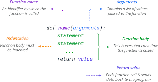
Python built-in functions are predefined functions that are readily available for use without requiring any imports or installations. These functions cover a wide range of operations, from simple tasks like conversions to complex operations like sorting and iteration.

Function Name Description
abs() Function  Return the absolute value of a number
aiter() Function Creates an asynchronous iterator from an asynchronous iterable.
all() Function Returns True if all elements in an iterable are true.
any() Function Returns True if any element in an iterable is true.
anext() Function Retrieves the next item from an asynchronous iterator.
ascii() Function Returns a string containing a printable representation of an object.
bin() Function Convert integer to a binary string
bool() Function Converts a value to a Boolean.
breakpoint() Function IInvokes the built-in debugger at the specified line.
bytearray() Function Creates a mutable byte array from a sequence of bytes.
bytes() Function Creates an immutable bytes object from a sequence of bytes.
callable() Function Checks if an object is callable (can be called as a function).
chr() Function Returns a string representing a character whose Unicode code point is the given integer.
classmethod() Function Converts a method into a class method.
compile() Function Compiles source code into a code or AST object
complex() Function Creates Complex Number
delattr() Function Delete the attribute from the object
dict() Function Creates a Dictionary
dir() Function Returns a list of the attributes of any object
divmod() Function Returns the quotient and remainder of a division.
enumerate() Function Returns an enumerate object that generates pairs of index and value from an iterable.t
eval() Function Evaluates a Python expression as a string and returns the result.
exec() Function Executes dynamically created Python code.
filter() Function Filters elements of an iterable based on a given function.
float() Function Converts a number or a string to a floating-point number.
format() Function Formats a value based on a specified format string.
frozenset() Function Creates an immutable frozenset from an iterable.
getattr() Function Retrieves the value of an attribute from an object.
globals() Function Returns a dictionary representing the current global symbol table.
hasattr() Function Checks if an object has a given attribute.
hash() Function Returns the hash value of an object.
help() Function Displays help documentation for a module, function, class, etc
hex() Function Converts an integer to a hexadecimal string.
id() Function Return the identity of an object
input() Function Reads a line from the user’s input
int() Function Converts a number or a string to an integer
isinstance() Function Checks if an object is an instance of a specified class.
issubclass() Function Checks if a class is a subclass of another class.
iter() Function Returns an iterator object from an iterable.
len() Function Returns the length (number of items) of an object.
list() Function Creates a list in Python
locals() Function Returns a dictionary representing the current local symbol table.
map() Function Applies a function to all items in an iterable.
max() Function Returns the largest item in an iterable or a set of arguments.
memoryview() Function Creates a memory view object of an object’s memory.
min() Function Returns the smallest item in an iterable or a set of arguments.
next() Function Retrieves the next item from an iterator.
object() Function Returns a new featureless object.
oct() Function Converts an integer to an octal string.x
open() Function Opens a file for reading, writing, or both.
ord() Function Returns an integer representing the Unicode character.
pow() Function Returns the value of x to the power of y.
print() Function Prints objects to the standard output.
property() Function Gets, sets, or deletes an object’s property.
range() Function Generate a sequence of numbers
repr() Function Returns a string containing a printable representation of an object.
reversed() Function Returns a reversed iterator of a sequence.
round() Function Rounds a number to a specified number of decimal places.
set() Function Creates a set.
setattr() Function Assign the object attribute its value
slice() Function Creates a slice object representing a range of indices.
sorted() Function Returns a sorted list from an iterable.
staticmethod() Function Converts a method into a static method.
str() Function Converts an object to a string.
sum() Function Calculates the sum of all elements in an iterable.
super() Function Returns a temporary object of the superclass.
tuple() Function Creates a tuple in Python
type() Function Returns the type of the object
vars() Function Returns the __dict__ attribute for a module, class, instance, or any other object
zip() Function Combines multiple iterables element-wise.
__import__() Function Used for dynamic importing of modules.

Best Practices for Writing Clean Python Code

Best Practices for Writing Clean Python Code

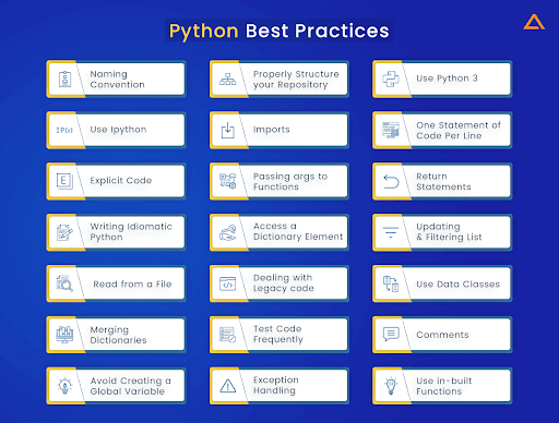
Writing clean code is pivotal for maintainability and collaboration. Here are some Python coding best practices to follow

  • Meaningful Naming: Use descriptive names for variables, functions, and classes.
  • Consistent Formatting: Adhere to PEP 8 guidelines for consistent indentation, line length, and whitespace usage.
  • Comments and Documentation: Add comments to clarify complex sections and provide docstrings for functions and modules.
  • Modularization: Break down code into smaller, reusable functions.
  • Avoid Magic Numbers: Use constants or named variables instead of hard-coded numbers.
  • Readable Logic: Write code that reads like a story, with well-organized and logical flow.
  • Error Handling: Implement appropriate error handling to make your code more robust.
  • Version Control: Utilize version control systems like Git to track changes and collaborate effectively.
  • Testing: Write unit tests to ensure your code behaves as expected.
  • Refactoring: Regularly refactor your code to eliminate redundancy and improve efficiency.

How Python Utilizes APIs for Web Application Interaction

How Python Utilizes APIs for Web Application Interaction

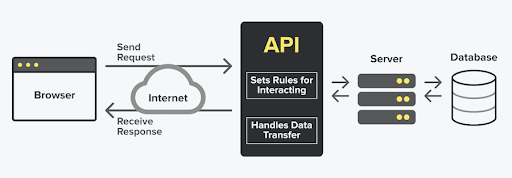
Its versatility and rich library ecosystem make it an ideal candidate for interfacing with APIs. Here’s how Python APIs interact with web applications:

  1. Sending HTTP Requests

Its libraries provide straightforward ways to send HTTP requests to web APIs. This enables Python programs to ask for data, send data, or trigger actions on remote servers.

  1. Receiving and Parsing Responses

Upon sending a request, web APIs respond with data, often in formats like JSON or XML. The programming language can’t parse these responses using libraries like json or xml.etree.ElementTree, making it easy to extract and manipulate the relevant information.

  1. Authenticating and Authorizing

Many APIs require authentication to ensure security. It can handle authentication by sending tokens or credentials along with the requests, enabling authorized access to protected resources.

  1. Data Integration and Automation

Python application’s interaction with APIs enables seamless data integration between different systems. This is particularly useful for tasks like fetching weather data, stock market information, or social media posts automatically.

  1. Web Scraping

While not strictly API interaction, Its ability to scrape data from web pages using libraries like BeautifulSoup or Scrapy can achieve similar results when APIs aren’t available.

Practical Applications of Python and APIs

Practical Applications of Python and APIs

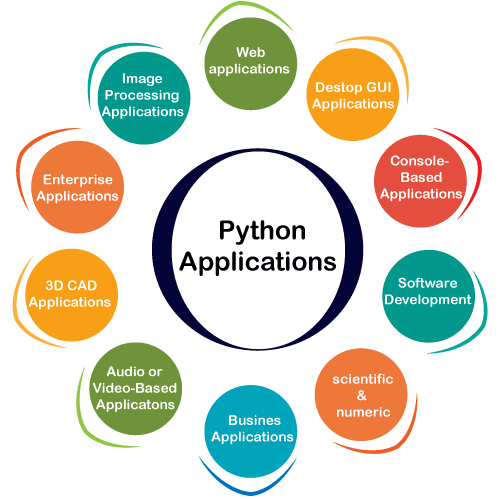
The integration of Python and APIs opens the door to a multitude of applications:

  1. Social Media Integration

Python web applications can interact with APIs provided by social media platforms to retrieve user data, post updates, or analyze trends.

  1. Data Analysis and Visualization

Python apps can fetch data from APIs, process it using libraries like Pandas, and visualize insights using Matplotlib or other visualization tools.

  1. Content Aggregation

Automatically gather news articles, blog posts, or any other content from various sources using APIs.

  1. E-commerce Integration

Python development companies can help businesses streamline e-commerce operations by integrating APIs from payment gateways, inventory systems, and shipping providers.

  1. IoT and Home Automation

Connect IoT devices to web services using APIs, allowing remote control and data exchange.

Top 10 Python Development Frameworks

It is home to a diverse array of development frameworks that cater to various needs. 

Let’s explore the top 10 frameworks:

Django:
A high-level web framework that encourages rapid Python application development and clean, pragmatic design. It follows the “batteries-included” philosophy, providing many built-in features like an ORM (Object-Relational Mapping), authentication, and an admin interface. Django is suitable for building complex web applications.

Flask:
A lightweight micro-framework that offers flexibility and minimalism. Flask gives you the freedom to choose components as you need them, making it suitable for both simple and complex applications. It’s a good choice for those who want to have more control over the components they use.

PyTorch:
Although primarily known as a deep learning framework, PyTorch can be used for general-purpose programming as well. It’s particularly popular in the field of machine learning and research due to its dynamic computation graph and ease of use.

TensorFlow:
Developed by Google, TensorFlow is an open-source machine learning framework. It’s widely used for building and training neural networks for tasks like image recognition, natural language processing, and more.

FastAPI:
A modern, fast web framework for building APIs with Python 3.7+ type hints. FastAPI is known for its speed and automatic generation of interactive API documentation, making it a great choice for building APIs quickly.

Tornado:
A scalable, non-blocking web server and web application framework. Tornado is designed to handle asynchronous I/O, making it suitable for applications that require real-time updates and high concurrency.

Pyramid:
A full-featured web framework that prioritizes flexibility and modularity. Pyramid is a great choice for building python web applications of varying sizes and complexities while allowing you to select the right components for your project.

CherryPy:
A minimalist framework that aims to be easy to learn and use. It’s a good option for building small python apps and services without the complexity of larger frameworks.

Bottle:
A micro-framework designed for simplicity and minimalism. It’s ideal for small-scale applications and quick prototypes due to its compact size and ease of use.

Kivy:
Although not a web framework, Kivy is a library for developing multitouch applications. It’s particularly useful for building python cross-platform applications with rich user interfaces for desktop and mobile platforms.

FAQs

Q1: Are built-in functions available without any imports?

A: Yes, built-in functions are inherent to Python and do not require import statements.

Q2: Can I create my own built-in functions?

A: While you can’t modify existing built-in functions, you can define your own functions in Python.

Q3: How can I learn more about Python’s standard library functions?

A: The official Python documentation provides comprehensive information about standard library functions.

Q4: What’s the advantage of using a micro-framework like Flask?

A: Micro-frameworks like Flask offer minimalistic, customizable solutions for web applications, allowing developers to choose components as needed.

Q5: How do APIs benefit Python programmers?

A: APIs empower Python developers to access and manipulate data from external sources, enabling tasks like data analysis, integration, and automation.

Conclusion

Its ability in interacting with web applications through APIs empowers developers to create versatile and integrated solutions. 

The language’s simplicity, along with libraries that facilitate HTTP requests, response parsing, and authentication, make Python a preferred choice for API-driven development. 

Whether you’re building data-driven applications, automating tasks, or integrating services, Python’s API interactions provide the foundation for innovation in today’s interconnected world.